
iOS Charts Patterns
Statistics are everywhere. We rely on basic Data visualization and always checking for something new happened with numbers. Visitors, Hits, Downloads, Sales, Whatever. We use such visualization just to make sure everything is OKAY, or something going wrong. This is the common purpose of having charts in your application. Moreover, in this way you deliver an opportunity to a user for improving his in-app activity. Win-win game!
But having a Flexible, Accessible, Easy-to-get charts screens for your app requires some skills and time investment. I was involved in Dashboards-related Design for ages before and once I realized to create a powerful iOS library of components for designers, developers and for the entire teams. In fact, Chartssection just one of many other iOS design patterns, so come in to get some tasty Inspiration :)
Components Overview
I am addicted to Components and see no other way to Design in nearest future or tomorrow maybe. Perhaps you should Rethink your Workflow into Components-driven mode today, or someone more skillful will replace you sooner or later. But let’s concentrate on some good news: I’ve already prepared a lot of free Figma templates from where you have to start your journey into the world of components implementation. OKAY, now what is this made of:
I performed some regrouping for some visual performance:
Application Bars
Must-have for every iOS app. Styled in Dark & Light modes, colors & typography variants. Swap between Big titles or default just by attaching required font styles, set the text-container Alignment after. FYI, those listed below are the Instances of one and only Bar component.

Segmented Controls
Still a frequent Pattern for many apps. Within Chart section there are few styles for Segmented UI available. Each of a variety crafted by up to 5 items in both Active and Inactive states. It’s up to you which is more convenient for your purposes.

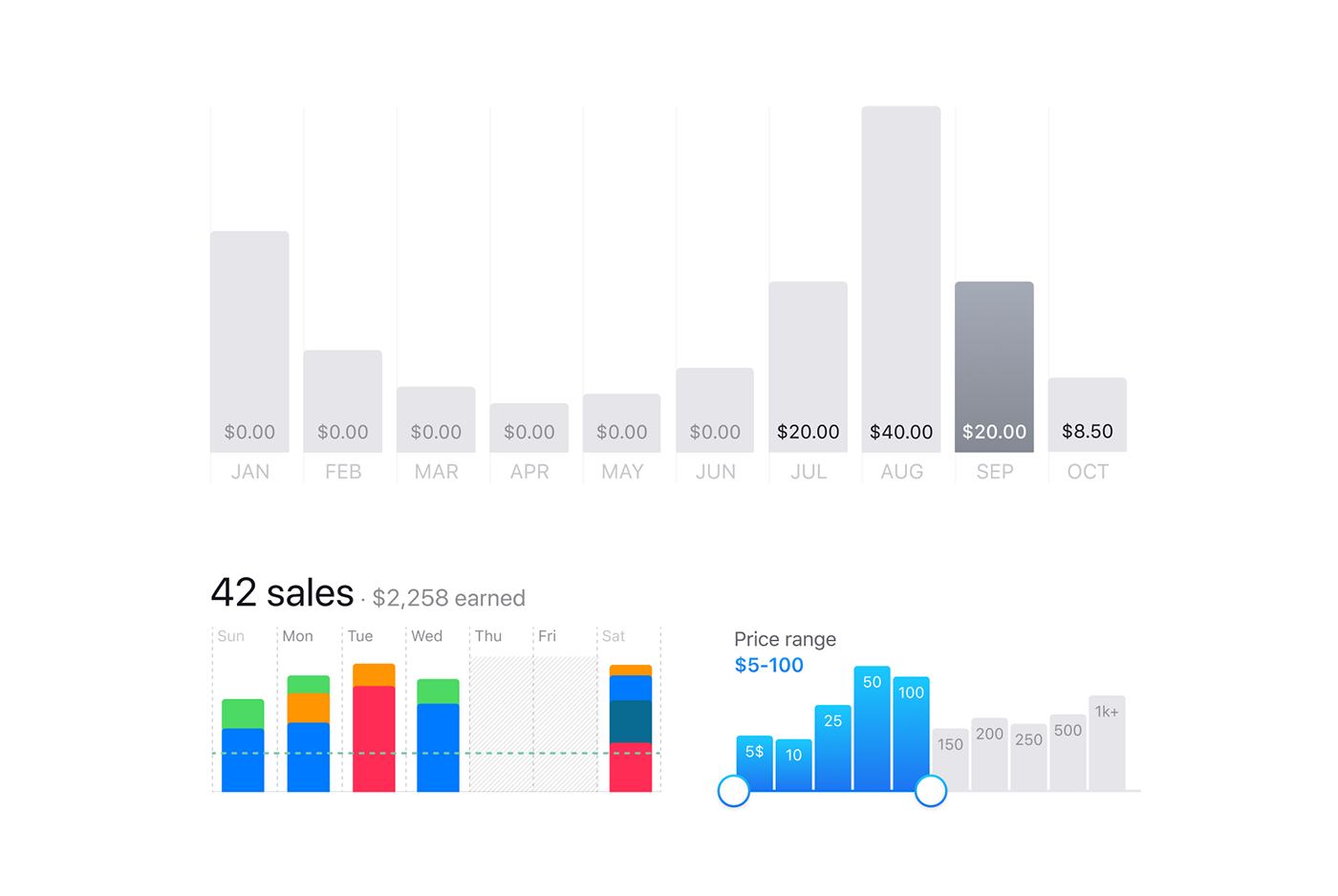
Vertical Bar Charts
Based on a VertBar-component: which is made of a Scalable Label for showing any value and Bar body. You’re free to drag for rescaling any bar and realign the caption as well (snap it to the bar’s top or bottom). This iOS design kit is equipped with a Slider-driven component for displaying average values according to a slider position. The more you slide, the more bars toggling to Highlighted.
Horizontal Bar Charts
Implemented in iOS App Templates in several compositions to Display the Progress of any action allowing to compare each to each. To set custom progress simply drag the Filled bar to the desired width, edit the Value after.

Radial Progress Charts
The best approach to display more Progress within less space. Fits for time, downloading, achievements and etc. Colors could be applied for increase the message: Low, High, Positive, Negative and others.

Line Charts
Well-known and used frequently in many Dashboards. You can switch to filled chart body instead of a gradient. Made by two independent layers: Chart Lineand Chart Body.

Other Items
A variety of List Components and Bottom Bars. Centered impact button made as an independent layer, so you just have to enable it within left Layers panel.

👏👏👏
That’s all for the Mobile Charts now. Thanks for reading this. Hope you’ll find useful some of my pictures. You can Discover more iOS design inspiration. Oh, by the way, if you’re a Smart Person, you have to try this toolkit for Figma. At least it will Save you months instead of building from scratch a Design Systemfor mobile apps…


