Translated by Google Translate:
Role: UX / UI designer; Time: ATM; Year: 2021; Software: Figma.
Situation
The "Group tasks" feature is added to the game - players consisting in clans, they can do tasks together and receive prizes for this.
The "Group tasks" feature is added to the game - players consisting in clans, they can do tasks together and receive prizes for this.
Business challenge
Involve players in the gameplay.
Involve players in the gameplay.
Player task
Get information about a feature: understand how it works, what prizes you can get and what needs to be done for this. Get the opportunity to participate. Upon request, receive information about the progress in the task and in reaching the next level of prizes.
Get information about a feature: understand how it works, what prizes you can get and what needs to be done for this. Get the opportunity to participate. Upon request, receive information about the progress in the task and in reaching the next level of prizes.
Your task
You need to design a scenario for the player's interaction with the "Group tasks" feature, taking into account that the player is already in the clan.
You need to design a scenario for the player's interaction with the "Group tasks" feature, taking into account that the player is already in the clan.
Delivery format and registration
It is necessary to prepare a version for iРпопе X. The completed test task must be provided as a link to a prototype or screen flow in Figma. (Russia, Saratov).
It is necessary to prepare a version for iРпопе X. The completed test task must be provided as a link to a prototype or screen flow in Figma. (Russia, Saratov).
Ситуация
В игру добавляется фича “Групповые задания" — игроки, состоящие в кланах, могут вместе делать задания и получать за это призы.
В игру добавляется фича “Групповые задания" — игроки, состоящие в кланах, могут вместе делать задания и получать за это призы.
Задача бизнеса
Вовлечь игроков в игровой процесс.
Вовлечь игроков в игровой процесс.
Задача игрока
Получить информацию о фиче: понять как она работает, какие можно получить призы и что для этого нужно сделать. Получить возможность принять участие. По желанию получать информацию о прогрессе в задании и в достижении очередного уровня призов.
Получить информацию о фиче: понять как она работает, какие можно получить призы и что для этого нужно сделать. Получить возможность принять участие. По желанию получать информацию о прогрессе в задании и в достижении очередного уровня призов.
Ваша задача
Вам необходимо спроектировать сценарий взаимодействия игрока с фичей “Групповые задания", учитывая, что игрок уже находится в клане.
Вам необходимо спроектировать сценарий взаимодействия игрока с фичей “Групповые задания", учитывая, что игрок уже находится в клане.
Формат сдачи и оформление
Необходимо подготовить версию для iРпопе Х, Выполненное тестовое задание необходимо предоставить в виде ссылки на прототип или скринфлоу в Figma (Россия, Саратов).
Необходимо подготовить версию для iРпопе Х, Выполненное тестовое задание необходимо предоставить в виде ссылки на прототип или скринфлоу в Figma (Россия, Саратов).

Translated by Google Translate:
Role: UX / UI designer; Time: ATM; Year: 2020; Software: Figma.
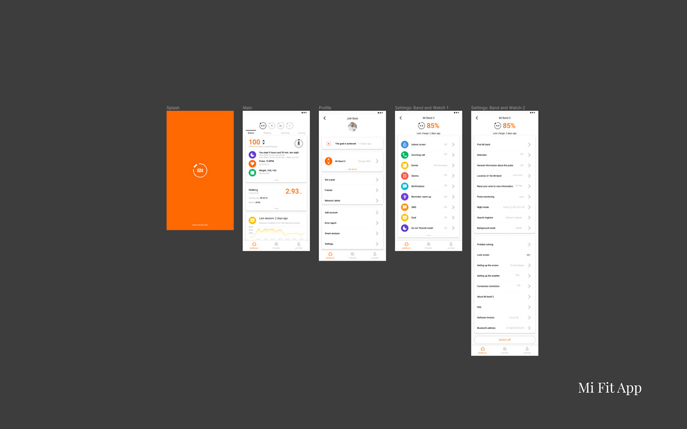
Mi Fit app improvement concept.
Goal: to finally figure out the logic in the application, to simplify the connection of devices and their configuration. Send to Xiaomi.
Problem: when using the old interface, the user is faced with the difficulty of understanding where this or that function is to control his device. It is also worth noting too overloaded cards with device and application settings.
Process: decomposed all screens of the application and analyzed the user's path along them. Problematic places of user entry and exit to this or that function have been identified. Visually convenient points for displaying data related to the connected device (battery charge or synchronization percentages) are also taken into account. The application and device settings cards have been optimized, more important functions are raised higher and accentuated with icons. Less important ones have been removed to other cards. Now, when you go to the settings, there is a main card with the "main" functions and additional cards on a separate screen. Previously, the logic was different, many items were transferred to new screens (which is unacceptable and tiresome). Now there are only two configuration screens, the items in them are divided into logical interaction cycles. Also, in parallel, work is underway on the general style, oddly enough, but in this application the problem of different icons and colors. Now everything is systematized and brought to the general style of MIUI design.
Link to Figma upon request. (Russia, Voronezh).
Концепт улучшения приложения Mi Fit.
Цель: наконец-то разобраться с логикой в приложении, упростить подключение устройств и их настройку. Отправка в Xiaomi.
Проблема: при использование старого интерфейса пользователь сталкивается со сложностью понимания где находиться та или иная функция для управления его устройством. Так же стоит отметить слишком перегруженные карточки с настройками устройства и приложения.
Процесс: разложены все экраны приложения и про анализирован путь пользователя по ним. Выявлены проблемные места входа и выхода пользователя на ту или иную функцию. Так же учтены визуально удобные точки для вывода данных относящихся к подключенному устройству (заряд батарей или проценты синхронизации). Оптимизированы карточки настроек приложения и устройства, более важные функции подняты выше и акцентированы иконками. Менее важные убраны на другие карточки. Теперь при переходе в настройки существует основная карточка с "главными" функциями и дополнительные карточки на отдельном экране. Ранее логика была иная, многие пункты перекидывали на новые экраны (что не допустимо и утомляет). Теперь экранов настройки всего два, пункты в них разделены на логичные циклы взаимодействия. Так же параллельно ведётся работа над общей стилистикой, как ни странно но в данном приложений проблема разных иконок и цветов. Теперь же всё систематизировано и приводиться к общей стилистики MIUI дизайна.
Ссылка на Figma по запросу. (Россия, Воронеж).
Translated by Google Translate:
Please note: work has been done with styles, colors, fonts, everything is named and connected to the project. And also in the project itself, everything is neatly arranged "on the shelves". Elements are collected in groups, frames.
The structure of the document is top-down: Cover - Styles - Wireframes - Design (subject to version).
Обратите внимание: проведена работа с стилями, цветом, шрифтами всё названо и подключено к проекту. И также в самом проекте всё аккуратно разложено "по полочкам". Элементы собраны в группы, фреймы.
Структура документа нисходящая: Обложка - Стили - Схема - Дизайн (с учётом версии).


Translated by Google Translate:
Role: UX / UI designer; Time: ATM; Year: 2019; Software: Figma.
Application concept for the selection of cosmetics by skin type.
Goal: Using the experience of competing ideas in this segment to create applications with a simple "direct" path for the user. Two transitions and a result.
Problem: the complexity arises on the side of the databases for the output of the result, a high-quality system of accounting and scanning of products is needed. On the design side, this can cause a clutter of data and "extra" screens for the user. There is also a different learning ability of the user, a complex and overloaded interface similar to banking applications can cause "natural" rejection from the user.
Process: surveys of potential customers of different age groups (Microsoft Forms) were carried out, their wishes were revealed (color, shape, method, etc.), tables were created with the percentage of positive or negative feelings (age - function) (Microsoft Excel), selected applications with a similar task. The received data is collected in a general portrait of the application. Further, the layout of the screens and their logic were developed. On the way to developing applications, it was decided to abandon "complex" authorization through social networks, in favor of SMS authorization. There are also created ways to enter the training cards (different age of users is taken into account, the cards can be skipped). The application menu is built on simple forms taken from the ZUNE design. The application is being developed hybrid (for Android, iOS).
Link to Figma upon request. (Russia, Voronezh).
Концепт приложения для подбора косметических средств по типу кожи.
Цель: используя опыт конкурирующих идей в этом сегменте создать приложения с простым "прямым" путём для пользователя. Два перехода и результат.
Проблема: сложность возникает на стороне баз данных для выдачи результата необходима качественная система учёта и сканирования продуктов. Со стороны дизайна это может вызвать нагромождение данных и "лишних" экранов для пользователя. Так же присутствует разная обучаемость пользователя, сложные и перегруженный интерфейс по типу банковских приложений может вызвать "естественное" отторжение у пользователя.
Процесс: проведены опросы потенциальных клиентов, разной возрастной группы (Microsoft Forms), выявлены их пожелания (цвет, форма, способ и т.д.), созданы таблицы с процентным соотношение положительных или отрицательных ощущений (возраст - функция) (Microsoft Excel), отобраны приложения с аналогичной задачей. Полученные данные собраны в общий портрет приложения. Далее была разработана схема экранов и их логика. На пути разработки в приложений принято решение отказаться от "сложной" авторизации через социальные сети, в пользу смс авторизации. Так же созданы пути входа на карточки обучения (учитывается разный возраст пользователей, карточки можно пропустить). Меню приложения построено на простых формах взятых из дизайна ZUNE. Приложение разрабатывается гибридным (для Android, iOS).
Ссылка на Figma по запросу. (Россия, Воронеж).

Translated by Google Translate:
Please note: work has been done with styles, colors, fonts, everything is named and connected to the project. And also in the project itself, everything is neatly arranged "on the shelves". Elements are collected in groups, frames.
The structure of the document is top-down: Cover - Wireframes - Design (subject to version).
Обратите внимание: проведена работа с стилями, цветом, шрифтами всё названо и подключено к проекту. И также в самом проекте всё аккуратно разложено "по полочкам". Элементы собраны в группы, фреймы.
Структура документа нисходящая: Обложка - Схема - Дизайн (с учётом версии).


Translated by Google Translate:
Role: UX designer; Time: 5 d.; Year: 2019; Software: Figma.
Customer with Upwork is an application for tracking the physical activity of users, with a social focus (users compete, communicate and give each other "gifts").
Goal: Create a "motivational user path" prior to in-app purchases of rewards and sending rewards to others.
Problem: internal product, development of only this part of the user journey in the application (many nuances and features are not known to me). The application did not have any motivational incentives before, and in order to implement a transaction, the application must have an internal account for these purposes. Conditionally "internal bank account". And also there was no general communication between users in the application (chat).
Process: created a user path from authorization to the main screen. Items added:
1.notifications (for chat, for received rewards from other users), also in this section the ability to quickly respond by swiping has been added, the same mechanism is used to remove unnecessary notifications in the application;
2. a personal account (profile) screen has been created, in this part of the application the user edits data about himself, deposits money into the account, sees his transactions, account balance and rewards that he can send to the user (favorite or frequently used);
3. a screen with the ability to communicate (chat) has also been added, the ability to send rewards without leaving other screens has also been integrated into the chat.
4. The logic of the main screen has been redesigned taking into account the innovations. (UAE).
Заказчик с Upwork приложение для отслеживания физической активности пользователей, с социальным акцентом (пользователи соревнуются, общаются и дарят друг другу "подарки") .
Цель: создать "мотивационный путь пользователя" до покупки в приложении поощрений и отправки поощрений другим пользователя.
Проблема: внутренний продукт, разработка только этой части пути пользователя в приложении (многие нюансы и особенности мне не известны). Приложение не обладало до этого мотивационными поощрениями и так же для реализации транзакции приложение должно обладать внутренним кабинетом для этих целей. Условно "внутренний банковский счёт". И так же не было общей коммуникации между пользователями в приложении (чат).
Процесс: создан путь пользователя от авторизации до главного экрана. Добавлены пункты:
1. уведомления (для чата, для полученных поощрений от других пользователей), так же в этом разделе добавлена возможность быстрого ответа смахиванием, этим же механизмом реализовано удаление не нужных уведомлений в приложении;
2. создан экран личный кабинет (профиль), в этом части приложения пользователь редактирует данные о себе, вносит деньги на счёт, видит свои транзакции, баланс счёта и поощрения которые может отправить пользователю (любимые или часто используемые);
3. так же добавлен экран с возможностью общения (чат), в чат так же интегрирована возможность отправки поощрений не выходя на другие экраны.
4. переработана логика главного экрана с учётом нововведений. (ОАЭ).


Translated by Google Translate:
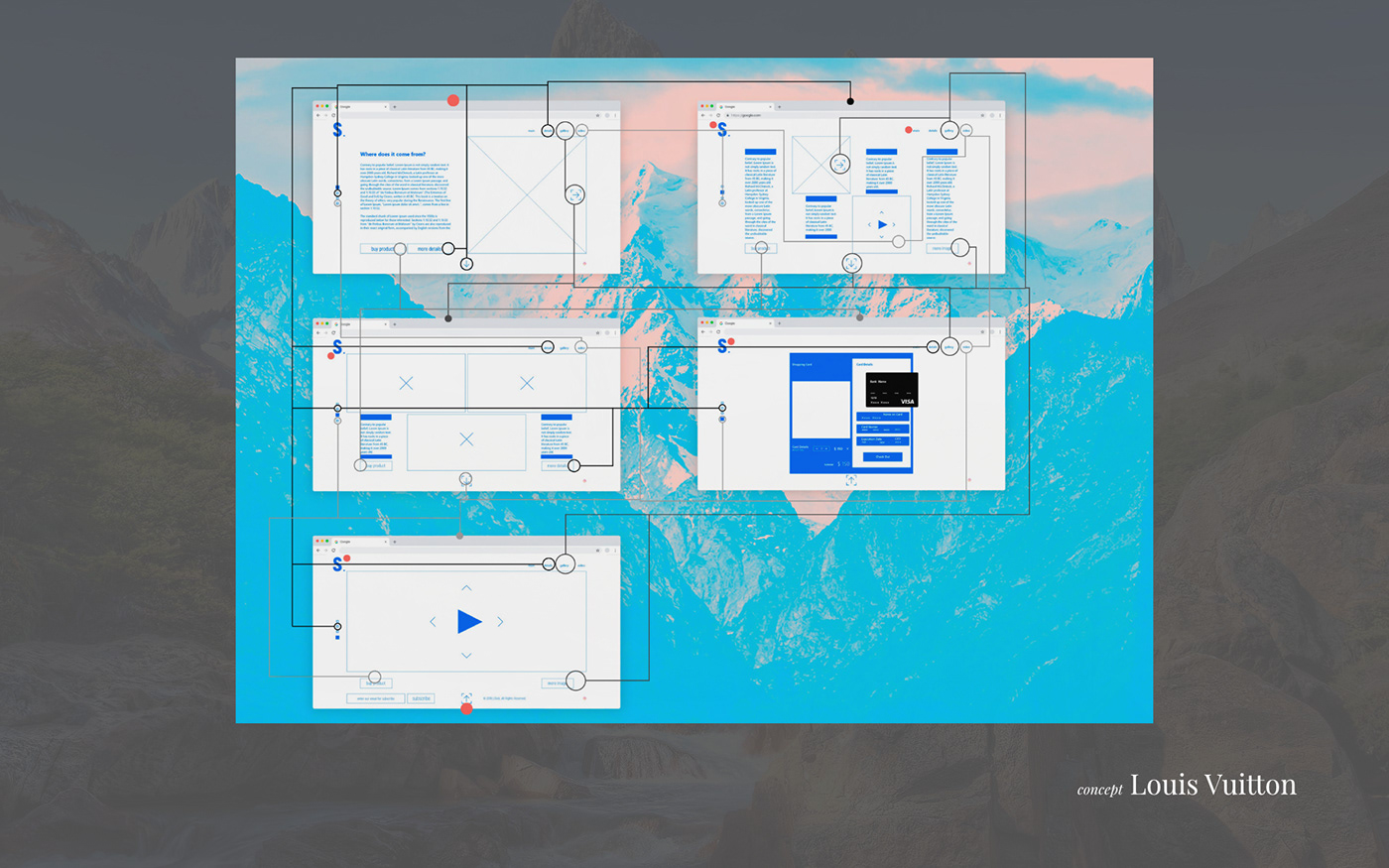
Role: UX / UI designer; Time: 5 h.; Year: 2016; Software: Adobe XD.
Site concept for Louis Vuitton, namely for "Ile Blanche" scented candles.
Goal: Create a vicious circle of the user journey that leads the user to a purchase. Integrate all "cards" with additional product information into this path.
Problem: using simple forms (buttons and interface elements) that regular customers of the brand are used to.
Process: I have calculated the optimal number of screens until the user gets tired. There are only four of them in this case. Further added the ability to purchase goods from any of the four screens. Drawing attention to the simple design forms of the main Louis Vuitton site, a 4-column page layout was chosen. This allowed for a simple and elegant arrangement of all elements. (Russia, Saratov).
Концепт сайта для Louis Vuitton, а именно для ароматических свечей "Ile Blanche".
Цель: создать замкнутый круг пользовательского пути, который приводит пользователя к покупке. Интегрировать в этот путь все "карточки" с дополнительной информацией о продукте.
Проблема: использовать простые формы (кнопки и элементы интерфейса) к которым привыкли постоянные клиенты бренда.
Процесс: мною рассчитано оптимальное количество экранов, до момента "уставания" пользователя. В этом кейсе их всего четыре. Далее добавлена возможность приобрести товар с любого из четырёх экранов. Обращая внимание на простые формы дизайна основного сайта Louis Vuitton, выбрана 4 колоночная вёрстка страниц. Это позволило просто и изящно расположить все элементы. (Россия, Саратов).