


Translated by Google Translate:
One of my favorite works. Competition work for the Sony SCi-Fi channel. The main font of this series is used. The main dates of the events of the series "Star Trek" are listed, as well as in the manner of listing the actors, the races of the series are listed. Used the Sony SCi-Fi channel logo. The background depicts the main character of the poster, namely a spaceship. If you look closely, you will notice that the ship is in the moment of exiting the "hyper jump". If you take a deeper look at the work, you can see the space in each part of the poster is different, the effect of overlaying several background images and their subsequent processing. The accent part of the geometric figure is an interesting and hype move in the design for 2018 (Russia).
Одна из мои любимых работ. Конкурсная работа для канала Sony SCi-Fi. Использован основной шрифт данной франшизы сериалов. Перечислены основные даты событий сериала "Звёздный Путь", так же на манер перечисления актёров , перечислены расы сериала. Использован логотип канала Sony SCi-Fi. На фоне изображен главный герой плаката, а именно космический корабль. Если присмотреть то можно заметить что корабль находиться в моменте выхода из "гипер прыжка". Если глубже рассмотреть работу, то можно заметить космос в каждой части плаката разный, эффект наложения нескольких фоно и последующая их обработка. Акцентная часть геометрическая фигура интересный и хайп ход в дизайне для 2018 года (Россия).
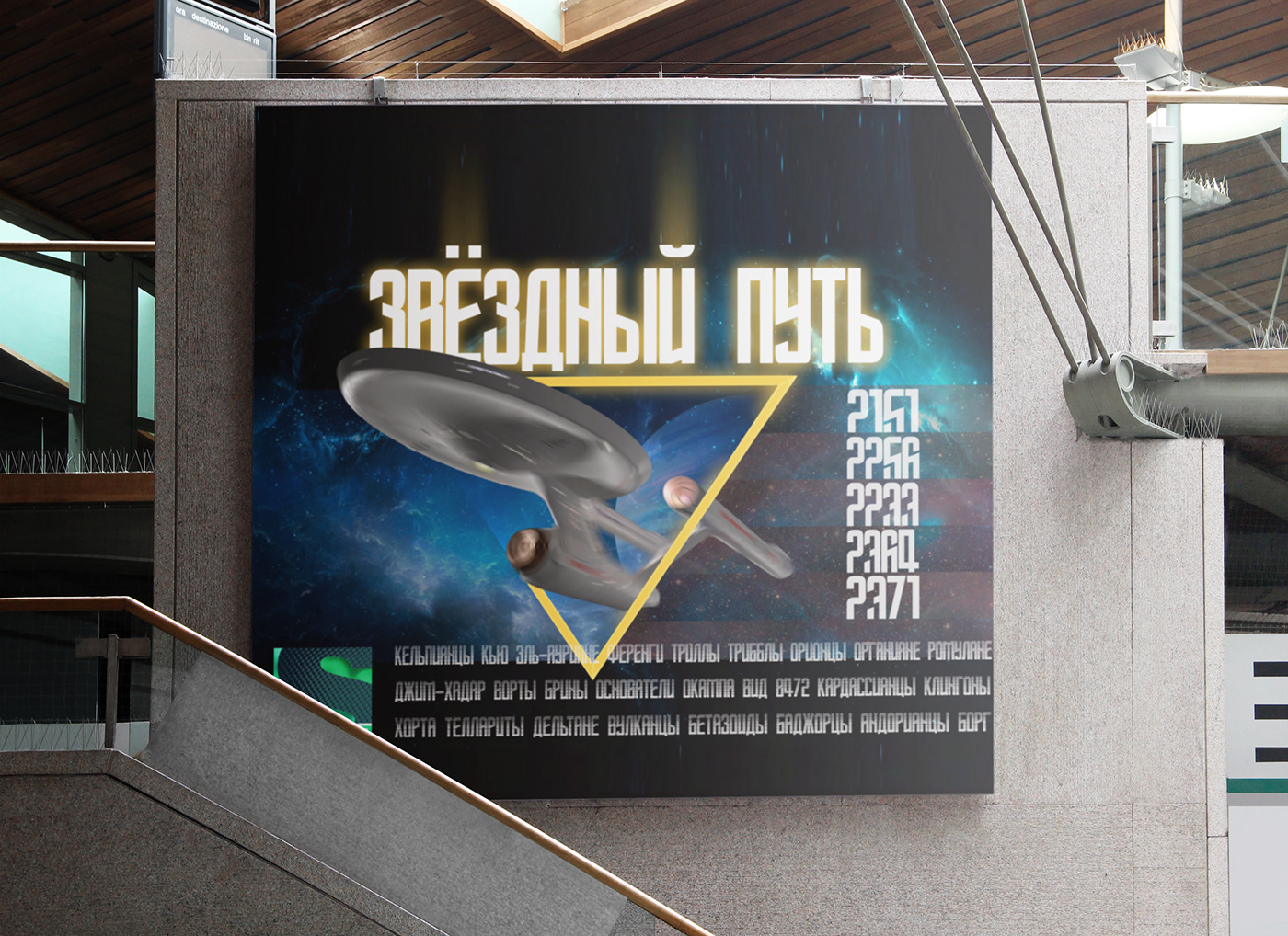

Poster for the TV channel Sony SCi-Fi, competition entry - 2018

Translated by Google Translate:
One of my favorite jobs. The date of creation fell at the time of the zeroing of the presidential terms in Russia. From here and a play on words: OBNULLI (zeroing) or the common expression OP, NULLI (see zeros) is used in the poster. Which should have caused special attention to billboards. Purpose: to draw attention to discounts in the shopping center. Bright colors and style of performance duaton + glitch effects. Advertising action. Billboard, A4 and banner for social networks (Russia, Voronezh).
Одна из моих любимых работ. Дата создания выпала на момент обнуления сроков президента в России. От сюда и игра слов: ОБНУЛИ или в плакате использовано простонародное выражение ОП,НУЛИ (смотри нули). Что должно было вызвать особое внимание к билбордам. Цель: привлечь внимание к скидкам в ТЦ. Яркие цвета и стилистика исполнения дуатон + глитч эффекты. Рекламная акция. Рекламный щит, А4 и баннер для социальных сетей (Россия, Воронеж).

Advertising campaign. Billboard, A4 and social media banner. Center of the Chizhov Gallery

Advertising campaign. Billboard, A4 and social media banner. Center of the Chizhov Gallery

Advertising campaign. Billboard, A4 and social media banner. Center of the Chizhov Gallery

Translated by Google Translate:
The brand did not identify itself. Competition work for a Russian manufacturer of smart electronics. Purpose: Create advertising posters that are light and clean. The posters used the style of minimalism, accent direct texts + the universe (Russia).
Бренд не назвал себя. Конкурсная работа для Российского производителя умной электроники. Цель: создать рекламные плакаты, легкие и чистые. В плакатах применена стилистика минимализма, акцентные прямые тексты + вселенная (Россия).


Translated by Google Translate:
One of the few works that has survived from the time of study. Interior poster with blend effect (Russia).
Одна из немногих работ, которая сохранилась с обучения. Интерьерный плакат с применением бленд эффекта (Россия).


Translated by Google Translate:
Posters for the insurance company. Purpose: to draw attention to certain insurance services. Photos are used as an example only. The posters use the main colors of this insurance company. The central horizontal line with the texts in the middle works as an underlay for accent highlighting and is also an exclamation mark. The very psychology of perception of the text from large to small. Although it is worth noting that reading in any direction allows you to understand the information. For 2016, the use of QR codes in this business niche was innovative. Format: A0 (Saratov).
Плакаты для страховой компании. Цель: привлечь внимание к определенным страховым услугам. Фотографии используются лишь как пример. В плакатах применяются основные цвета данной страховой. Центральная горизонтальная линия с текстов по середине, работает как подложка для акцентного выделения и так же это восклицательный знак. Сама психология восприятия текста от большого к маленькому. Хотя стоит отметить что прочтение в любом направление позволяет понять информацию. Для 2016 года использование QR кодов в этой нише бизнеса было инновационно. Формат: А0 (Саратов).


Posters for clients, photos used for example - 2016


