
Introduction - المقدمة
Isterlab is a mobile app to provide users with news summaries that are customized to their personal preference.
اسطرلاب هو تطبيق اخباري ذكي يقوم بجلب الأخبار التي تهم القارىء فقط ويعتمد ذلك على اختياره لعناوين ومواضيع مفضلة.
The Problem - المشكلة
The team wanted to add new features and to enhance the current user experience in general.
كنا بحاجة لإضافة خصائص جديدة وتحسين تجربة المستخدم للتصميم الحالي.
The Design Process - عملية التصميم
User Stories - قصص المستخدمين
I needed to understand every single detail of the app, so I worked on a user stories sheet which contains all the details a reader can do. Once this is done, I can use it to track my work and see if the design I'm working on did achieve all the stories.
من أجل فهم كل تفصيل في التطبيق، أقوم بالعمل على مستند يحتوي على جميع التفاصيل المراد العمل عليها بالتطبيق، والتي تساعدني وتساعد العميل في تتبع العمل والتأكد من أننا قمنا بتغطية كل المطلوب.

Initial Sketches - السكيتشات الاولية
I try to explore how some of the views will look in terms of structure and layout by taking in consideration that the order and placement of elements is not final.
أحاول استكشاف افكار على الورق كي انتقل بعدها إلى الكمبيوتر لتسريع العملية.

Wireframing - التخطيط
For this step, I always prefer using Adobe XD. I worked on a wireframe for each main screen and linked them together with the prototype mode.
في هذا الخطوة استخدمت ادوبي اكس دي للعمل على التخطيطات. قمت بالعمل على التخطيطات الرئيسية للتطبيق.

UI Design - تصميم واجهة الاستخدام
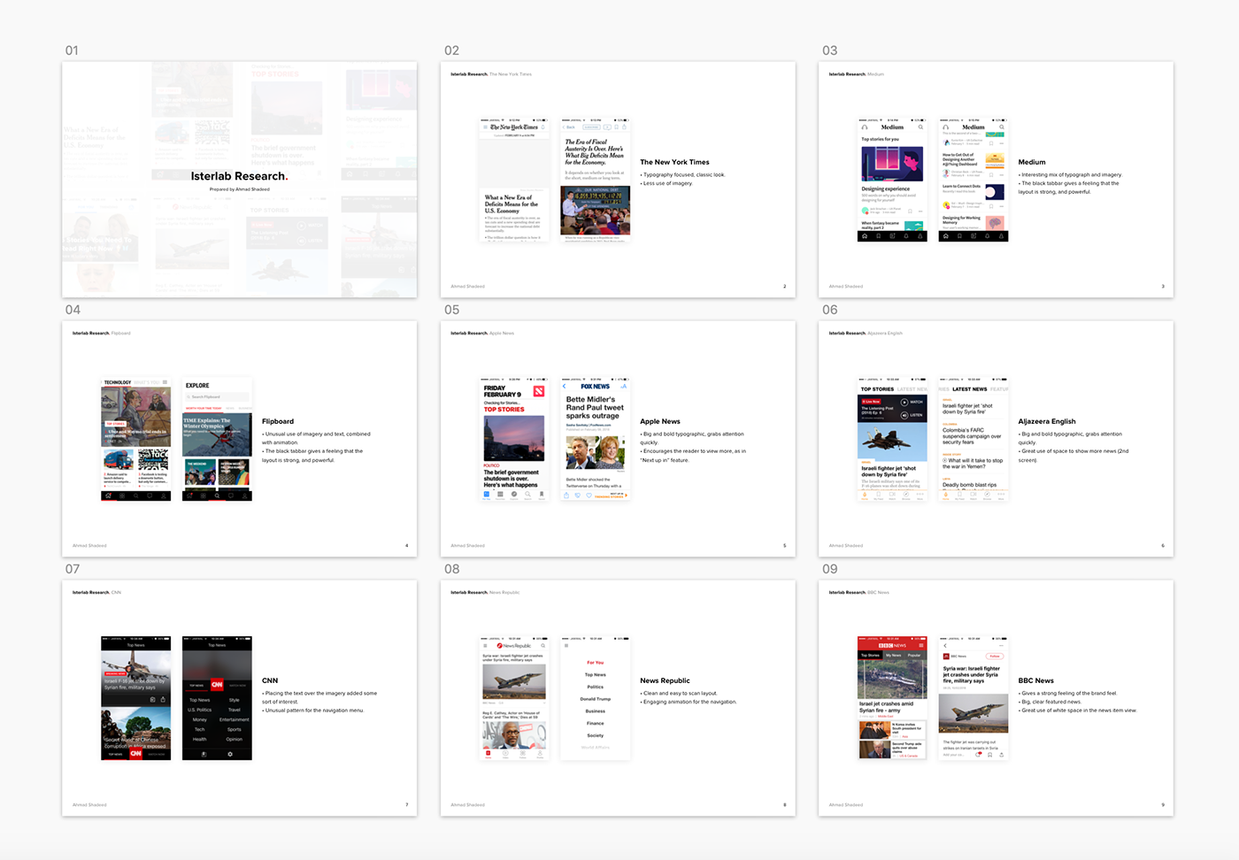
Before kicking off the UI design, I did a research to explore other similar apps out there. The goal of this step is to try to see if the client prefers a specific design direction/concept for me to work on.
قبل البدء في تصميم الواجهة، قمت بعمل بحث لتطبيقات مشابهة كي أعرف اتجاه التصميم المفضل لدى العميل.
I explored a design direction I have in mind, and here is the result. After a discussion with the client, we decided to put this off and try another concept without incorporating the brand logo too much.
قمت بإستكشاف اتجاه التصميم وخرجت بالنتيجة التالية.
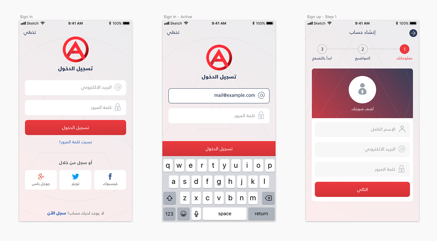
After that, I tried another direction and replaced the login form with social links. Here is the updated design direction.
لم تعجبنا النتيجة الاولى وحاولنا العمل على نموذج آخر معدل وتم الاتفاق عليه.

Welcome Screen - شاشة الترحيب
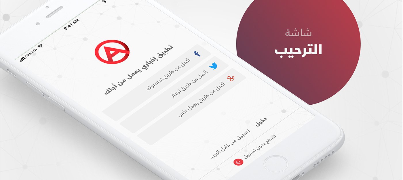
A flow for how the user can sign up in the app.
توضيح لكيفية عمل حساب لمستخدم جديد.

Home Screen - الشاشة الرئيسية
In this screen, the main focus was to create different looking blocks to engage the reader in the content.
في هذه الشاشة حاولت كسر الجمود وعمل عدة تصاميم للاخبار بحيث لا يمل المستخدم منها.


Home screen
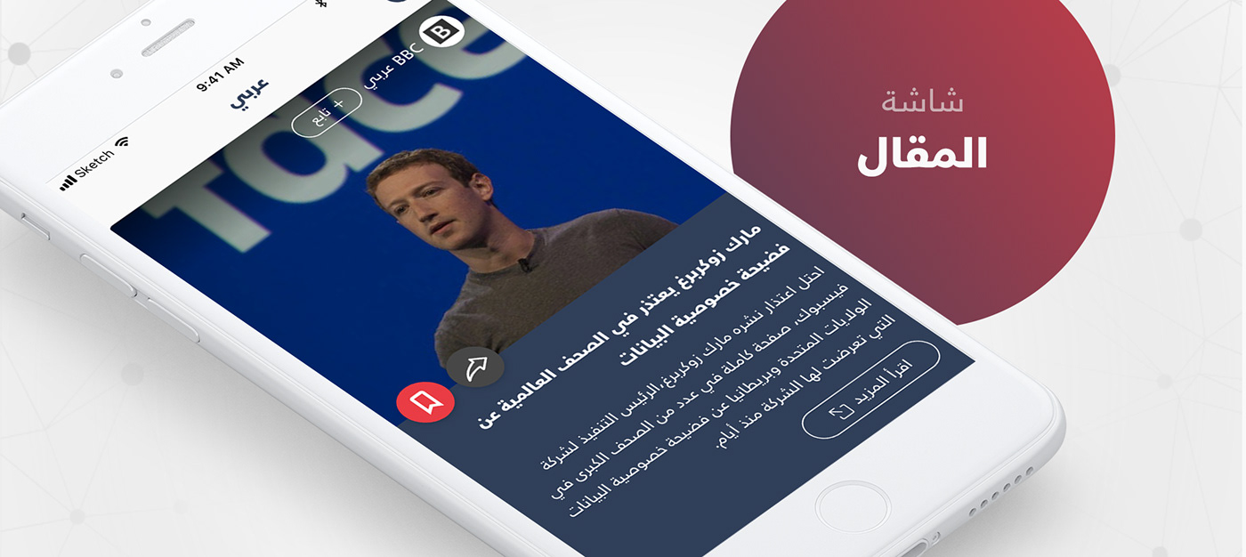
Article Screens - شاشات المقال
For this screen, we have different types of content like text, video or both. The design should be able to handle all of them.
يوجد انواع عدة من المقالات، نص عادي، او فيديو او كلاهما. التصميم يجب ان يعمل مع كل هذه التغييرات.

Here is a prototype for how the article cards are expected to work.
And here is how the user can follow a resource..
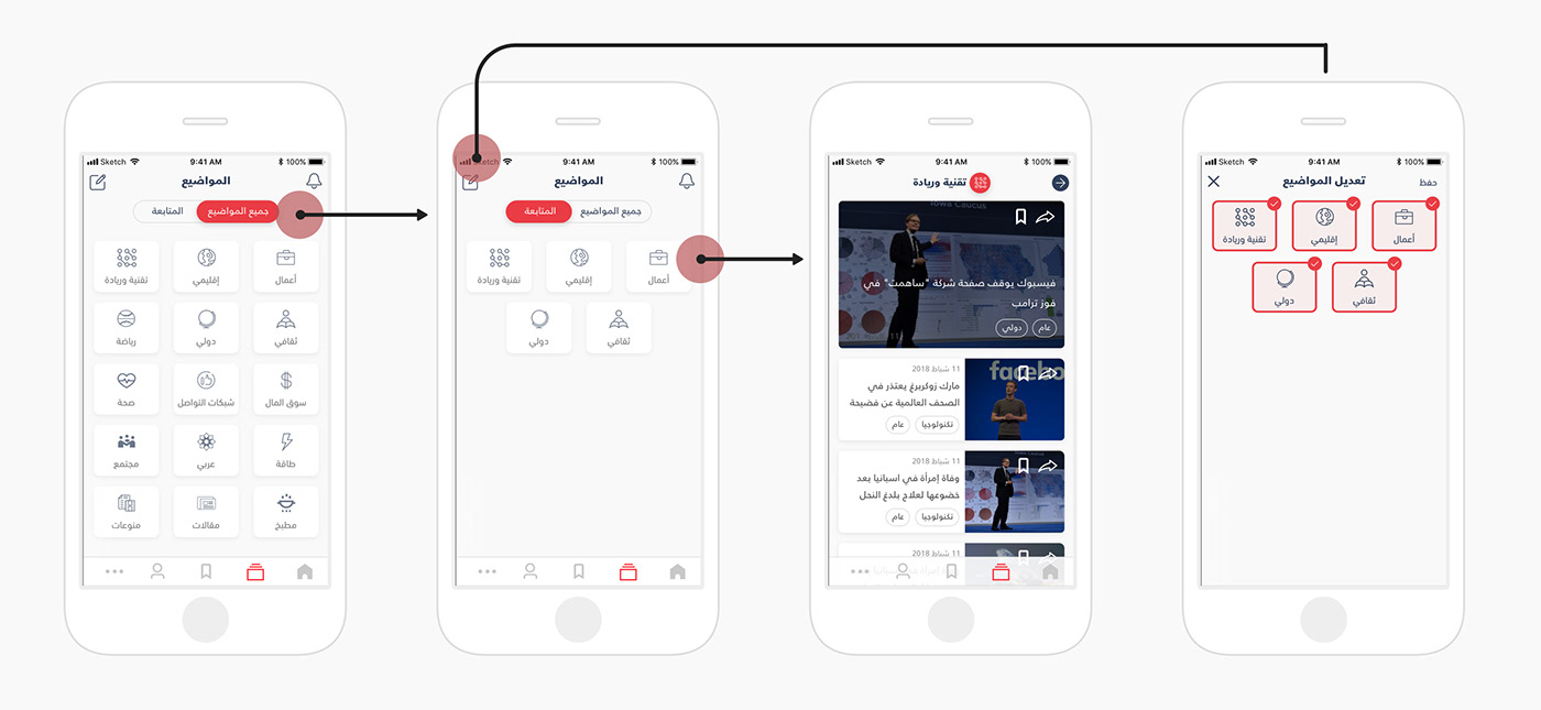
Topics - الموضيع
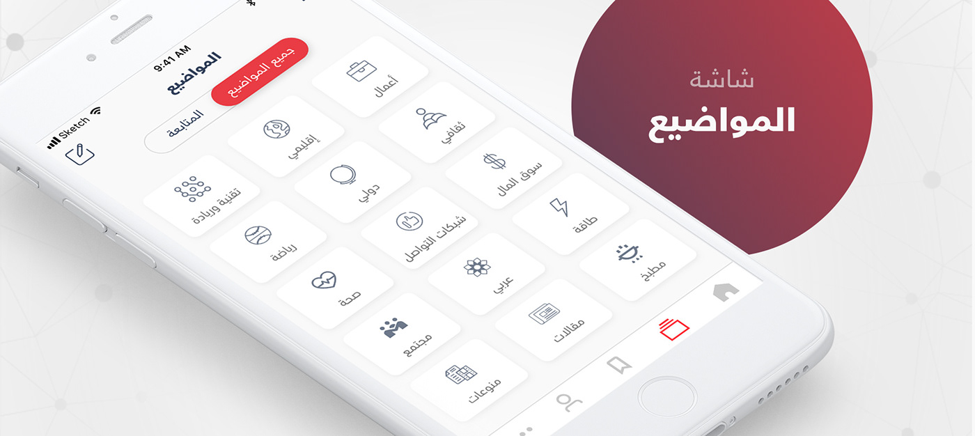
In topics, the user can add or remove a specific topic from his list.
في المواضيع، يستطيع المستخدم اضافة او ازالة موضوع معين من القائمة.
Read Later - القراءة لاحقاً

The user can swipe the card to the right in order to remove it.
لإزالة موضوع معين، يجب ان يقوم المستخدم بالسحب إلى جهة اليمين.

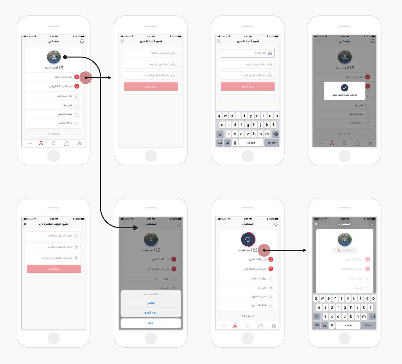
User Profile - الملف الشخصي

And here are some screens from the profile screens.
هنا بعض الشاشات من الملف الشخصي.
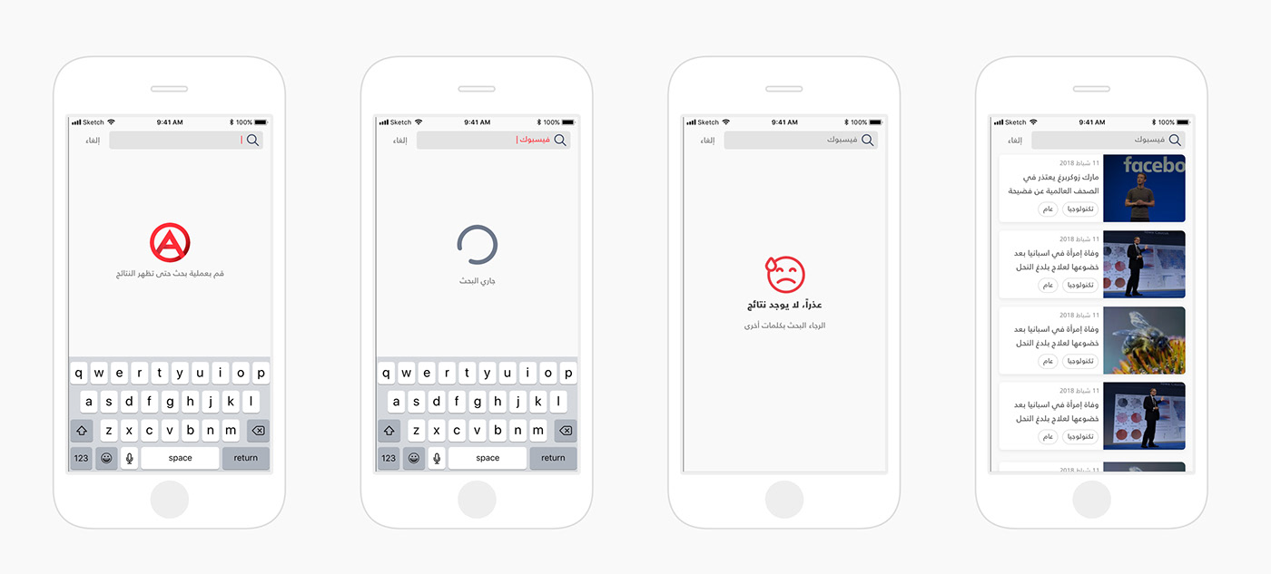
Search Results - نتائج البحث

And here is the search flow..
وهنا توضيح لكيفية عمل البحث مع الأخذ بعين الاعتبار حالات فشل البحث.
The End
Thanks a lot for reaching here.
If you need help in your next UX/UI design project, I'll be happy to hear from you on:
contact[at]ishadeed[dot].com.

