User Experience Design:
Expense Sharing App Prototype
In late 2017, I took on a personal project of creating and testing an app prototype following a user-centered design process. I practiced usability testing and created a prototype using the following steps:
Step 1: Market & Competitive Analysis
A typical project consists of stakeholders with a vested interest (a business or client with a problem). Through project stems from noticing a consumer pain point and doing extensive market research/target audience fit, I picked an expense sharing app because I found through research that the use of mobile payment systems are increasing, and millennials are comfortable with mobile payments due to perceived security, convenience, and portability. Additionally, many participate in a variety of expenses-sharing activities such as social events, trips/event planning, and reoccurring living situations (splitting internet and electricity bills with a roommate, etc.). I then did a competitive analysis of the most popular expense-sharing apps on the market:

Step 2: Heuristic Analysis
Upon learning a few different sets of best practices to build a digital interface, I used the Forrester Research Website Brand Action scorecard, a heuristics tool focused on the usability of a product interface. I reviewed the most popular product in my competitive analysis (Venmo) for comparison.

Step 3: Contextual Interviews
I created an outline for a contextual interview and conducted a few with sample users. Limited time and resources constrained the sample size/quality and the methodologies used, but I was able to take away a few key findings and recommendations (outline/questions on the left, results on the right):

Step 4: User Personas
The next step was to develop user personas, generalizing the target demographic while expressing understanding and empathy for the users. This helped me visualize the users for the app and develop solutions based on their needs/goals:


Step 5: Card Sort
In thinking about the content, features, and functionality of the product, I came up with 25 items for users to choose from. Using OptimalWorkshop, I made an open card sorting exercise to gather feedback for how to effectively group user functionalities within the app. (Group names were suggested but participants were also free to make their own titles and sections). Below are screenshots of the card sort, from the intro survey to the instructions/category, and an example card sort. Due to time and resource limitations, student groups were preassigned to participate in our card sorting exercises.


Step 6: Site Map
Taking the card sort feedback into consideration, I created a site map for the app interface:

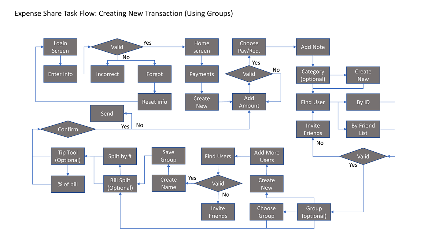
Step 7: Task Flows
At this point, a task flow would be a helpful visual depiction of how a user completes a task. Creating this flow helped me think through all the actions a user must take:
Step 8: Tree Tests
The next step was an exercise that tested whether or not the navigation was easy to understand. Using Optimal Workshop again, I created a tree test with the sections/sub-headers previously defined by the card sort exercise. I created three tasks for the users to complete: 1) creating a category for a new payment, 2) linking a new credit card to your account, and 3) sorting past transactions by group. These were important user functions that spanned the different features available within the app. Left to right: 1) tasks with correct answers, 2) full menu for participants to pick from, 3) screenshot examples of participant's task pick.


Step 9: Interface Sketches & Wireframes
After completing the tree test, I began brainstorming and sketching out different ideas for the app interface. I mapped out user actions for easier visualization, sketched design inspiration from different money-related interfaces/devices, and created different drafts of the main app sections.


I then cleaned up the sections by creating wireframes for the main screen sections: Home, Payments, Pending, Summary, and Account: (red and yellow text were notes to myself as I transitioned into prototyping).


Step 10: Prototyping + Usability Testing
After creating wireframes, I fleshed them out in Adobe XD and created an app prototype. At the time, there was limited animation/user flow capabilities so I exported screenshots of the app and connected them with InVision. I conducted a few usability test sessions following a script. The step-by-step prototype guide is also available, but was not given to participants. Below is a summary of the usability test results along with key findings and recommendations:


The final prototype walkthrough can be viewed in the quick video below: