Credus Clinic
Found by two young doctors, Credus Clinic is a place providing professional and comprehensive medical care.
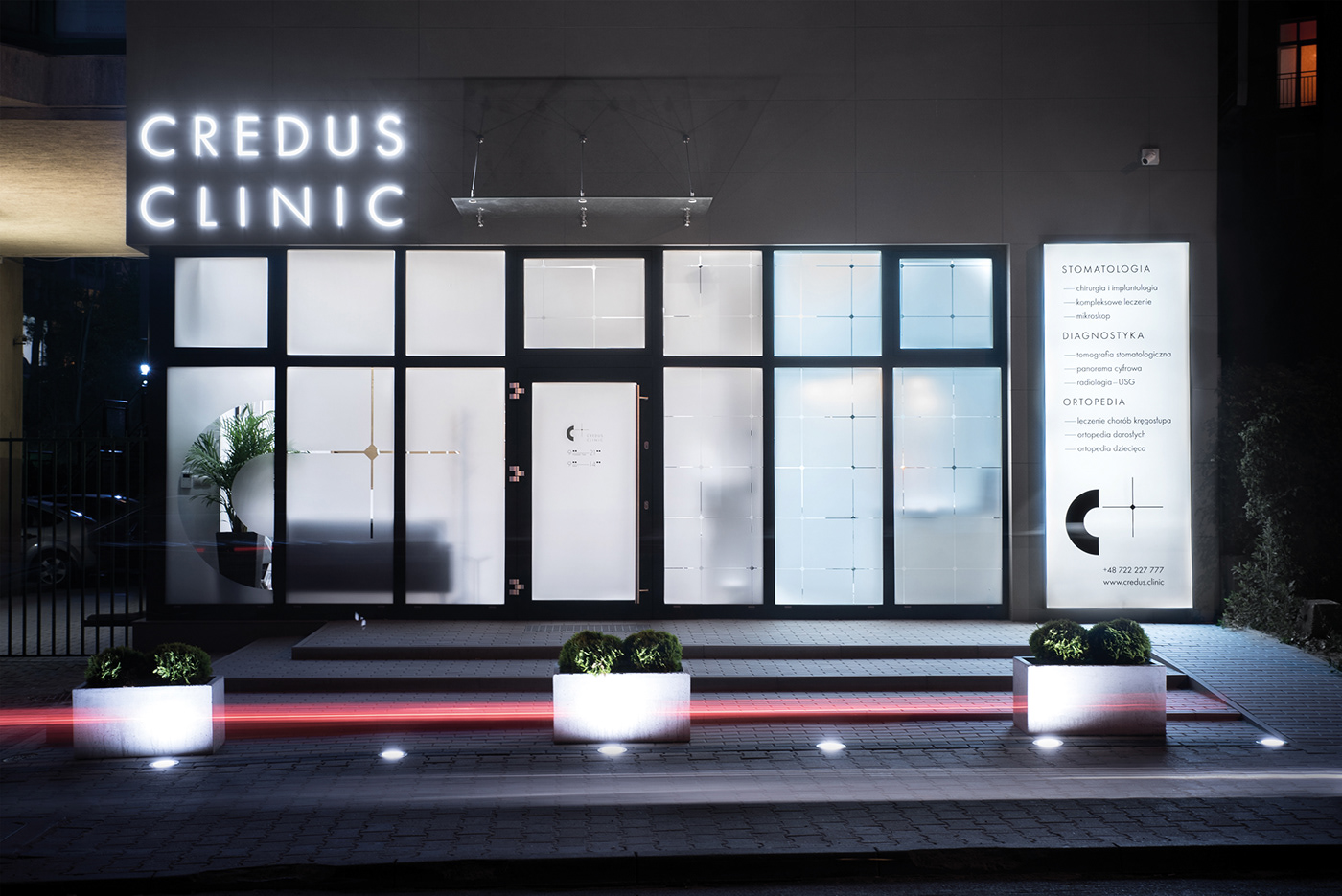
Formed by the team of specialists truly concerned about patient's health and comfort, Credus Clinic is an example of modern and cozy space bringing their clients to a positive mood. They worked with Modelina Architects on interiors already. Our role was to create a complex identity and meet the visual character of the clinic.
Formed by the team of specialists truly concerned about patient's health and comfort, Credus Clinic is an example of modern and cozy space bringing their clients to a positive mood. They worked with Modelina Architects on interiors already. Our role was to create a complex identity and meet the visual character of the clinic.
Our clients wanted each client to feel comfortable from the first step to the end of treatment. By analyzing the needs, we created the name Credus which directly refers to trust and corresponds with the values and emotions that the brand conveys.
We employed greyscale colors with details and meaningful symbol, composed of the "C" letter - derives from the name Credus and across - from one hand symbolizing the medical aspect of the clinic, and from the other one, it is a plus. Plus, to underline, that it's something more than just a clinic.
Brand Identity: Tato Studio
Interiors Design: Mode:lina Studio
Photographs: Patryk Lewiński / Tato Studio

The additional graphic element is a mathematically designed pattern based on the multiplied brand's symbol. It's placed both in print materials, as well in the interiors space as an element of decoration.
To emphasize the strong graphic picture of the brand, we used iconic photographs of Poznań - based photographer Szymon Brodziak, which captures the human body in motion, trapped by the grid.
The scope of our work included identity, printing materials, way-finding system, totem, exterior information.