


The Company
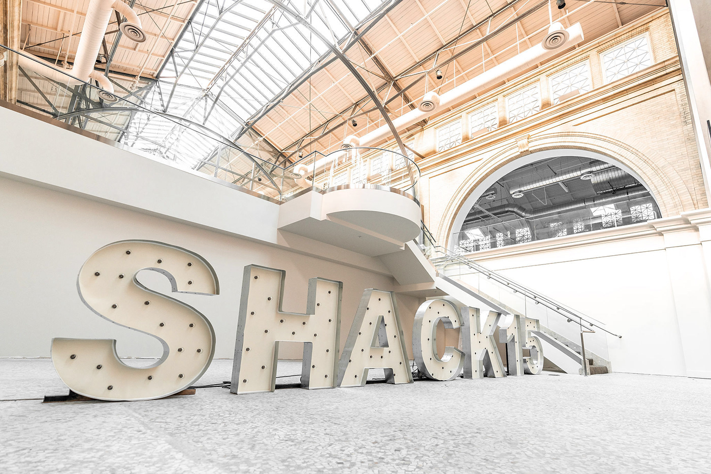
Launching in San Francisco's iconic Ferry Building in early 2019, Shack15 will offer a work and social space designed to bring together entrepreneurs and investors from across the world. I was commissioned to design and build an interim website to provide a taste of what Shack15 has to offer, allowing future members to apply for membership before the doors officially open.
Client: Shack

Project Execution
Shack15 is a culmination of necessities and aspirations. Explore the brand and you'll find yourself in a world of support, inspiration and likemindedness. My goal was to emulate this upbeat and positive vibe by highlighting their iconic San Francisco office while staying true to their Norwegian roots.
A soft color system with an open layout and clean type was utilized to reflect their brand, while incorporating collaged illustrations to emulate their focal points— Vision, Space, Community, Culture and Involvement. These collages reflect the multi-layered functionality of the brand, as well as their down to earth nature. Touching furthermore into the Scandinavian design, I created an iconography system to highlight each category—slightly playful but subtle and effective.
Client: Shack15
Year: 2018
Project Type: Commissioned


