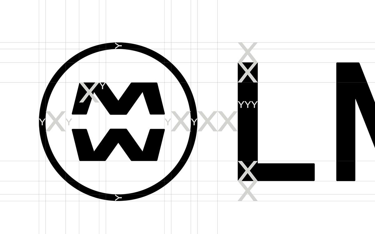


Logotype
Identity
Environment
La Maison du Whisky, or 'The Whisky House', started as a family owned whisky shop in Paris that has specialised in rare whiskies since 1956. They’ve been so focused on selling the best whiskies in the world, that their visual identity somewhat got a little lost along the way.
We got approached to create a new identity for them. As LMDW has been expanding in recent years they needed a system which would allow for new departments and companies to grow together. Their 5 whisky and spirits shops in Paris and Singapore all had to feel like they originated from the same company, even though the names of the shops changed slightly. For instance, in Paris we have LA MAISON DU WHISKY (on rue d'Anjou), & FINE SPIRITS (on Carrefour de l'Odéon) and MAISON DU WHISKY (on rue Jean Chatel) and in Singapore we have MAISON DU WHISKY (on Mohamed Sultan Road). On top of this we also had the LMDW brand with a few different departments: 'Collections', 'Distribution' and simply 'LMDW'.
We developed a symbol, inspired by their original and unique MW-marque, which would be the connection between all the different names and departments, and then a typographic system to let all elements feel like they belong to the same brand. We also developed a unique color palette for each shop to differentiate them slightly more from one another.
In collaboration with Sid Lee
See more here:
Whisky.fr Website
LMDW Website
La Maison du Whisky on wikipedia
See more here:
Whisky.fr Website
LMDW Website
La Maison du Whisky on wikipedia


