

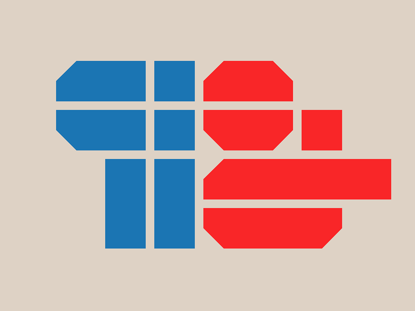


Texel is a condensed brutalist display typeface that began life as a studio io branding concept. Although the concept never made it to life, the notion of exploring brutal geometry through typography really stuck with us.
Taking cues from the architectural movement of Brutalism, the typeface embraces ruggedness and rejects the need to be comfortable or easy on the eye.
Rolled out in three separate cuts - regular, horizontal & vertical with italics - Texel is heavy, cold, oppressive & formidable. And makes no excuses for it.


