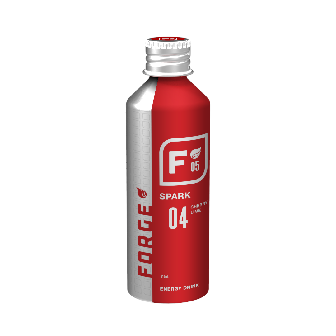
A walk through a supermarket beverage isle reveals that many current energy drinks bombard the viewer with loud graphics and complicated, busy designs. The act of carrying these beverages invites a certain perception that is not fitting of all personalities. Utilizing striking simplicitiy with bold, vibrant coloration, FORGE is designed to stand out amongst modern energy drinks. Sophisticated in appearance with a modern edge, the family of drinks is designed to appeal to both an athletic and young professional demographic.
Inspired by the logos and symbols of the early to mid-1900s steel and oil companies, FORGE represents a time when hard work and a zeal for growth were the norm. The name of each of the five original flavors, as represented in the symbol, also lends its name to the industries and energy that helped build America.
While FORGE is a ficticious brand and product, it was born through the identification of a perceived problem with current energy drink trends and appearances.