


TV 2 Lorry is a local Danish tv channel covering Copenhagen and its surroundings. It primarily deals with local news and culture events. There are roughly 2.2 million inhabitants living in the area.
TV 2 Lorry was very precise and straightforward in their brief : "We want to be visible on all platforms and use graphic design as a tool for communicating news and culture."
My solution is a CVI build around easily scalable and adjustable stroke based icons.
They can be used in explainers to help communicate complicated subjects and work well on moblie platforms, websites, as well as on TV. Due to their simplistic aesthetic they are easy to recognize and easy to implement.
TV 2 Lorry is a public service broadcaster and they have decided to release the icons under a CC BY-SA 4.0 Creative Commons licence and the customized version of Montserrat Black under the Open Font initiative.
Design vision reel
Motion design by Frederik Krogh and Jakob Lange
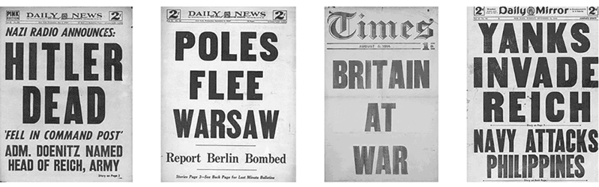
Newspaper corporations from the early 19'th century had some of the same fundemental challanges as media outlets have today.
To survive on a cut throat market you need to be visible. Back then, the only window of sale was a frontpage on a cluttered newsstand. Today its an overpopulated newsfeed on social media platforms. The solution: "big, bold and is easy to read". Some of
these frontpages date all the way back to 1914, but could in priciple still work on social media today.
This was one of the initial sources of inspiration.
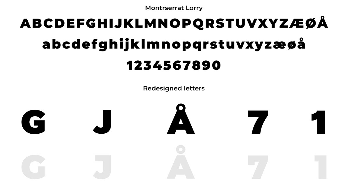
The identity is build around the open typeface Montserrat by Julieta Ulanovsky. The thick weights has a pleasent and warm feel to it.
To better fit the overall brand, we choose to hire type designer Kristoffer Vidtfelt to redesign a couple of letters.
The modified font is published under the open font initiativ. Download it here.
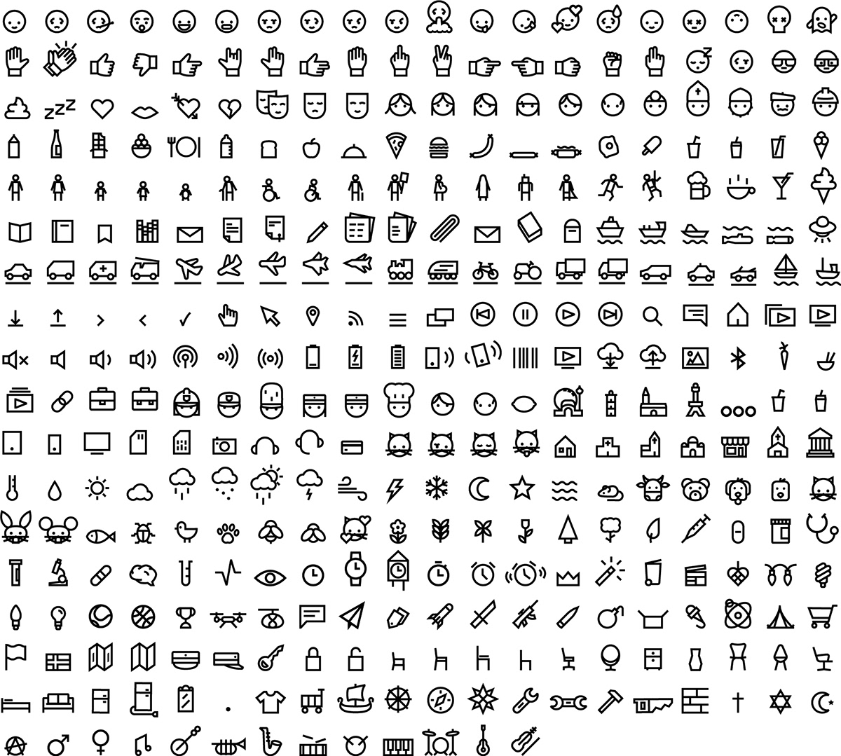
A key part of public service is to explain complicated matters in an easy way.
The icons' thick stroke and simple aesthetics makes them distinguishable and works well in all sizes on all platforms.
They can be used to make explainers, catchy swiss inspired poster design and infographics.
There are around 500 and they are publiched under the CC CY-SA 4.0 Creative Commons licence
and can all be downloaded from here.

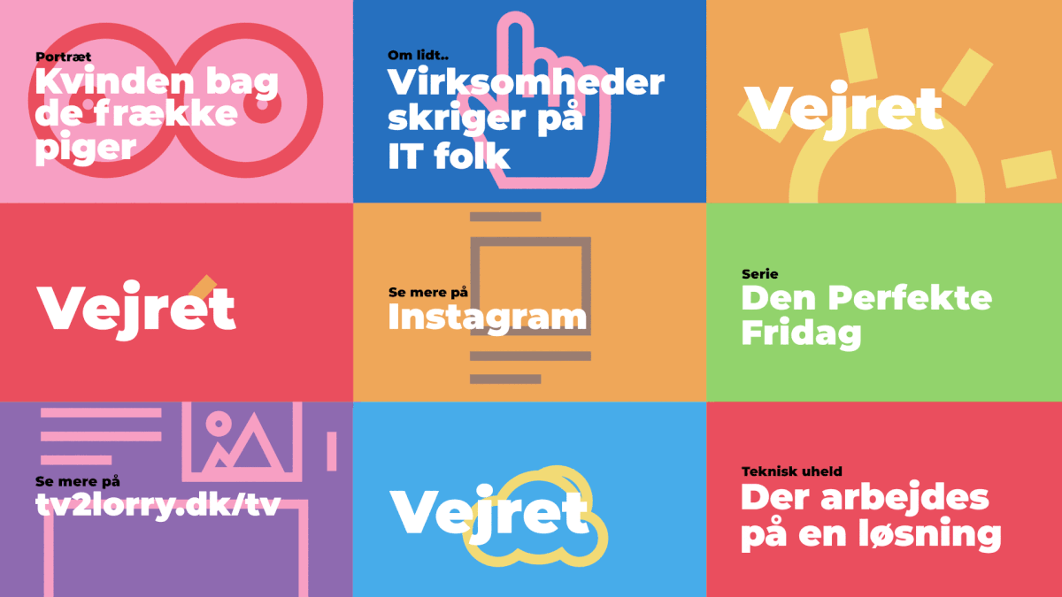
The pallette is broad. These colors are used in pairs, one primary and one secondary. The background color is the primary and will serve as the main color on lower thirds, info boxes and other tv elements through out the program. The text is always black and white.

Overall animation principle. Mainly based on public service keywords, such as readability and accessibility.
Simple and playful animations
Motion design by Jakob Lange and Frederik Krogh
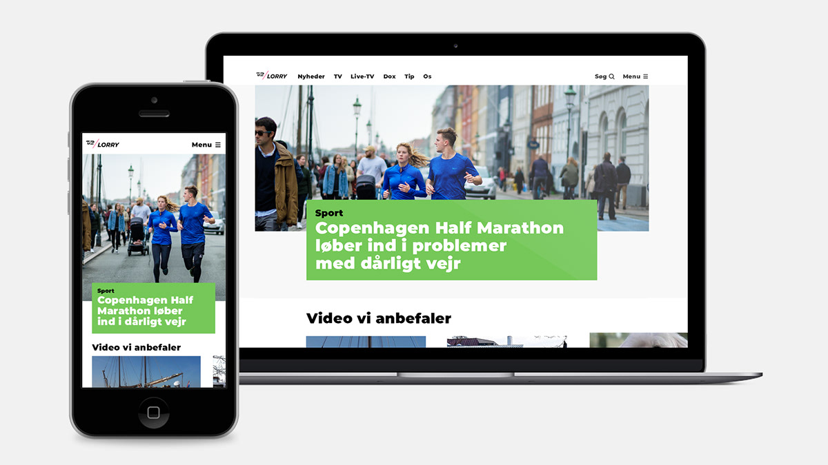
Website with single-colored boxes in a white space highlighting important content.
Web design by Mia Cassens and Frederik Krogh

Big type and simle aestetics are used to engage people with quizzes and information on SoMe platforms.
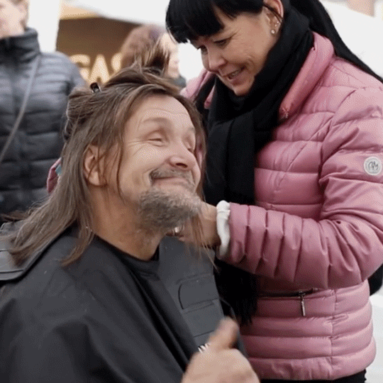
SoMe layout with animation
Instagram story layout

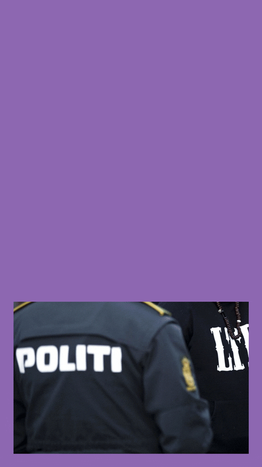
Breaker with cross platform reference

Breaker with cross platform reference

Fullscreen title sequence

Weather forecast title sequence
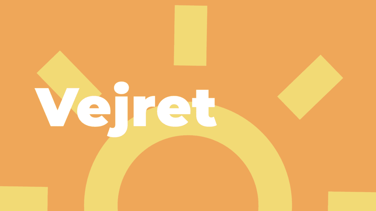
Weather forecast title sequence

Simple and functional lower third animation
Lower third
Lower third
Program title
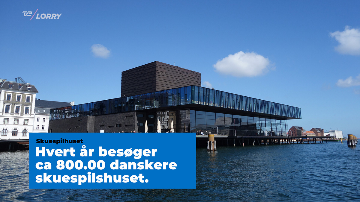
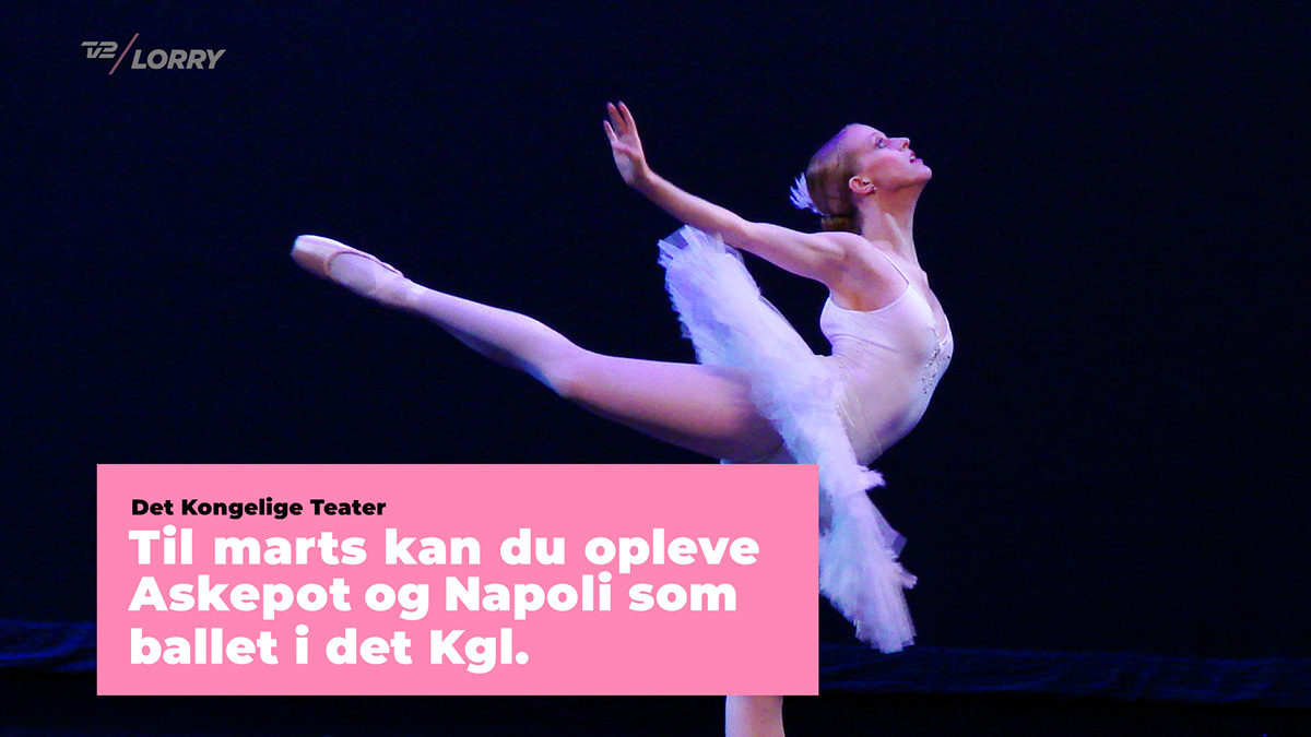
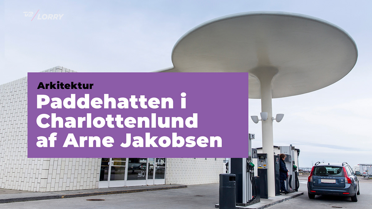
Explainer
Explainer
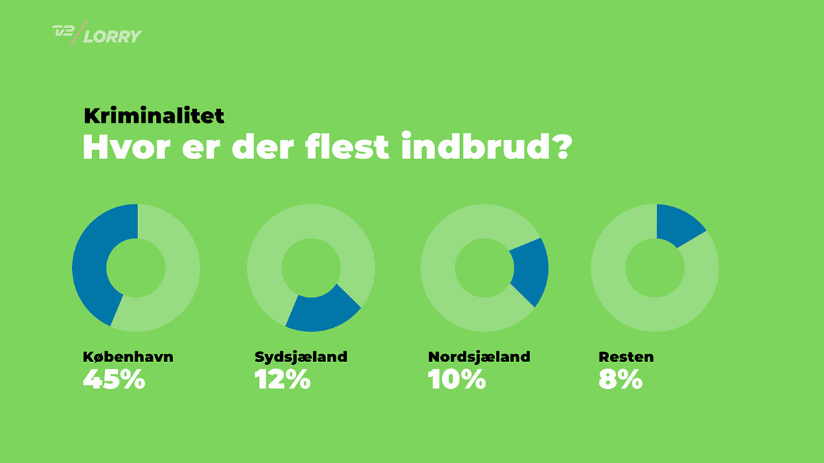
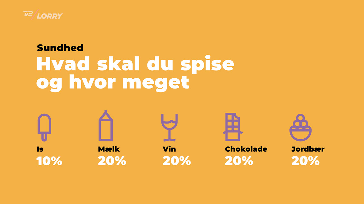
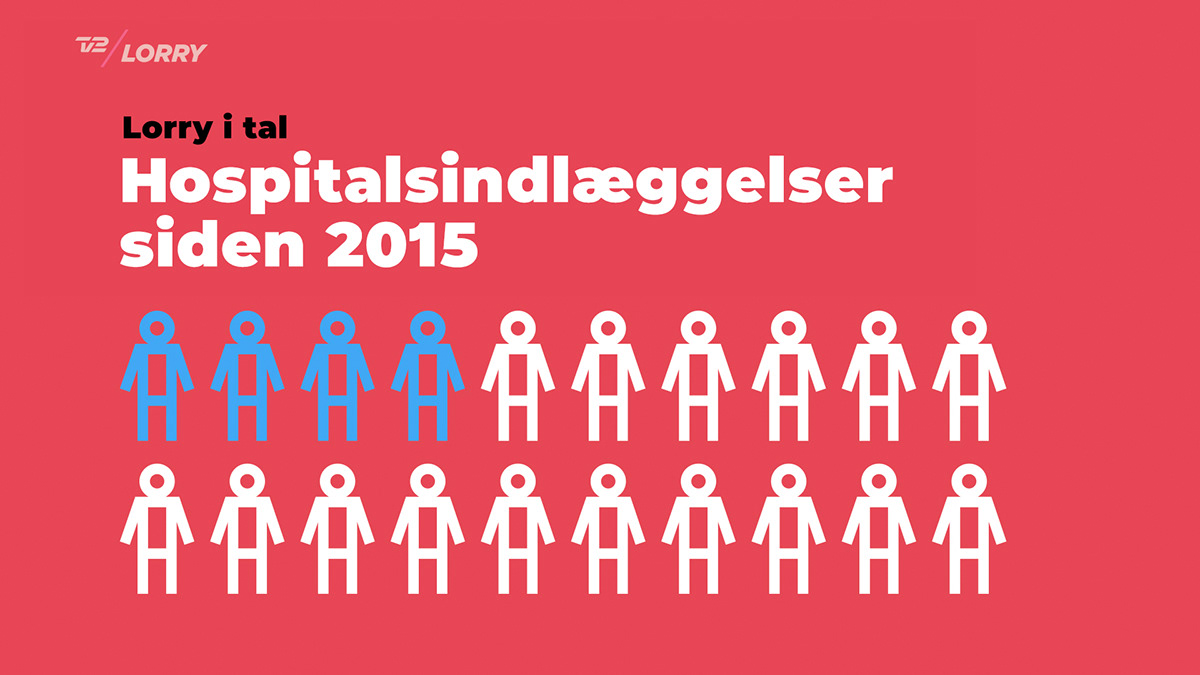
With only 2-colors, you need to split up data in bite-sized chucks. This process simplifies the data and makes it easier to understand.
In this layout a circle diagram is split up in 5.
Another example of infographics in 2-colors and how data can be split up to create a better overview.
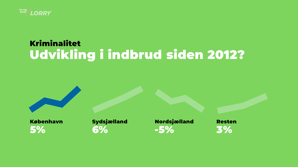
In this layout, each graph will be highlighted one by one with animation.
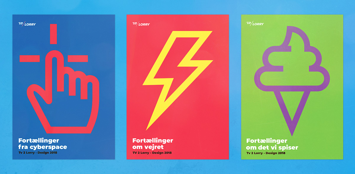
Posters created with icons from the icon package
Design system reel
Credits:
Overall design and art direction
Frederik krogh
Junior designers
Jakob Lange, Rasmus Gerner
Mia Cassens, Christophe Kolbeck


