

Logotype - The main reason behind the very loose spacing and kerning was a result of the creative process and the playfullness in the identity, and then it also bears a weak reference to the word "artspace".

The colors used in the visual identity. The rules for using these colors are not very strictly defined
The typography used in the visual identity is Lutz headline by lineto
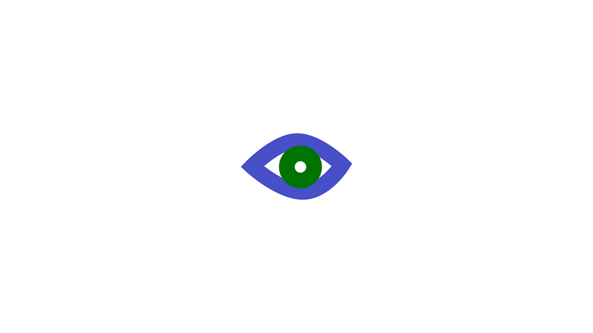
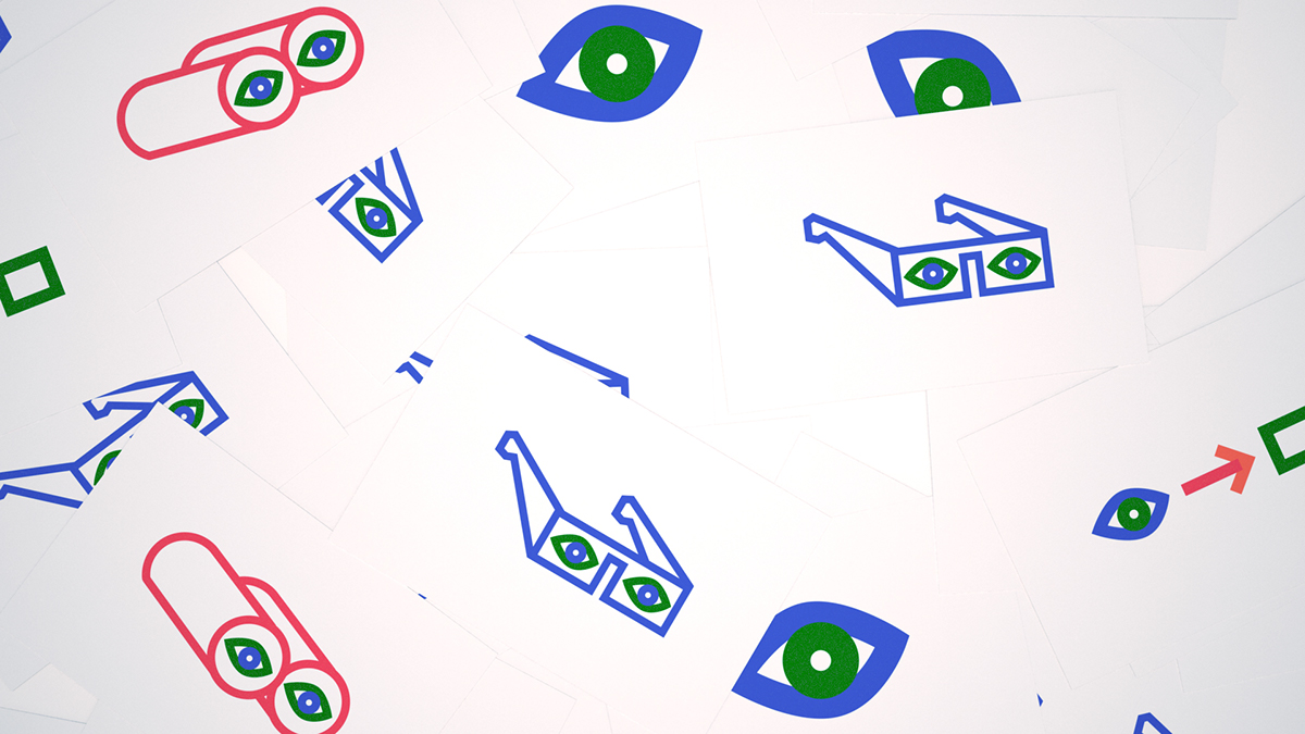
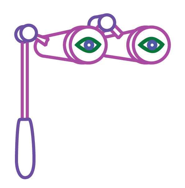
Main visual element. The eye and your sight is an important part of a gallery experience and it is therefore a essential part of illustrations and graphics.
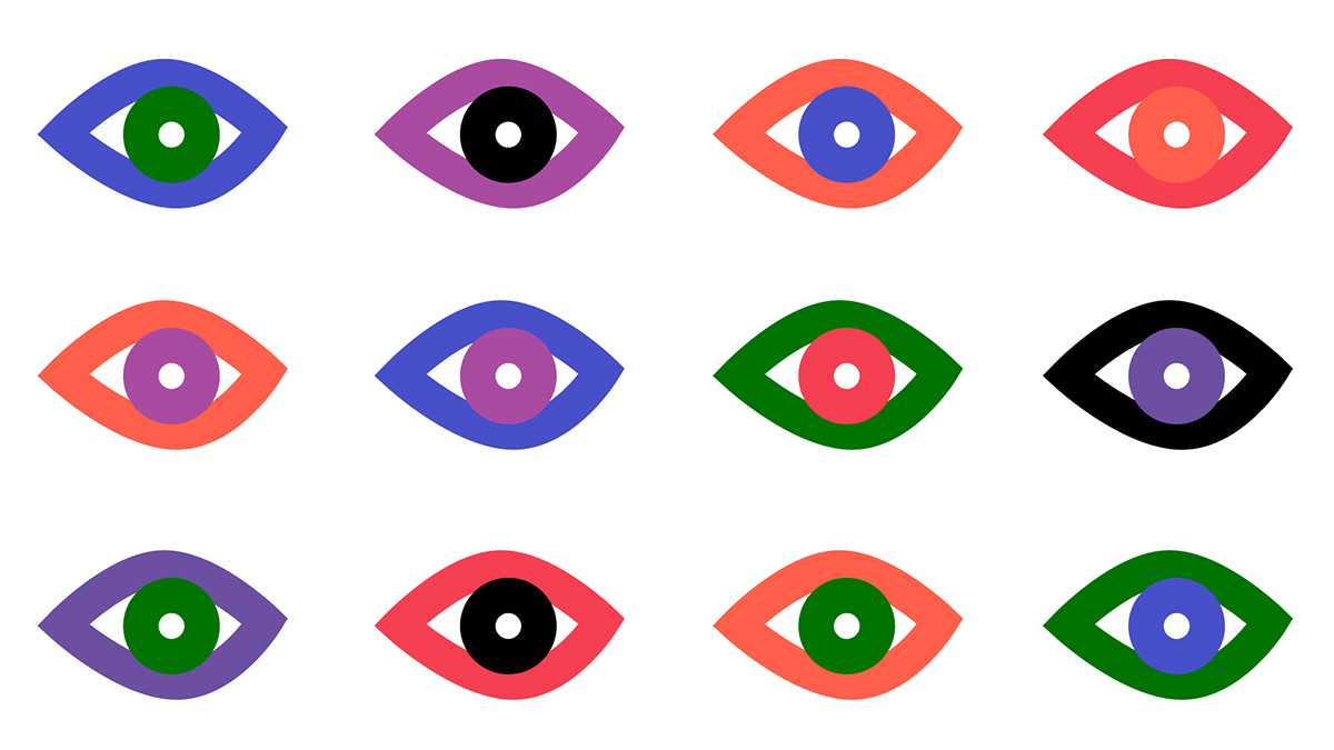
Different color combinations
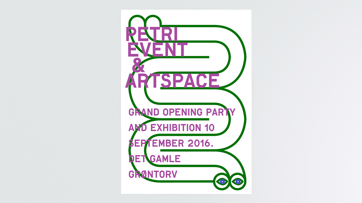
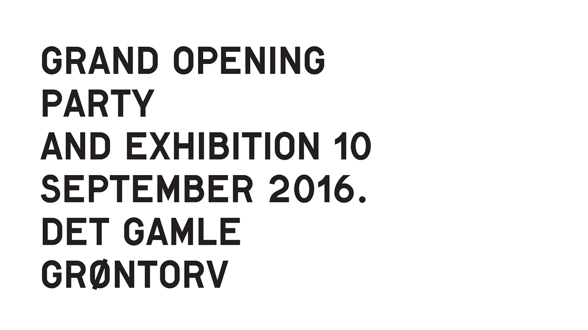
Event poster for a gallery opening
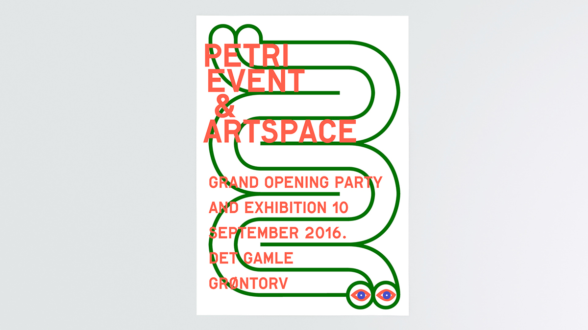
Event poster for a gallery opening
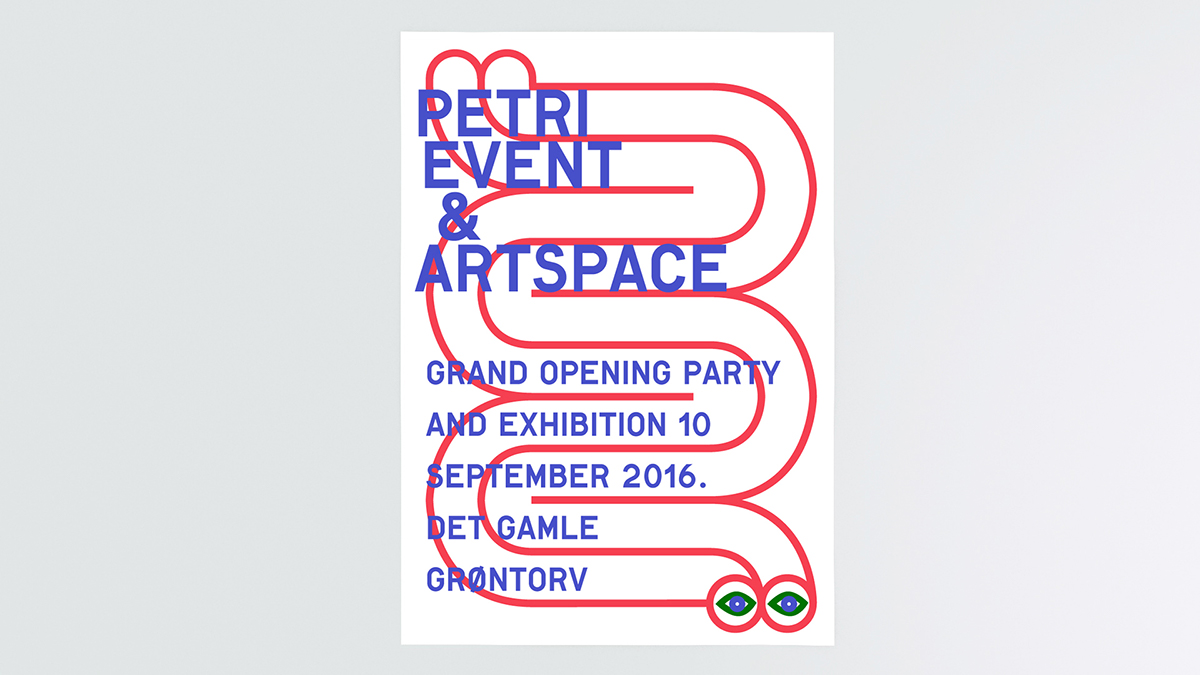
Event poster for a gallery opening
Business cards

Totebag
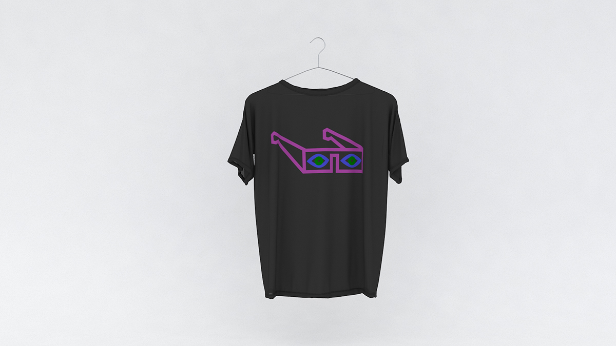
T-shirt

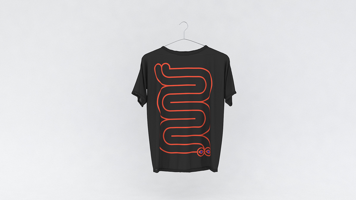
T-shirt
T-shirt
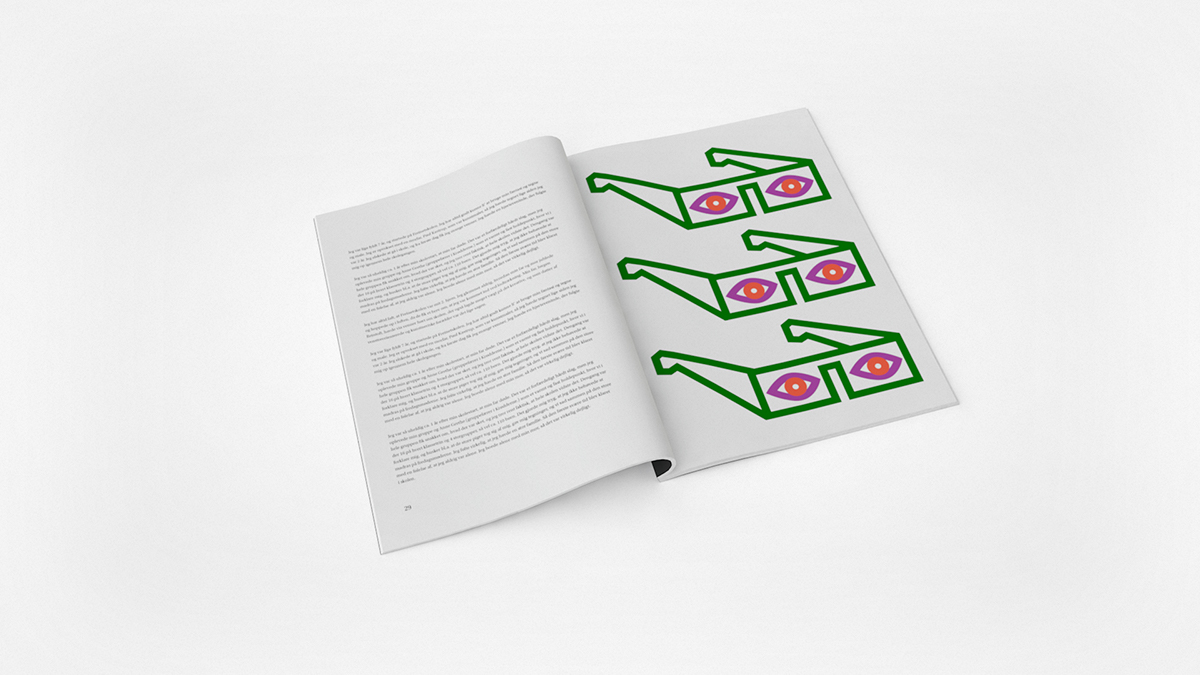
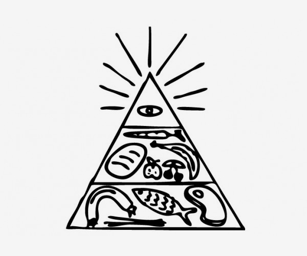
Illustration

Open sign
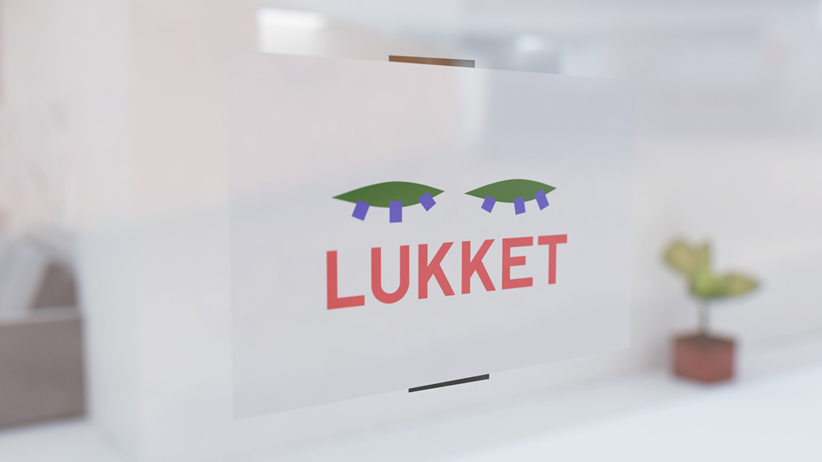
Closed sign

The illustrations are easily used in gif animations

The illustrations are easily used in gif animations

Illustration used for a cartoonists art exibition
Fine arts illustration

Avantgarde-ish art illustration

Big indoor sign
The eye was taken from this logo. Its an old logo i made for an event / popup restaurant / art project called "Resturang" by the same owner. The reason for reusing the eye was to create a visual link / hint to the old project.


