
For Color theory, we were asked to design two seperate packages for one chosen food item. One had to be a bargain brand, while the other was to be a high-end brand.

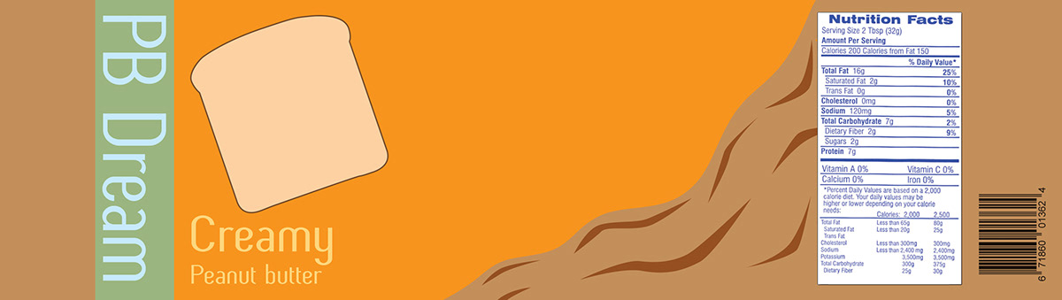
Bargain Brand

For the bargain brand, I chose to use a typical peanut butter container as the base. I chose to use a bright orange color to give the essence of inexpensive. The bright colors of the package were to grasp attention against other products on the shelf. I also decided to use a piece of bread with some parts cut out to simulate the peanut butter as it would be on the bread. This was used to bring more originality and attention to the product.
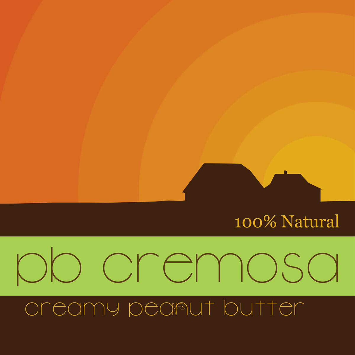
High-End Brand

High-End Brand In Context
Photography compliments of Alex Lafferty


