


A two page layout on career for fellow designers. The piece is about me, but more importantly about my work, and the relationship between the two. As an illustrator, I wanted to feature an illustration of myself (years ago) and to play off the worker-focused, heroic imagery and typography of the Russian Constructivist movement, and set it in my flat, simplified, and deeply textured style. I also wanted to feature those aspects of design most dear to me, illustration, type, layout, and historical reference.

Detail of the Illustrator file showing the deep and layered texture, the rough type, and simplified, flat illustration style.

A lighting study to explore the "heroic lighting angle" required for this powerful pose, typical of the historical style referenced. You may note the removal of at least fifteen years and twice as many pounds. The sledge hammer is a roll of holiday wrapping paper.
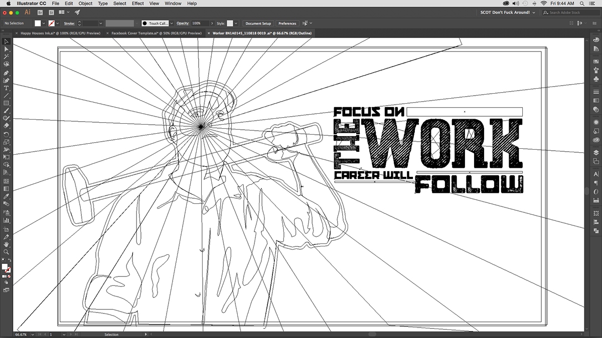
Most of the work is done in Illustrator. Creating, working, and reworking the illustration and the typography, as well as the spread layout, overall balance, colors and texture options amounts to almost all the work to be done.
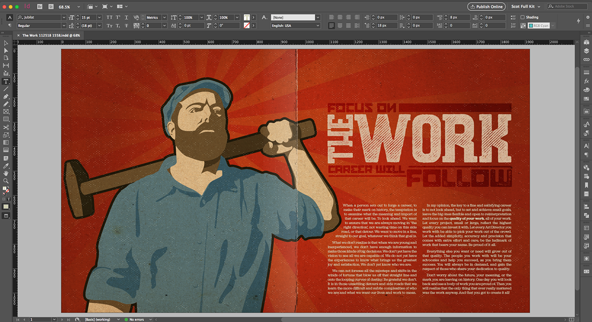
The final piece is to add the body text and working it down tight, which is the purview of InDesign.


