
Yessing is a new sports fashion brand founded by NetEase, a leader company in the Chinese Internet market listed on the Nasdaq index. In addition, it is a pioneer in the development of applications, services and other technologies in the digital context.
The challenge for Erretres was to create an apparel brand for an active target who combines the sports with their everyday activities. The brand should transmit the values of ingenuity, freshness, intelligence, amusement, and simplicity.
Erretres created a modern and contemporary image which affords the internationalization of the brand. The strategy team realized a strategic check-up of the client’s brand platform aiming to strengthen it and to create a concept which was ultimately based on the freedom of movement. This concept was the starting point for the development of the visual identity.
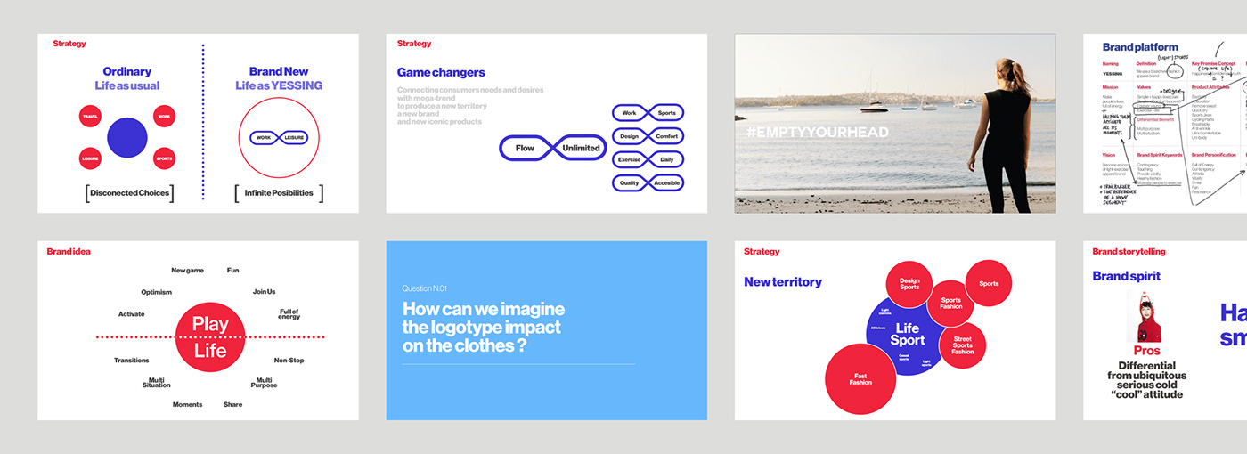

The visual identity – logotype, symbol, and graphic elements – for Yessing was created from the values of freedom of movement, dynamism, and flexibility.
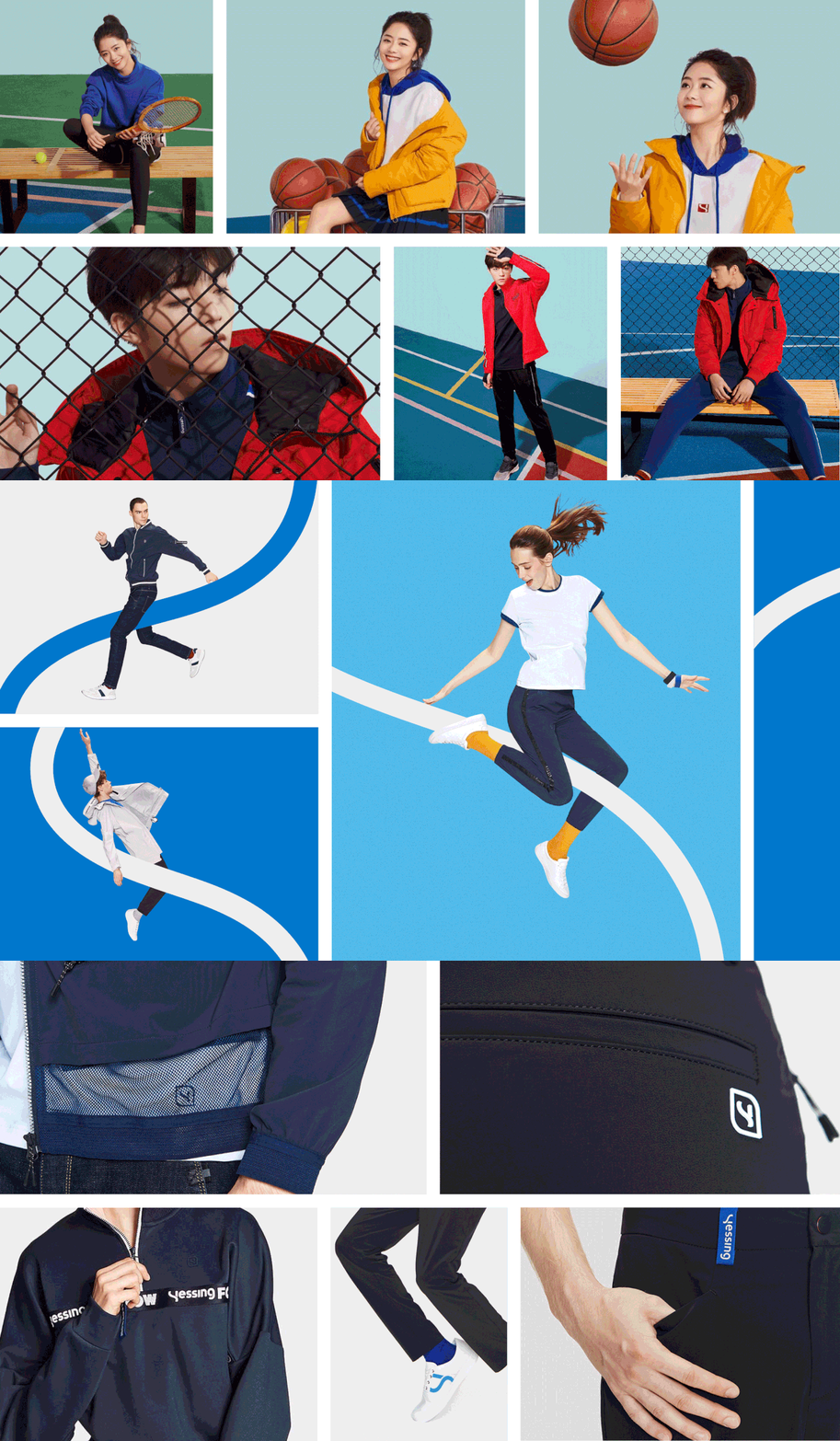
The design team built a design system which included the necessary elements for the brand implementation in diverse formats of corporate, commercial, and product communication. We selected the curve as the graphic element for the representation of the brand’s dynamism, also present on the logotype and the symbol.


We defined three diverse photographic styles: the brand’s, the communication campaigns and the product’s photographic style. The one for the brand was aspirational, as the representation of a lifestyle in which the sports, the activity, and the freshness are essential. For the communication, photographic style we established the guidelines for the studio and outdoors photo shootings with models in movement positions and color masses which could contain the seasonal communication campaign information. Lastly, for the e-commerce, we opted for the combination of pictures of the folded garments and the models in movement.

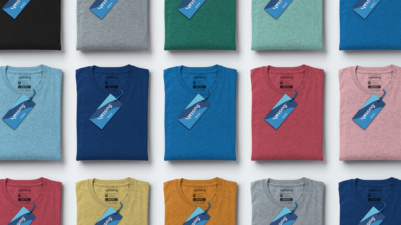
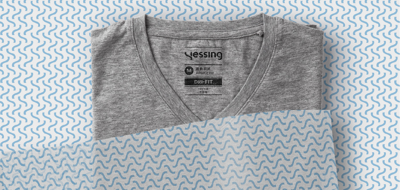
From the visual identity, we developed the applications for labeling and packaging, essential for a fashion brand. In addition, we defined the curve and the negative space as graphic elements of communication which would be applied to all types of contact points, both online and offline.


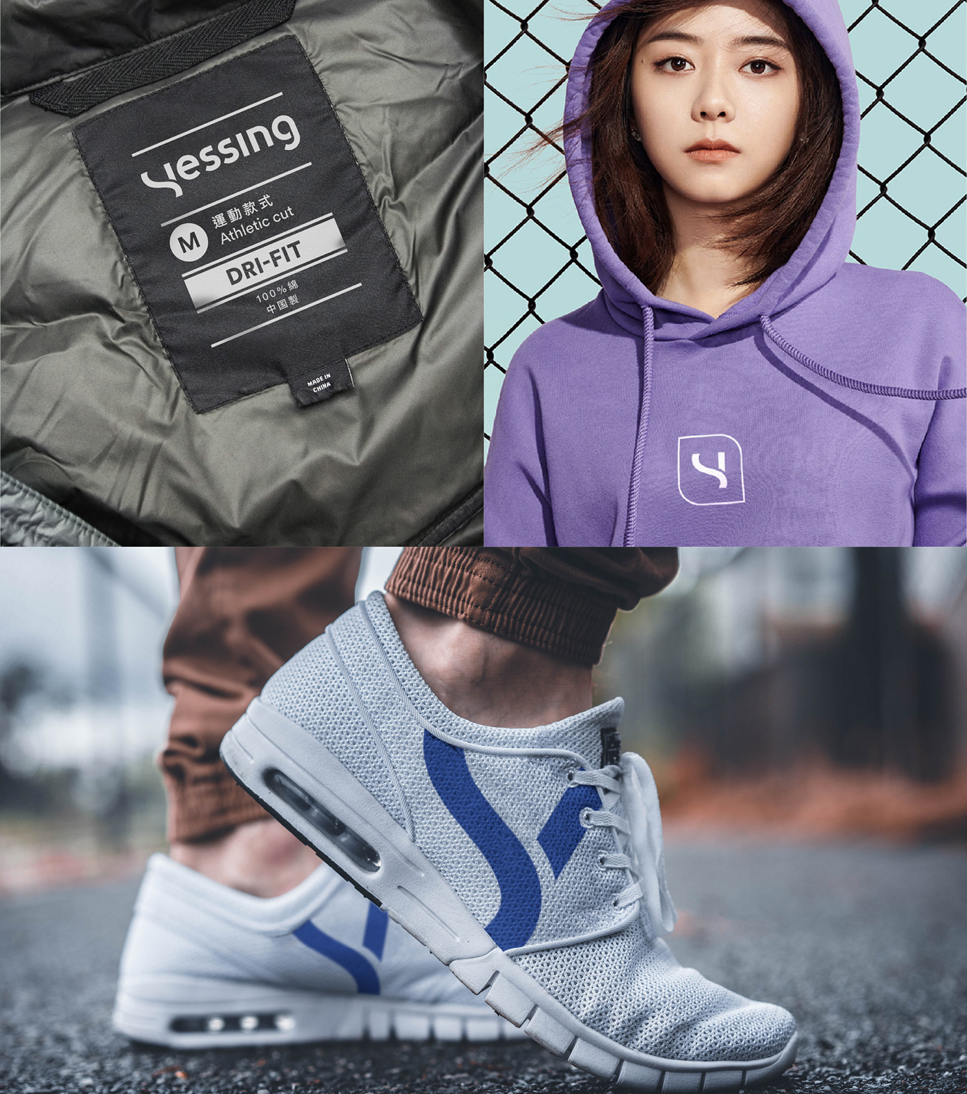

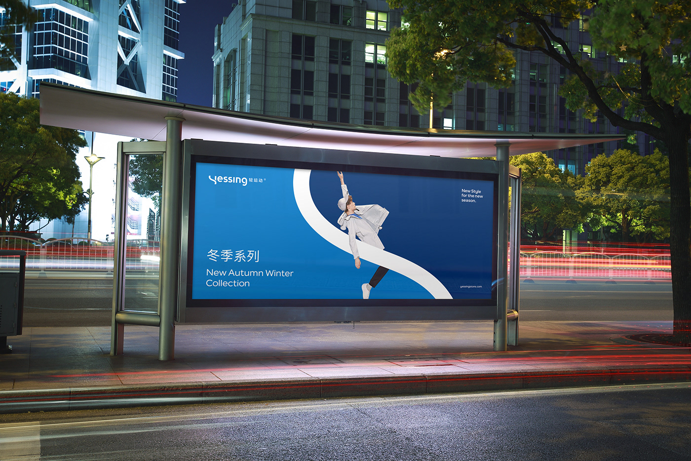
Yessing’s communication should transmit the values defined during the strategic phase, which were developed in the visual identity. The design system allowed us to combine the different elements – logotype, symbol, curves, negative spaces and photographies – on diverse contact points such as OOH advertising, digital advertising, corporate website, e-commerce, social media and digital media.


In the digital context, we established the guidelines for the look & feel of the corporate communication in two main contact points: the corporative website and the social media ecosystem. Yessing is a modern, international brand with a strong technological component given by NetEase. So, these two digital contact points are the basis for the brand’s relationship with its audiences.


