


Winner of the Packaging Impact Design Award 2018.


The Brand
Sucrerie is a manufactory including a café, which sells loving handmade Macarons.
Sucrerie creates a special culinary experience on the tongue by using traditional recipes and an extraordinary concept of regional and seasonal ingredients.
If you don’t have time to lounge in a velvet armchair and enjoy the Macarons in our café, it will be necessary to provide a special packaging to secure the transport to bring the flair of Sucrerie to other places.
Especially since the rise of e-commerce, which can be a chance for a small manufactory to attract more customers, the packaging must be able to impress and attract customers, and in the meantime guarantee a save transport to their homes.
In conclusion: the packaging needs an extraordinary unboxing experience!
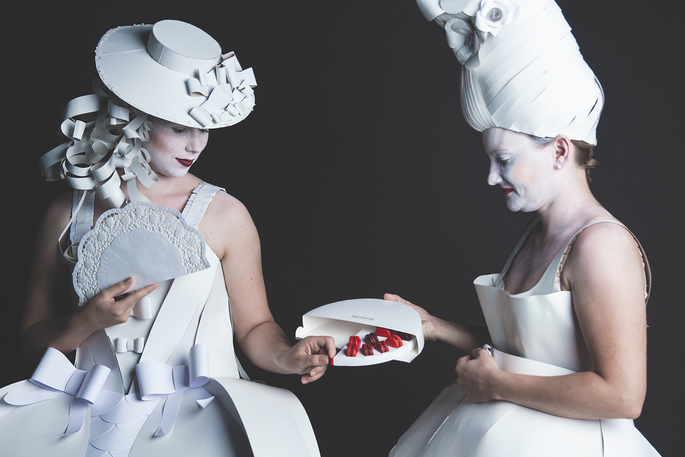
Packaging Design
Because of the packages’ construction, the consumer has to interact with the packaging and an efficient unboxing experience is created.
The semicircular packaging is supposed to remind the customer of a fan used by the French Mademoiselles from the Baroque era. Its exceptional packaging design differentiates in such a specific and impressing manner that it leaves a long-lasting memory on customers. To open the packaging just pull the red satin loop, which is connected to the plug-in tongue. Therefore the packaging can be opened and closed as often as you like.
The packaging contains an inlay, which is connected to the outer packaging and allows you to unscrew the inlay. The recesses in the inlay allow fixing the Macarons and prevent them from being damaged during transport.
As a suitable packaging material we chose BillerudKorsnäs White 270 g/m2 white carton board. The great strength allows an unrivalled depth of embossing, which comes with high-quality results without the risk of cracks.
Moreover the high-end whiteness and the great surface smoothness are further quality features of the carton board.
These characteristics are of particular importance because the packaging contains large areal blind embossing on the front side and prints only on the bottom side except the printed logo ‘Sucrerie’ on the front side.


Graphical Design
One of the special features of the packaging is the blind embossing.
The graphic design of the packaging is not a colourful print image but rather an embossing pattern, which forms an ornamental pattern on the packaging’s front side.
The design was inspired by the Baroque era and interprets this inspiration in a modern way.
In French, Sucrerie means sugar factory.
As Macarons are part of French confectionery, it is a suitable name for a manufactory.
The word logo Sucrerie in an Antiqua Font and is called Walbaum MT STD in italics.
The font harmonizes with the pattern and completes the simple elegance of the packaging design. The chosen design should give the customer the feeling of being part of something special and exclusive.
By dissociate from overly colourful printed packaging, the Sucrerie packaging sets itself a statement, apart from the colourful diversity of its competitors, by using minimalistic, simple and elegant white colour. The eye-catching design is also sustainable in ecological terms.


Motivation of the jury:
"The combination of design, unexpected functionality such as turntables, overall concept development and comprehensive execution convinced the jury strongly on all counts. The idea of a premium product presentation was translated into an innovative, purposeful packaging solution with an unconventional design and a positive unboxing experience – and thereby created a feasible product package with a high market potential."


