
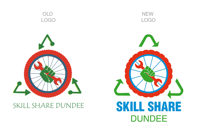
I remaded the Skill Share old logo. I have changed lots of things, but keeping the structure and appearance of the original one. The new colours are more vibrant and pure, the wheel and the hand has been simplified and the arrows are clockwise and rounded. The new font is simpler, thicker and bigger. Can you see the differences?

The logo is the most recognizable image of the organization that transmits the idea that we want our audience to receive. The old Trellis logo it’s very monotonous and old fashioned. It uses quite dull colors that don’t transmit the main idea of Trellis, it seems a little sad instead of positive. The logo’s typography it’s too thick. The icon of the logo is very irregular, and the plant with the shading is hard to see, because the colors are too similar.
The old logo has been reviewed, maintaining the original idea and the main elements that form it but changing the aspects that have been explained above. The new colors are more vibrant, pure and fresh. The new typography is more simple, modern and clear.


