Challenge
As a UI Designer for Ogment, a curriculum builder web app for grade schools, I lead the process of creating a design system and pattern library for our product. Ogment didn’t have a document of visual standards for elements like colors, navigation, buttons or a location for that information to be shared with the designers and developers to utilize. Having a style guide would help us fix inconsistencies throughout the product and foster a sense of unity across our team.

Approach
Scope
A collective meeting with members of design, engineering and management teams allowed us to determined a manageable approach would be to redesign key components of the app over a period of sprints, rather than take on the product as a whole. Our key components included buttons, text-fields, page navigation and modals.
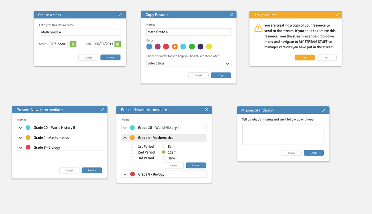
Component Audit
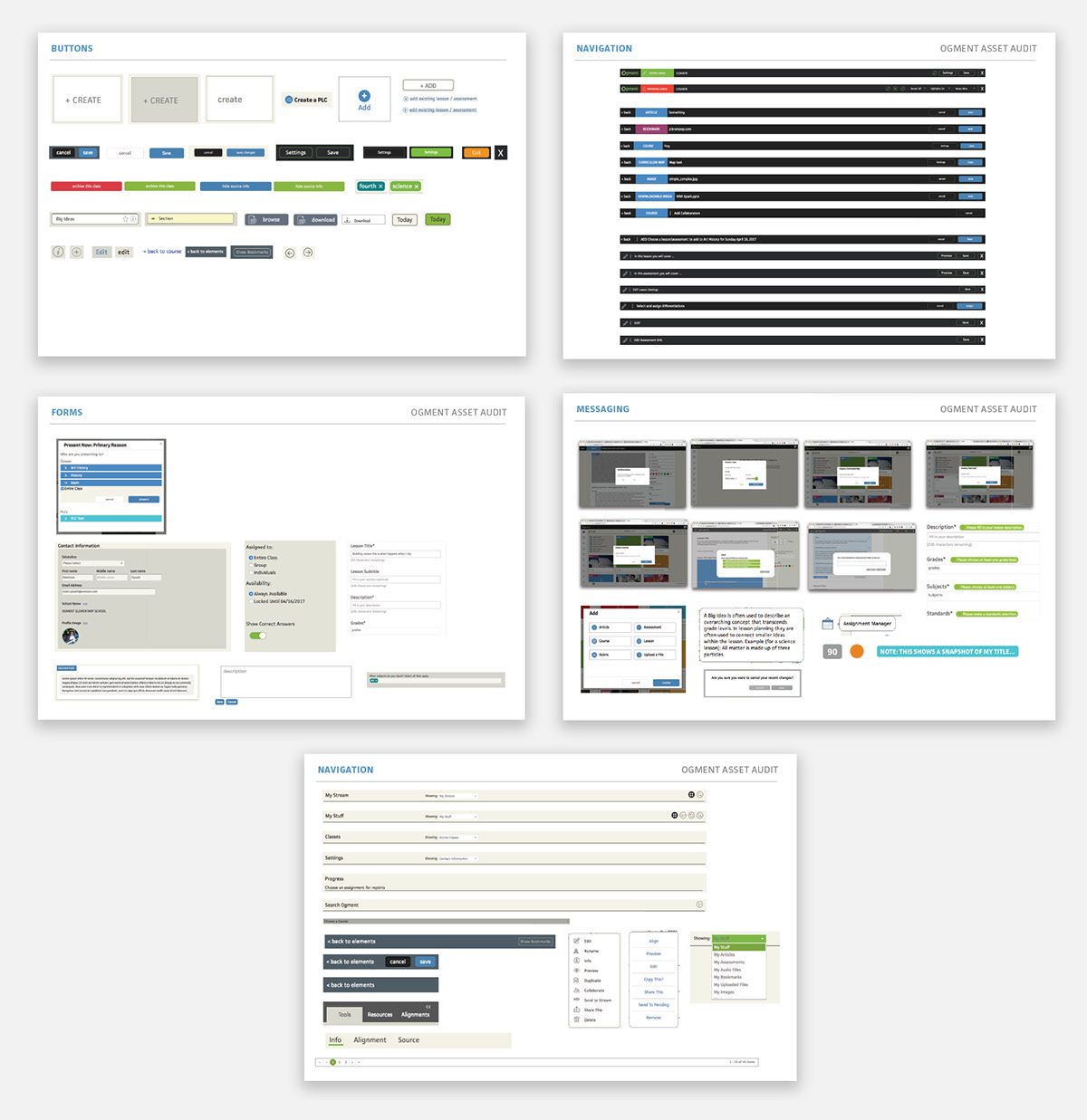
Myself and our Creative Director undertook a design audit by meticulously walking through Ogment, taking screen shots, and collaging the common components on a page together. This allowed us to see the amount of variations of each component we had lead to a discussion of what worked and what didn’t.
Design
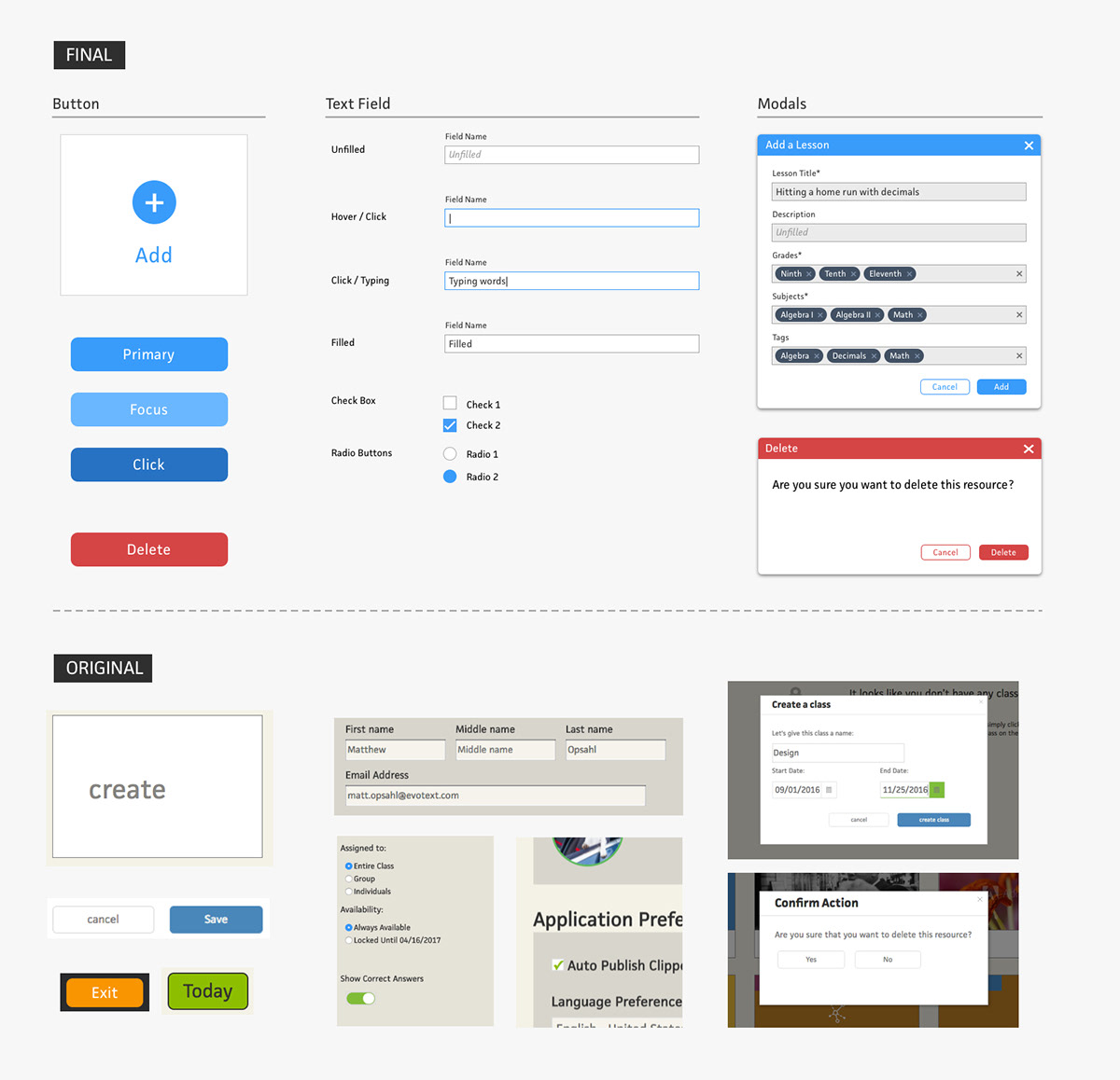
Visually, the components felt basic, and could better represent Ogment values of an engaging, empowering curriculum builder. We needed a more lively and approachable color palette. Functionally, modals and buttons need visual queues to inform the user of their specific actions. Additionally, we ran an accessibility test of text fields and buttons, revealing more contrast would be needed for visually impaired.
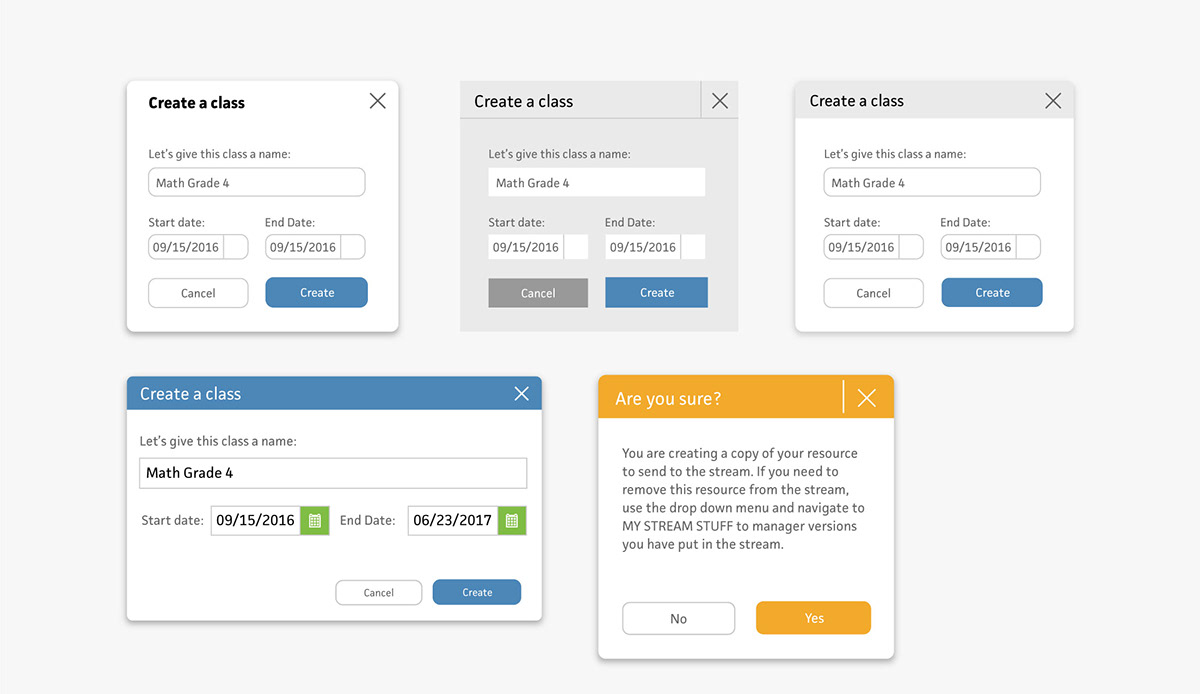
We determined modals would be a smart component to start with because they include multiple elements that make up the DNA of a product; buttons, forms, typography and text fields.
Engineering
Once we had solid styles, we shared with engineering our proposed designs, how we organized our new system, and compared that to the existing CSS sheets that controlled those elements. We wanted to simplify the style sheets, every element was linked to one of these new styles going forward.
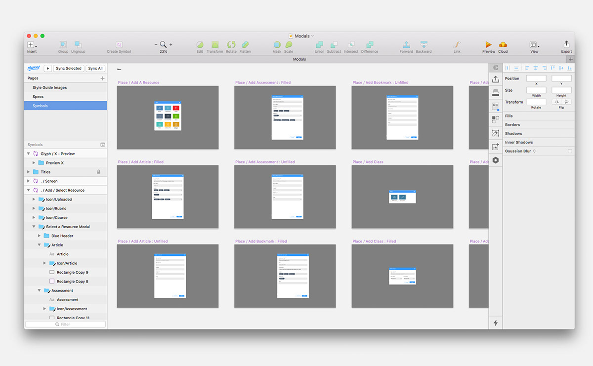
Scale
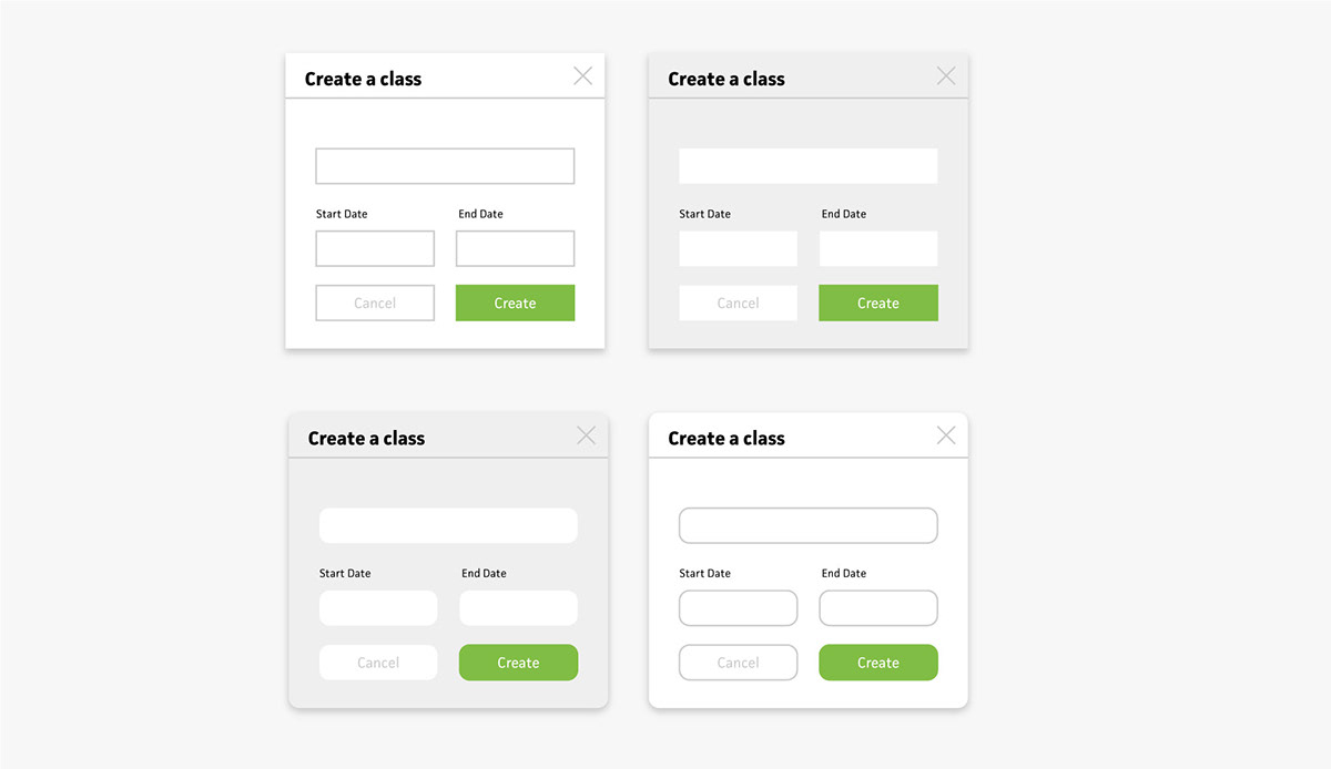
I built the master files for each component type in Sketch. The documents included symbols to use in projecting going forward and spec sheets for each unique component.


Style Guide Site: Documenting both usage and style
I also lead the experience and design of our new style guide site. I researched other products who had public facing style guide sites to get a sense of different approaches. Some products took a technical approach by showing colors and sizes of their components, while other products went more indepth with usage and placement standards alongside the technical specs. The later approach more often than not paired with a cohesive product. We felt it was important for Ogment to be exceptional as well.
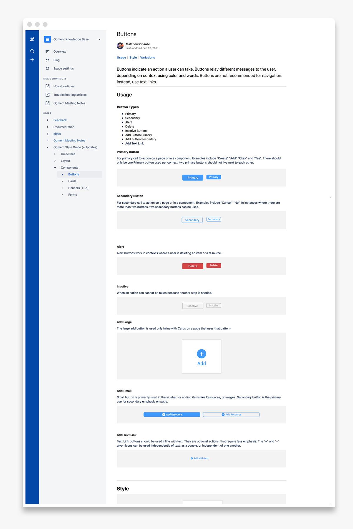
Sample; Buttons style page
Result
Setting design standards for Ogment’s key components not only made the product look better, but also provided a guide to help make design decisions going forward.


