
The Challenge
EvoText is a successful "ed-tech" product design agency who has historically gained clients by word-of-mouth reputation. However, EvoTexts' portfolio site was not helping to drive hopeful clients to contact the agency for a bid. We needed to determine the pain-points of our web inside in order define our goals to make a more effective experience.
My Role
As a UI Designer at EvoText, I lead the process of working with our leadership and marketing team to re-design our existing portfolio site.
Approach
A kick-off meeting with our CEO and marketing team allowed us to evaluate the existing site and create a list of pain-points to resolve:
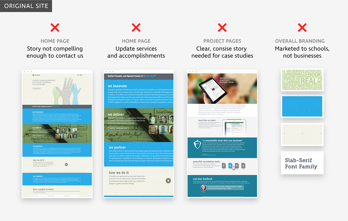
We determined the highest priority was to showcase services and accomplishments on the home page culminating in a call-to-action, and establish a consistent approach for showcasing several new projects.
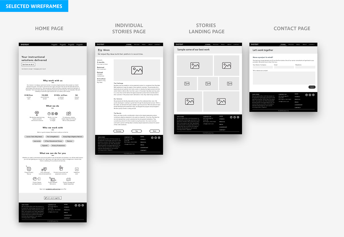
Wireframes: Home page
I selected the home page as the ideal starting-point for the project for two reasons: 1) It contained a primary pain-point that needs to be solved and 2) The page includes common building blocks of the site so a consistent layout and approach can be established from the beginning.

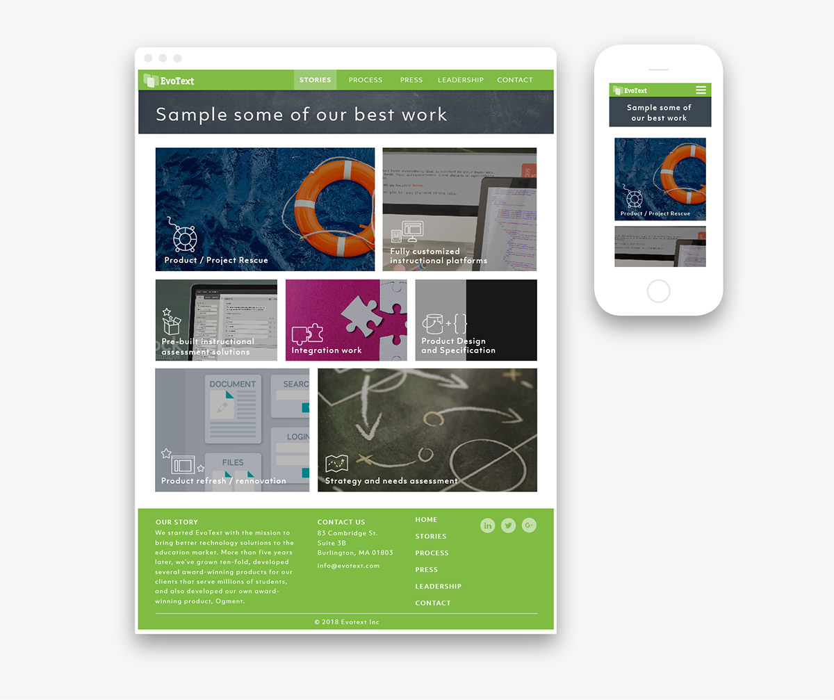
The goal of the home page was to showcase our accomplishments and services. I created several options that stacked information in blocks, including awards, services, clients with a bold "Contact us" at the bottom.

We selected a graphic approach to the home page because it made the highest impact and was easy to read. Rather than using "color bars" that divided each section, we kept white space throughout for a continuous story.

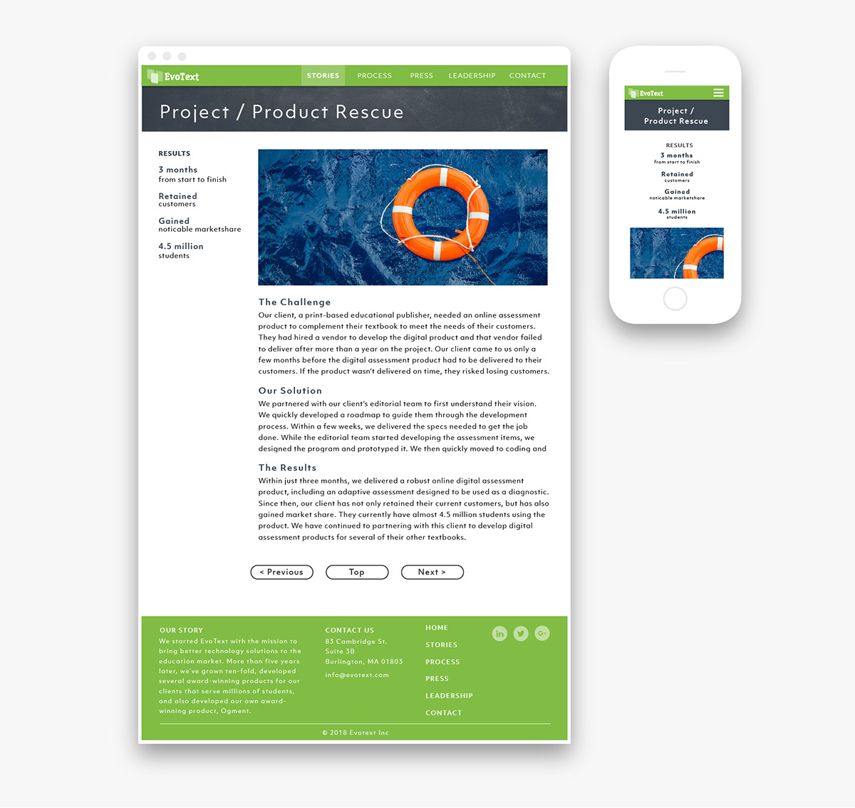
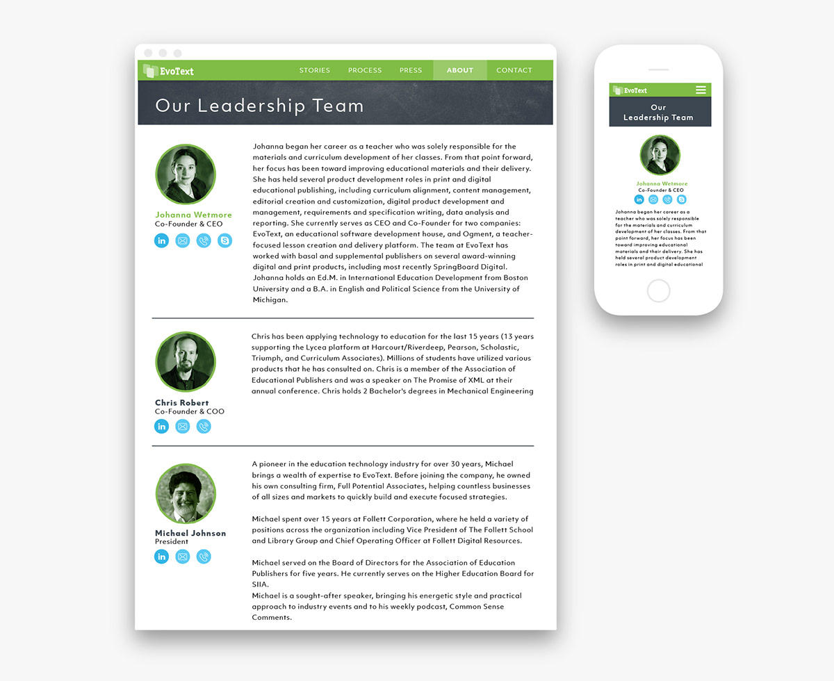
Wireframes: Project Pages
Now that we established a story and format for key elements like headers, footers, layout and fonts provided guidance for the interior pages. we moved on to "case studies".
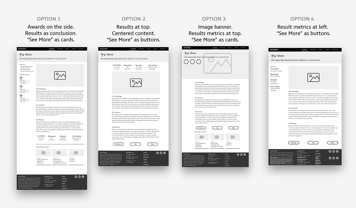
We selected the option that had results in the sidebar because it showed more information at a glance and required minimal scrolling.

Now that we had picked a system for showcasing our case studies, we created wireframes for the remaining pages so we could move on to look & feel.
Look & Feel
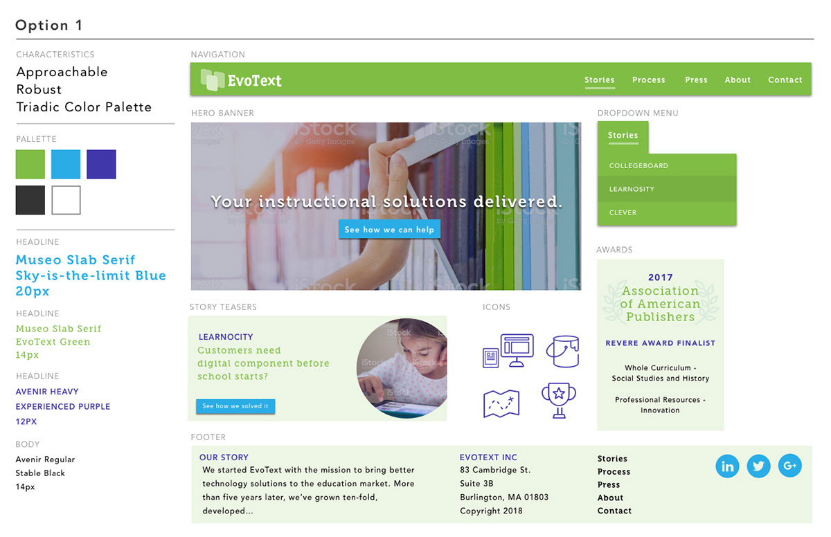
I presented two style options: one geared towards students - playful and colorful, the other geared towards business people - professional and minimalist.
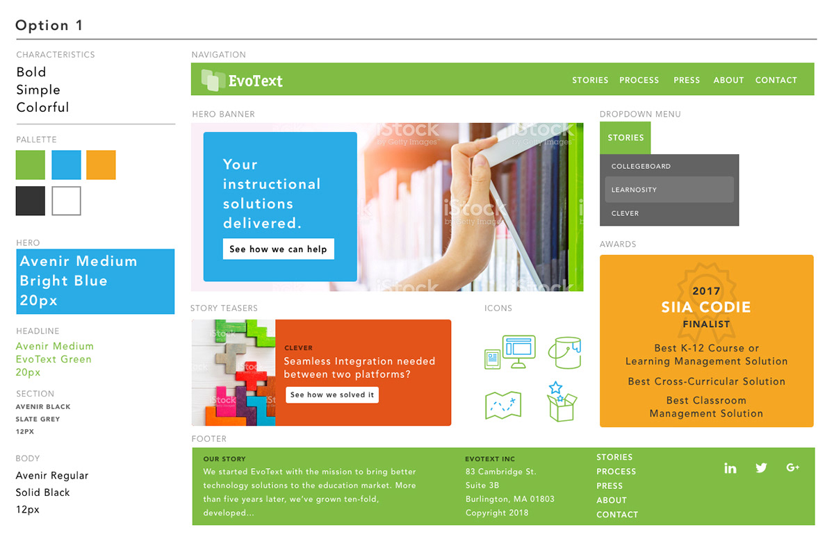
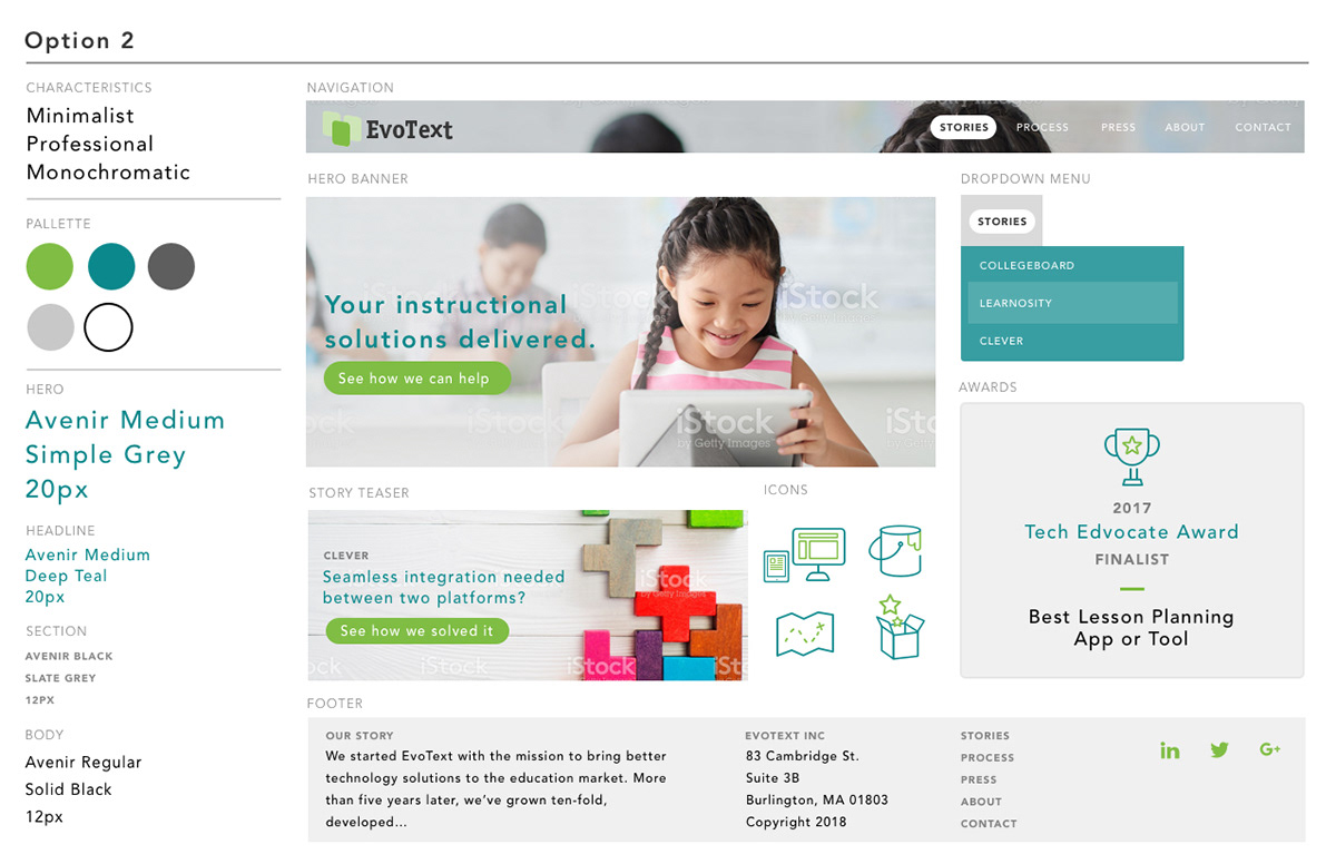
We determined that while EvoText has qualities of both options, we needed a third option that felt like a mix of the two. The third option ended up being selected.
Final Designs
Our final design focused on our brand colors, green, chalkboard black and clean white. We changed our typography from the youthful slab serif to a clean san serif for a simple and professional feel.
The hero banner with a chalkboard sketch representing our solution based approach communicated our job while tying our services to schools.


Result
The EvoText dot com is now live. Our CEO and marketing team feels even more confident in promoting our services with a site that provides a fresh starting point in gaining new clients.


