
Label design for New Zealand craft wine VANDAL /2016/

Behind the story
Three kiwi winemakers have decided to collaborate and make the “side project” together. It involves making wines that are less conventional in style, therefore, they were looked for less conventional branding but also free of gimmicks and has longevity. The wines made in very small quantities and targeted at fine wine retail outlets and fine dining restaurants for experienced wine consumers looking for something special. In crude terms these are “craft wines” that are a bit more challenging to taste but infinitely more interesting.
“We strive to make a tasty beverage that is an enjoyable drinking experience. It's ok if people don’t like these wines because they are a bit challenging or unusual but consumers shouldn’t have to “try” and like them. Aiming for a ”that’s different, but I like it!” reaction.
Another point to note, two of the winemakers have active conflicts of interest as they currently work for large corporate wine producers. Because of this, they are not permitted to disclose their identities or actively have any association with this brand in the market place as this breeches their (dis)respective contracts. Winemakers wear masks to conceal their identities in any promotional material, so this is also a potential tangent to exploit within the branding/labels.
Name
Historically vandal tribes were displaced from eastern Europe and forged their place in history by going against the grain or the Roman Empire… Described as a uniquely destructive people, the term Vandalism was born from their actions in history. Modern Vandal imagery is associated with graffiti which also gave us some inspiration from. Vandal as a word sits in line with the product ethos: unconventional, against the status-quo, anti-establishment.
Searching ideas

Client:
— We would like to flesh out concepts 4 and 8. We have actually got another idea that would like to throw in the mix. We really like the images associated with Hunter S Thompson the Gonzo journalist of Fear and Loathing Leaving Las Vegas fame (in fact we were very close to calling our brand Gonzo Wine Co but we are running with Vandal which we are all happy with).


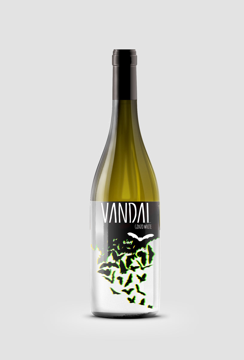
After trying different colour options and compositions have decided to continue just with bats. Have received the requirements from the printer: paper label, front 110 mm across and 90 mm high, back FYI 90 by 80 mm.
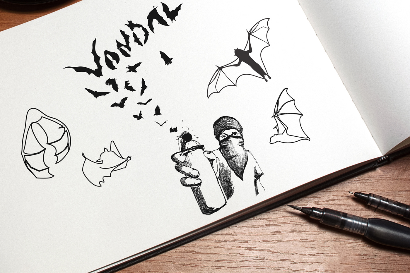
Finally we had one thing that combined all previous concepts together — rebellion. But it was not bright riot show, mostly it was a revolt of a secret society — invisible at first sight, dark and mysterious. On the first drafts I based on the image of graffiti artist who releases bats from spray paint can. But as we wanted to strive minimal style and bring more mystery to the label in final we decided to focus on bats only.
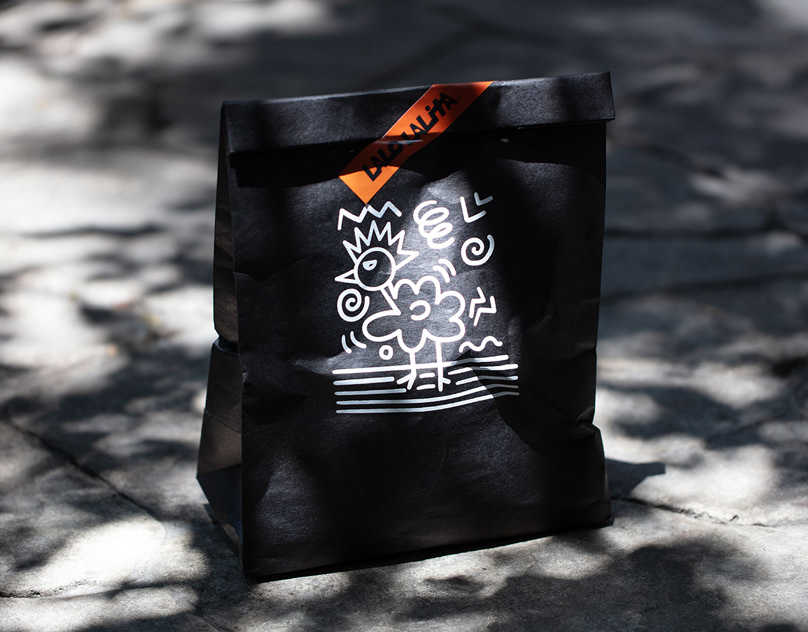
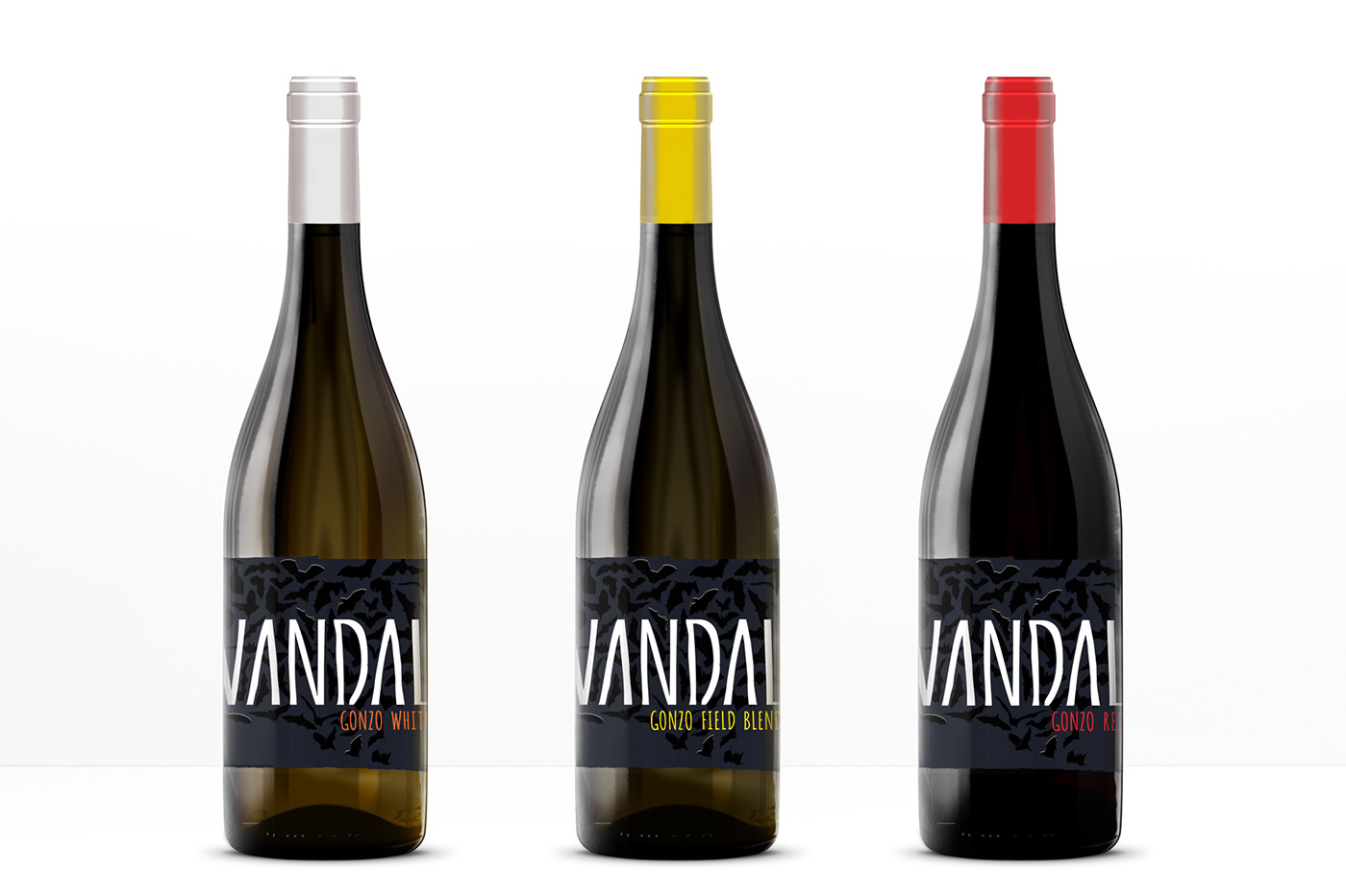
Here I gained invaluable insight — to reflect the real nature of covert resistance, I had to play with textures by using black on black. So while the bottle is on the shelf, you see a very simple label with just the brand name, nothing else. But when you take the bottle in your hands, you'll be surprised to discover the bats — the same way you'll be surprised by the unusual taste of this wine. Unlike bottles meant for shop shelves, these bottles were designed for close contact in wine boutiques and restaurants. So, this trick of not grabbing attention from a distance but flourishing in the hands should work well. At the end I used mate black paper (Pantone 532C) and deep black ink (CMYK 50/50/50/100) with selective highlighting of UV varnish.
The final concept

Real product photos

photo by @procurewinenz

photo by FIL D'OR フィルドール restaurant
Check in real: instagram.com/vandalwineco


