


What is LifeWorks?
Trusted by over 15 million people and 50,000 companies, LifeWorks is a rewarded employee well-being platform that helps employees feel loved by supporting, connecting, recognising, rewarding and guiding them on their well-being journey. The platform, available on iOS, Android and Web focuses on transforming total well-being across employee assistance (EAP), rewards & recognition, HR communications, perks & savings, and wellness. Motivated, engaged and productive employees deliver immediate and better results.
LifeWorks has been acquired by Morneau Shepell on July 27th, 2018.

What we did
Before starting the rebranding project, we decided that we needed to keep the logo as close as possible to the original while giving it a new and fresh look. We then started the process of rethinking LifeWorks, refining it with new elements of branding; a brand new colour palette associated with a new font and a new brand element: the line.
How we did it
I worked closely with other members of the design team and an HR Tech Analyst and Advisor to redefine LifeWorks branding position according to the company's core values (focused, accountable, transparent, caring and driven by customer success). We first started a research phase around LifeWorks strengths and weaknesses, the competitors and inspiring existing brands. Then started the mood boarding phase, based on 2 voice archetypes: The Magician and The Caregiver.

The Magician
As the magician archetype, LifeWorks is seen as a brand that will leave a mark on the world through a voice that is transformational, imaginative, and empowering. The magician aims to understand the fundamental laws of the universe, he wants to make dreams come true and create something special. His strategy is to develop a vision, help people transform their world, inspiring change and expanding consciousness.


The Caregiver
As the caregiver archetype, LifeWorks is seen as a brand that will leave a mark on the world through a voice that is caring, supportive, nurturing and thoughtful. The caregiver protects and cares for others, he wants to help others through service. His strategy is to help others feel loved, cherished and safe.


Creative directions
From these mood boards we defined 2 mains directions to go with: The Guide and Break Through to a Better You.
Break Through to a Better You


(Above) Personal work.


(Above) Work of my teammates.
The Guide


(Above) Personal work.


(Above) Work of my teammates.
We decided to keep the Guide. Put in words, the guide is the hands that help you getting through a better place. The line we use across marketing, communications and UI designs symbolises this guide. It is always here to take you to the answers you need. The line transforms into main icons that represents our core values and services.


(Above) Examples on how to use the line on print.


(Above) Examples on how to use the line in communications or marketing documents.

(Above) Example of business card.
The Font
We chose Averta as our main font. Coming with a lot of weights, it gives us freedom to build our designs with a clear hierarchy. It supports most of the European languages, helping LifeWorks by Morneau Shepell to communicate to its clients across the globe.

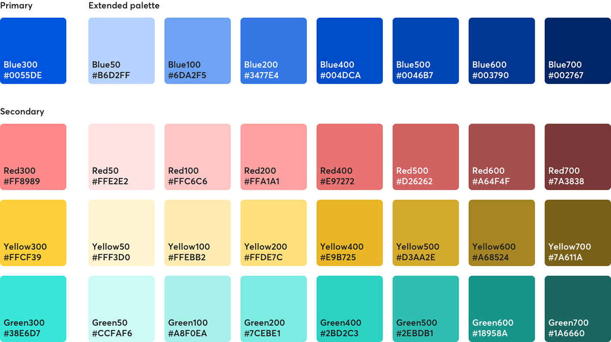
The colours
LifeWorks palette consists on a primary brand colour and 3 secondary colours. They all come in different shades as pictured below.
Photography
We worked with Caroline True to take photographies that represented our vision and values.


Thank you for watching!


