
The logo
Our friends from Free Sofia Tour started a great initiative and we were happy to assist with the core branding – the logo design. Basically – it’s a guide walk for tourists in the city, organized on regular basis for free by enthusiasts. From design perspective – the hard part was to organize the 3 words in a proper way so they can look cool, but readable , too. Since the 3 words are taking a lot of space and there’s none for any outside-standing classic mark – we put the mark inside. This way everything stays clean and smart. The “step” also points to the notice “free” in case you’ve missed it somehow. The second idea within the logo is that the letters F, I and U are kind of forming another step in progress… The font is casual and non-obligatory – just like the concept of the city initiative itself.

The logo in negative is even more beautiful. Maybe you’ve noticed already – our team loves green. It represents so many things, it’s so fresh and such a good alternative to the red as a signal color in city environment that we just can’t stop using it.

The square-ish proportion guarantees that the logo will fit in the most common logo spaces. Especially in the online social space ( like facebook ), where the square avatar fields are dominating.

Some design developments of this exact logo proposal.
The branding
After providing the logo design for Free Sofia Tour we worked on creating business card and flyer designs, as well as the web design of the organisation.
The business card is 3 color digital print on 300 g matte paper, 30 mic matte laminate finish.
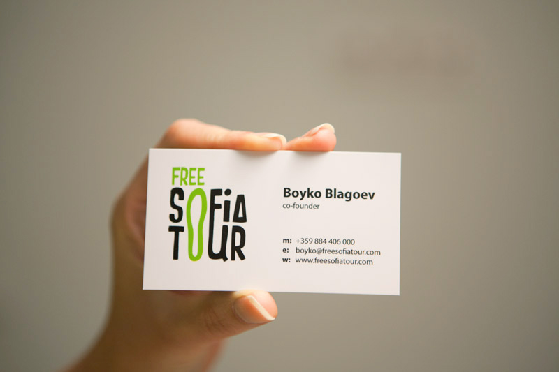
White background ensures good text readability.
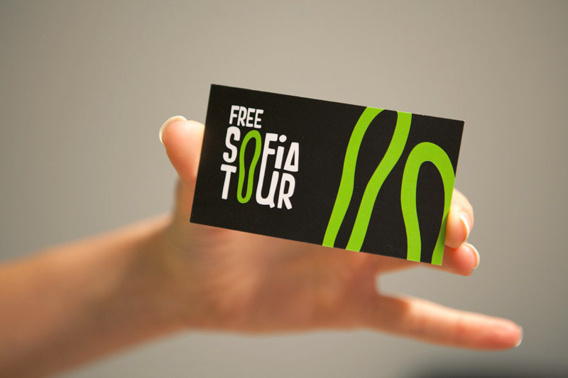
Black background makes the logo pop out and the card itself look stylish.
Black background makes the logo pop out and the card itself look stylish.

The green step is the key element that makes the black & white combination fresh and friendly.

Our flyer design for Free Sofia Tour - information - front side
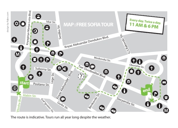
Our flyer design for Free Sofia Tour - route map - back side
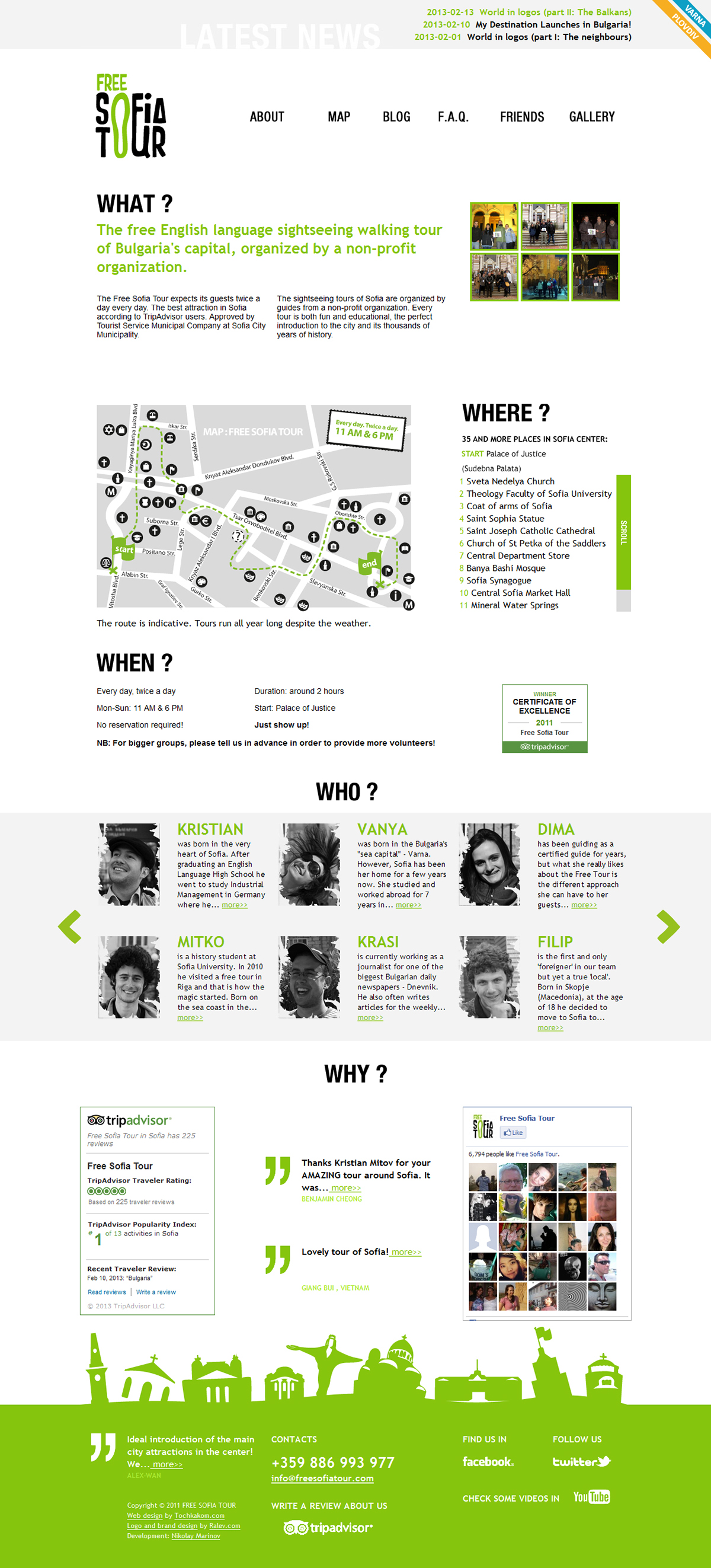
The web design
We worked on the web design for the Free Sofia Tour site in cooperation with Nikolay Marinov ( who coded the initial version ) - we created the appearance and he develooped the site. Our efforts were appreciated by BG Site - an annual competition, one of the most prestigious competitions for web in Bulgaria. Freesofiatour.com won first prize in the Cause, event, society category for 2012.

The website design is now included in our Bulgarian web design portfolio.
Visualisations
Below you can see some early visualisations with different version of the logo.
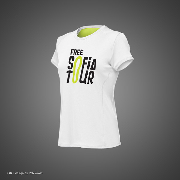

The very bright green is actually not readable on white background, so later on we’ve changed the nuance. We’ve advised the clients to experiment in the future with different light reflecting folios that may pop-up the vision even more. These can also appear very practical for every walker in the big city.

You can notice that in this version the T is like an arrow, but we’ve reduced the accents in the logo and in the final design – the T is plain.
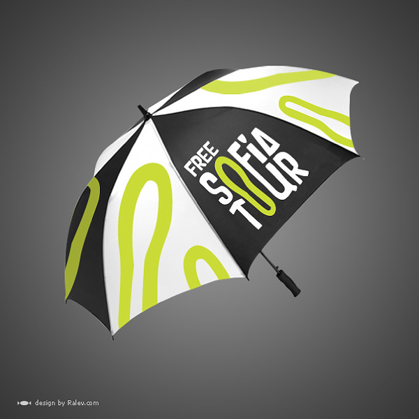
A well-designed umbrella is always a great brand souvenir.
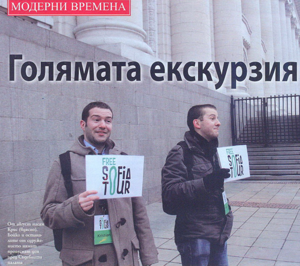
The logo design works on the street as well.
In the end, if you happen to come visit Sofia at some point, don't miss out on the free tour - there are many people who share their experience and they're all happy to recommend the walking tour. Check out what people say on tripadvisor.com.


