Branding for generic ibuprofen
I wanted to examine how one could brand a generic drug in order to make it more appealing to consumers. This is a theoretical look at what ibuprofen might look like if the generic were marketed as heavily as the name brands.
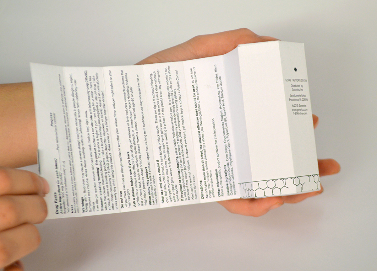
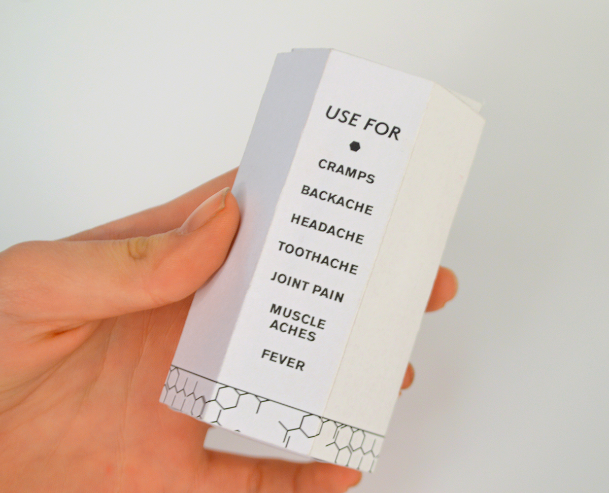
The design is based off the ibuprofen molecule, incorporating its hexagonal structure into the shape of the carton and the pattern used on the base and pull tab.


The Use For panel makes the purpose of the drug clear to the consumer. This design could be applied to any number of generic drugs by adapting the Use For text to clearly and concisely communicate the uses of each different drug.
I researched what information was required on an ibuprofen carton and formatted it so that it would be both visually appealing and easy to read. Rather than placing the text on all sides of the box, I incorporated a pull tab. This allows the consumer to read all the drug information at once, rather than needing to flip over the box to see all the different panels, as is the case with most drug cartons.