📱
Designing for iPhone?
Meet the biggest visual library of native & custom
iOS 12 components for your inspiration
The source of visual guides for a designer who stuck with a visual look
for a component in his current or upcoming project
At the moment I am working on a Figma iOS design kit and examining all the possible native controls for iPhone and patterns to create the most powerful UI library. Take a cup of coffee or something that you prefer and let’s see how far you could go by combining custom styles with native components declared at Human Interface Guidelines


Segmented Controls
A segmented control is a linear set of two or more segments, each of which functions as a mutually exclusive button. Within the control, all segments are equal in width. Like buttons, segments can contain text or images. Segmented controls are often used to display different views. In Maps, for example, a segmented control lets you switch between Map, Transit, and Satellite views.

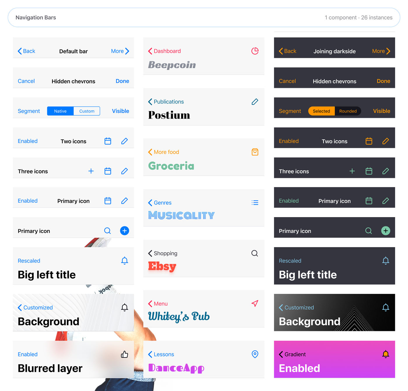
Navigation Bar
A navigation bar (or navigation system) is a section of a graphical user interface intended to aid visitors in accessing information. Navigation bars are implemented file browsers, web browsers and as a design element of some web sites. In mobile apps a navigation bar appears at the top of an app screen, below the status bar, and enables navigation through a series of hierarchical screens. When a new screen is displayed, a back button, often labeled with the title of the previous screen, appears on the left side of the bar.
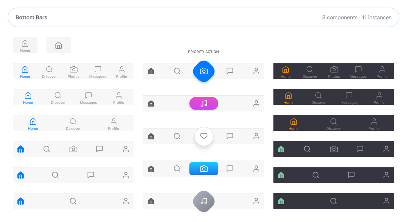
Toolbar
In computer interface design, a toolbar is a graphical control element on which on-screen buttons, icons, menus, or other input or output elements are placed. Toolbars are seen in many types of software such as office suites, graphics editors and web browsers. In mobile applications a toolbar appears at the bottom of an app screen and contains buttons for performing actions relevant to the current view or content within it.
Dialogs / Modals
The graphical control element dialog box is a small window that communicates information to the user and prompts them for a response. Dialog boxes are classified as “modal” or “modeless”, depending on whether they block interaction with the software that initiated the dialog. In mobile development this pattern called as “Modality”. Modality creates focus by preventing people from doing other things until they complete a task or dismiss a message or view. Action sheets, alerts, and activity views provide modal experiences

Text Fields
A text box, text field or text entry box is a graphical control element intended to enable the user to input text information to be used by the program. Human Interface Guidelines recommend a single-line text box when only one line of input is required, and a multi-line text box only if more than one line of input may be required. Non-editable text boxes can serve the purpose of simply displaying text.

Buttons
Buttons initiate app-specific actions, have customizable backgrounds, and can include a title or an icon. The system provides a number of predefined button styles for most use cases. You can also design fully custom buttons. Buttons allow users to take actions, and make choices, with a single tap.

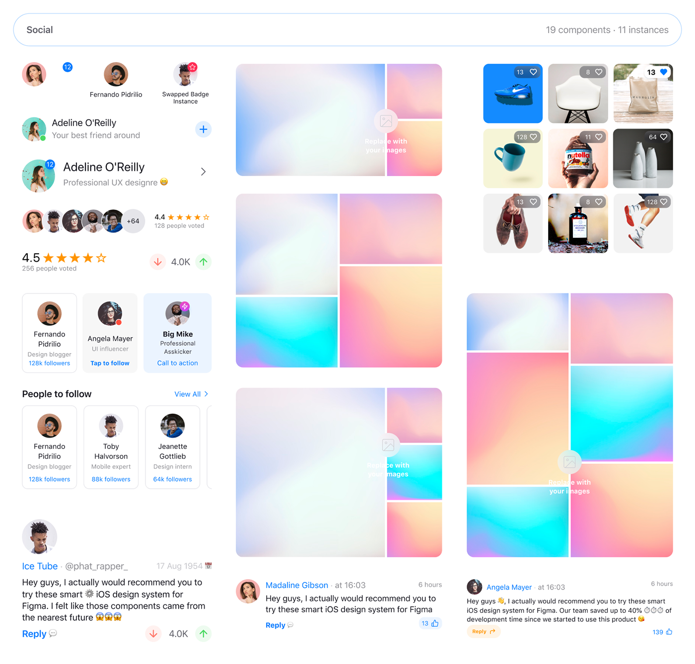
Social Components
Social design is design that is mindful of the designer’s role and responsibility in society; and the use of the design process to bring about social change. Within the design world social design is sometimes defined as a design process that contributes to improving human well-being and livelihood
Data Visualization
To communicate information clearly and efficiently, data visualization uses statistical graphics, plots, information graphics and other tools. Numerical data may be encoded using dots, lines, or bars, to visually communicate a quantitative message. Effective visualization helps users analyze and reason about data and evidence. It makes complex data more accessible, understandable and usable

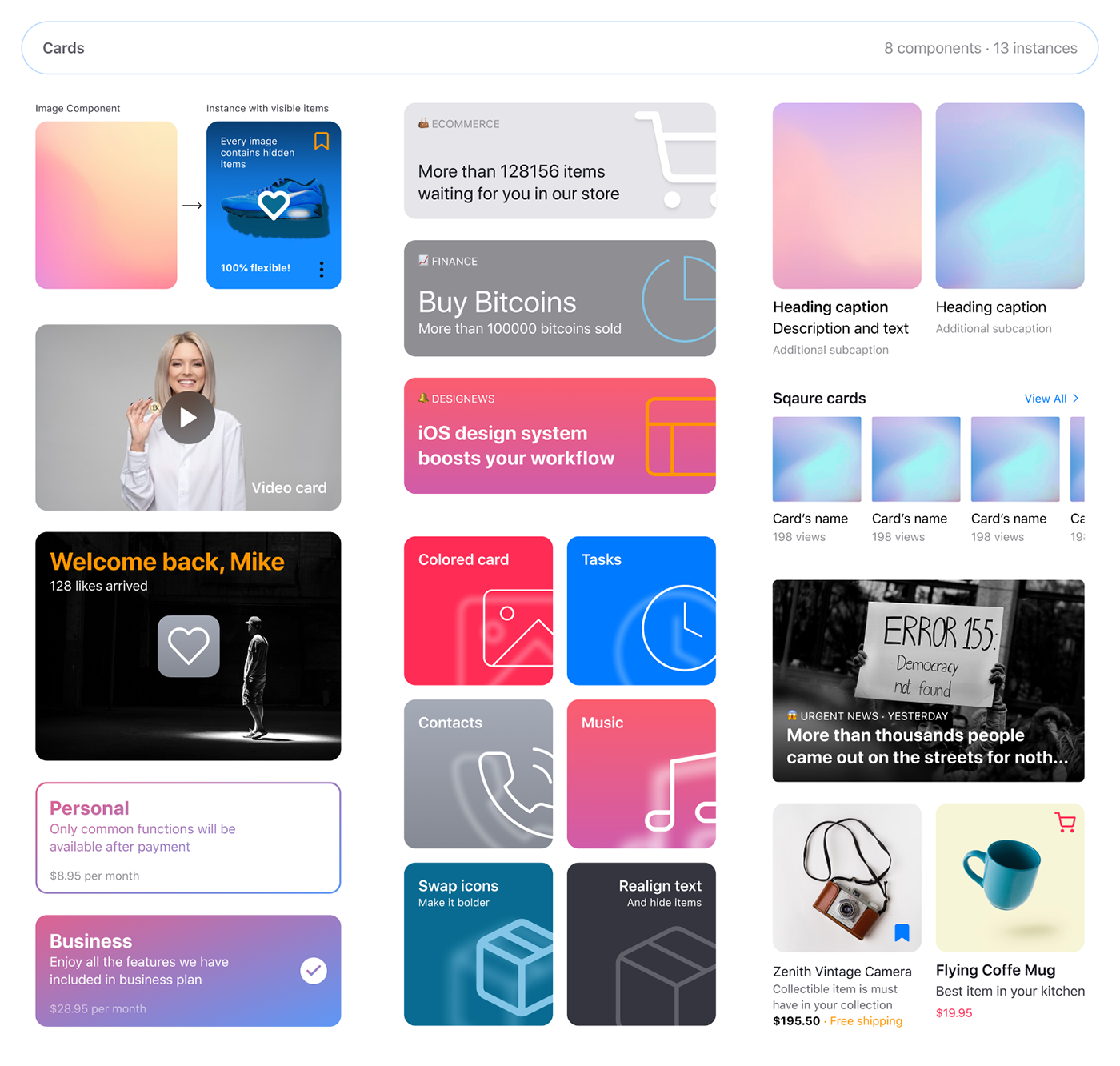
Cards
Cards contain content and actions about a single subject. They can be used standalone, or as part of a list. Cards are meant to be interactive, and aren’t meant to be be used solely for style purposes. Cards are those little rectangles full of inclusive images and text that serve as entry points to more detailed information. The word ‘cards’ is an excellent metaphor since they look like real-world tangible cards in user interfaces.
Lists
Lists are a continuous group of text or images. They are composed of items containing primary and supplemental actions, which are represented by icons and text. Lists are optimized for reading comprehension. A list consists of a single continuous column of subdivisions called rows that contain items of content.

Date & Time Pickers
The datepicker allows users to enter a date either through text input, or by choosing a date from the calendar. It is made up of several components and directives that work together. The month, year, or range of years that the calendar opens to is determined by first checking if any date is currently selected, if so it will open to the month or year containing that date. Otherwise it will open to the month or year containing today’s date.

Empty States
Occurs when an item’s content can’t be shown. Empty states can display a wide variety of content. For example, they can include a list without list items, or a search that returns no results. Although these states aren’t typical, they should be designed to prevent confusion. An empty state, or zero-data state, is an afterthought for many designers.

How to use this components?
Meet the professional Figma iOS design kit. This design system now available for your mobile projects. Aimed to speed up the development process by up to 40%. Become an early bird, purchase today and save a penny.
Figma users, this is your ultimate mobile toolkit for creating native, custom or wireframing mobile apps within 100% constrained components dedicated for endless scalability. Sketch users, very soon you’ll be able to open Figma files and use it for Sketch. Check out this announcement and stay tuned.


