CASTILLO RUM - B SIDE
Packaging
In this post, you’ll see some of the other concepts that didn’t end up making the cut for the Castillo Rum project, but provided a excellent opportunity for me to challenge myself and experiment with 3D design.
Here, the design needle is turned up to 11 on the rebranding dial to show the client where the project could potentially go. Compared to the original design, there are several added elements that create a more unique look.
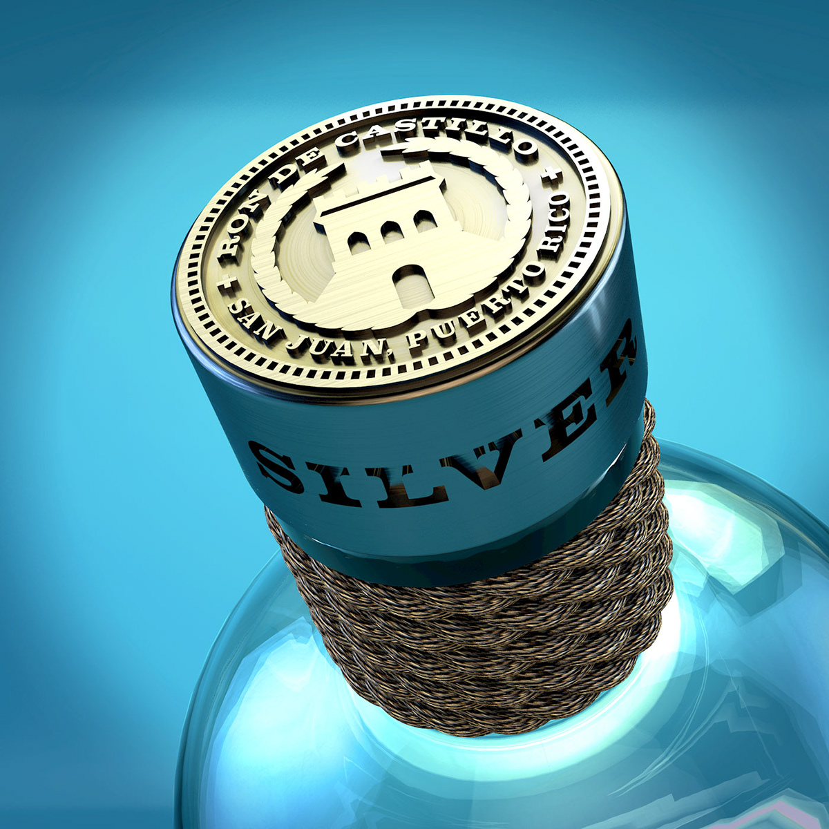
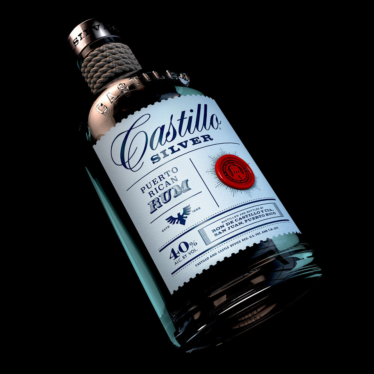
The 3D render itself was quite a challenge like the oversized bottle, the rope around the bottleneck, the rough paper texture on the label, the type on the bottle itself and of course the embossed cap. I kept with the same flavors as the original concept, but added in a new design and style to each one. It’s been a fun design exploration!
Creative Director: Chris Sendra

Here you can see all three bottles with the added elements. This is the beauty of showcasing your work through 3D design. I was able to add in a colorful background which enhances the label of each bottle.

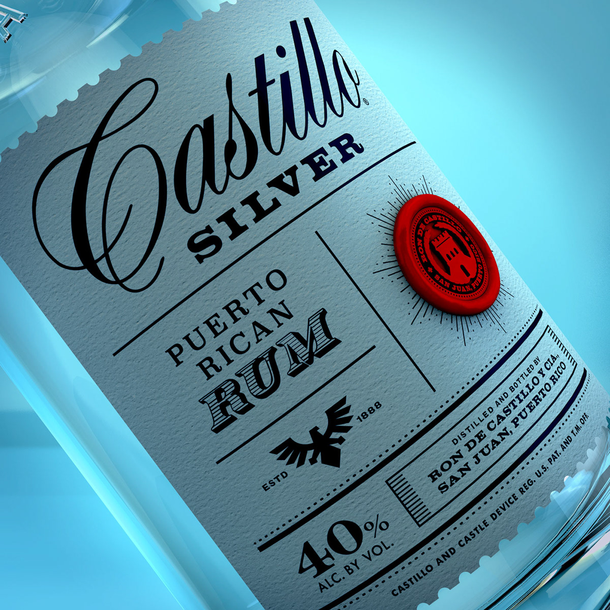
I like the clean look of the silver bottle design. Here you can see the texture of the paper and the dimensional wax stamp.
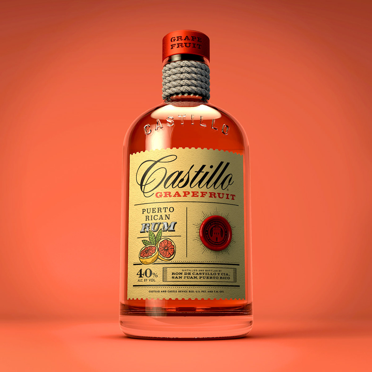
I wanted to create a refreshing vibe to compliment the grapefruit flavor. I felt the colors personified the flavor profile and to make it pop even more, I added in a vibrant background in the 3D rendering.

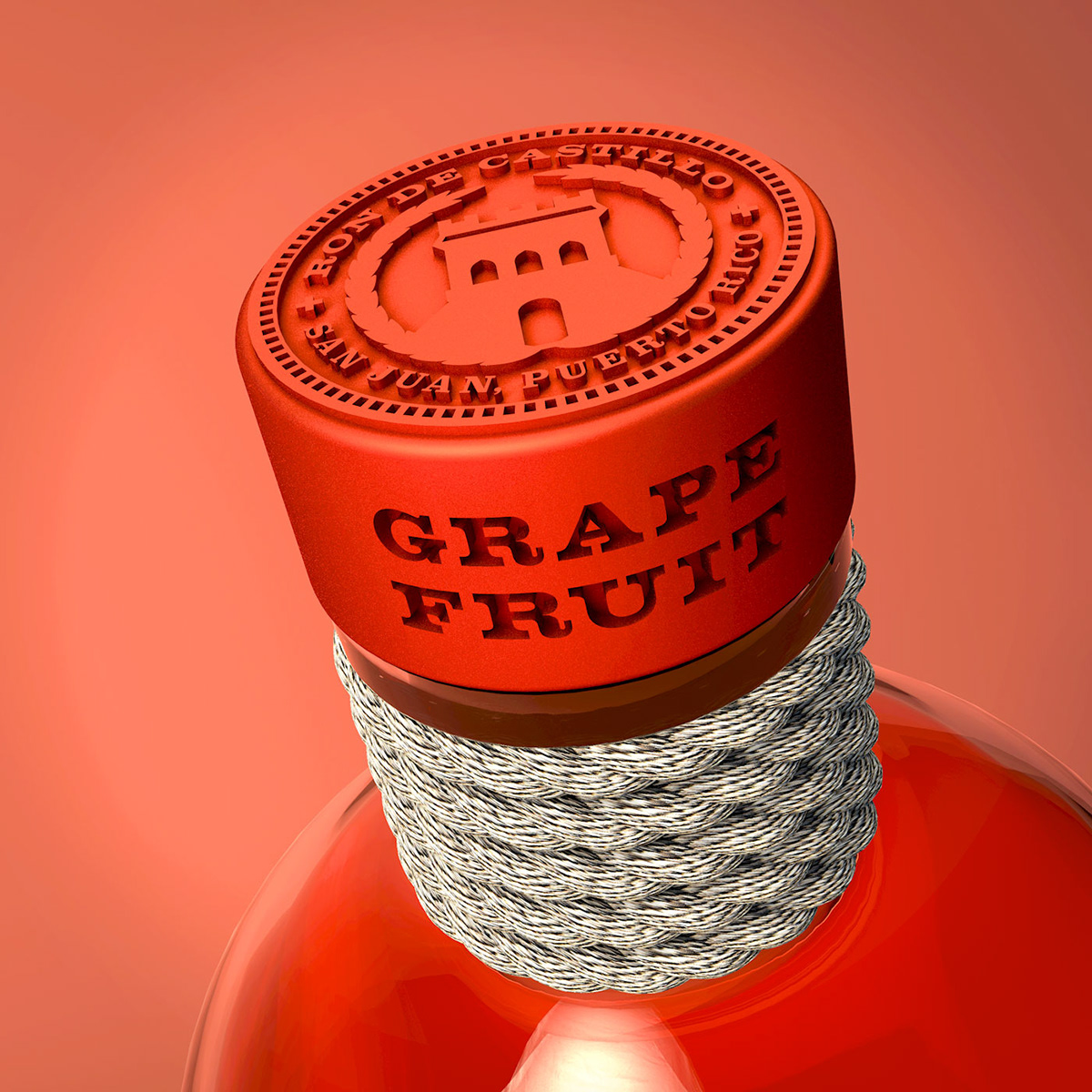


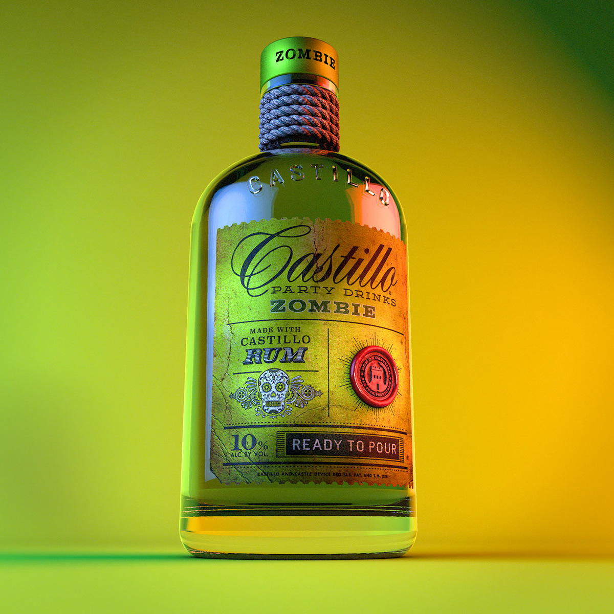
I took a bit more liberty on this one. For this concept, I felt like the lighting needed to be very dramatic. The label is ultra distressed to give it an aged feel fitting for the zombie icon.
Thanks for your time and interest in my work. Cheers!


