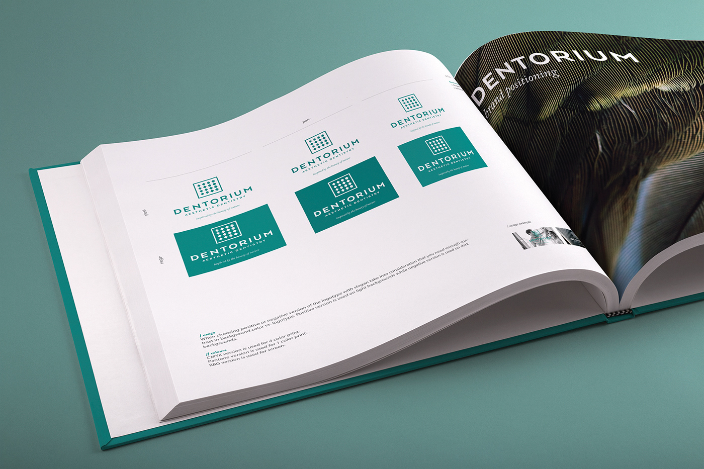
Dentorium
In the essence of nature is imperfection, coming in various organic, irregular forms. Every being is different and unique. However, whenever an imbalance occurs, natural forces make sure to take actions that restore harmony. Nature always strives to move from chaos to balance and recreate perfect formations.
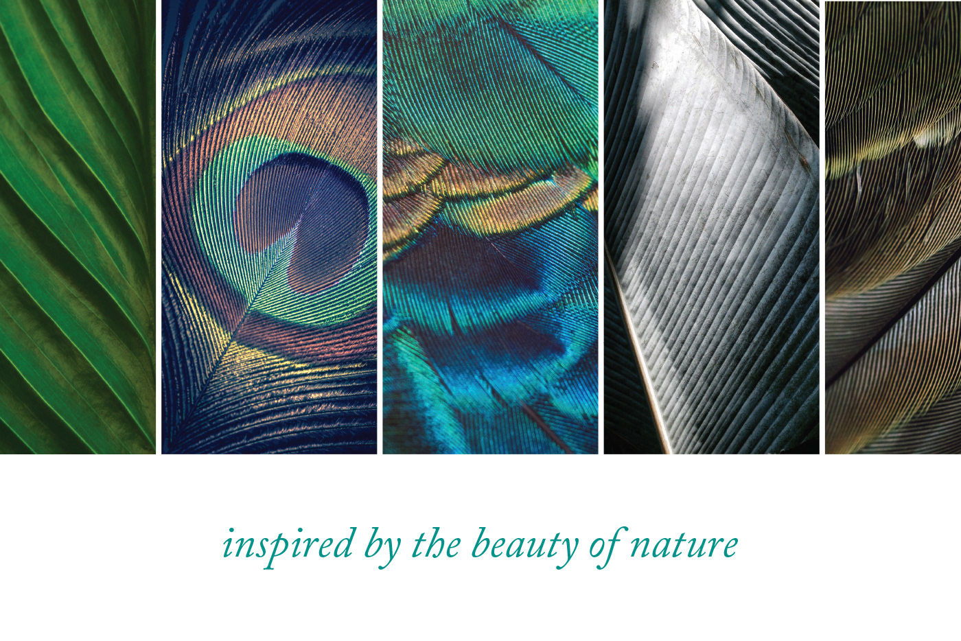
“Inspired by the beauty of nature” is a slogan and working mantra for a specialized Aesthetic Dental Studio and Implantology Center Dentorium that wanted to embed their “perfection of the imperfection” working philosophy into the new, visual brand identity.
By shifting the old paradigm from the generic “Hollywood smile” towards the celebration of natural and individual beauty, Dentorium developed an approach in providing a dental solution with great respect of patient’s unique face anatomy and personal differences.
The challenge was to integrate that thought process and a feeling of restored harmony into the company logo.
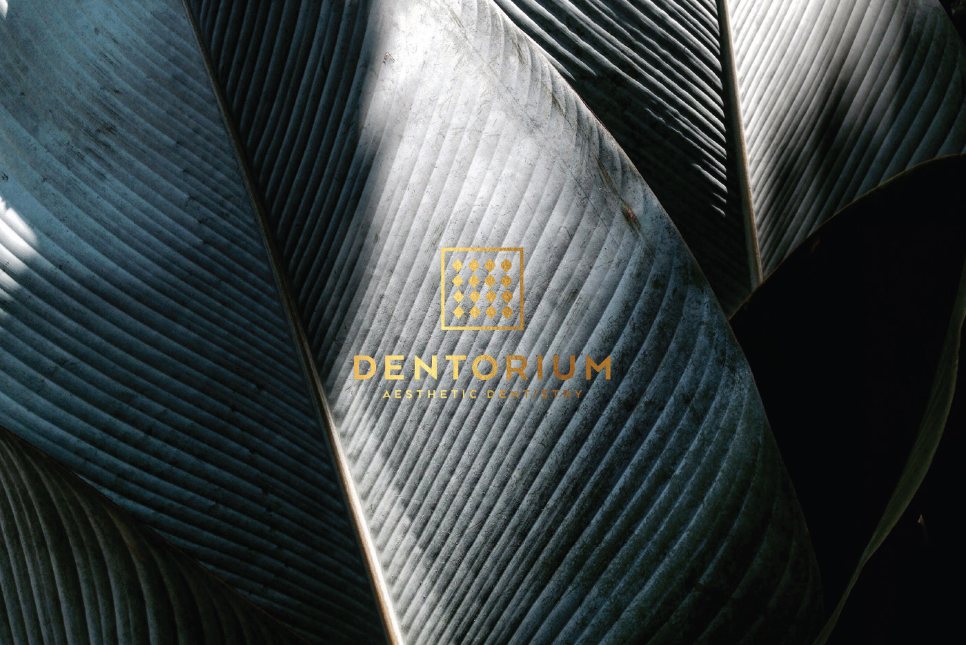
Zambelli Brand Design was determined to stay away from the typical tooth and smile iconography but still wanted to keep one symbolic element that is expected in the dental industry, which is the green foundation. Other three elements are more innovative and used to mirror the message that the dentistry wanted to convey – turning patient’s imperfections into perfect but natural smiles.
The 16 rhombus shapes sorted in four lines and placed inside a simple square symbolize the 16 teeth on each jaw. Their serrated edges gradually transit into smooth curves, which represents the carefully planned process of transforming imperfections into beautiful, organic shapes.
The logo icon and typography are colored in teeth-like white, while the background is emerald green. On the one hand, it’s the standard color of the dentistry market, even though its shade is slightly different from the usual, lighter tone. On the other side, green as the iconic color of everything natural perfectly matches the accompanying and nature-inspired textures and patterns of deep-green leaves and peacock feathers, which round the brand identity.
In a different version, the logo is topped with “gold dust,” symbolizing sophistication, achievement, elegance, value, and quality, which highlights the effort to recreate beauty in its best form.
With this simple but visually eloquent trademark, Dentorium managed to get their message across and attract clients that believe in natural beauty, while restoring their unique smiles as well as their confidence.