


Transforming someone’s business ideas into a new brand identity is what drives us here at Zambelli Brand Design. That’s why we always get particularly excited when we serve clients that build businesses on top of their passions. One such client story is Figura, where the personal passion of its founder, Tijana Maretić, intertwined with fresh market demand and resulted in an entirely new line of products. After years of travelling the world, Tijana settled in Hong Kong with her family and founded a food distribution company, CroGourmet, to bring authentic Croatian products, such as organic salt, premium olive oil, or truffle delicacies, to Southeast Asia. Citizens of Hong Kong particularly loved the Croatian fig cake, but its packaging wasn’t telling the story of its supreme quality in the most successful manner. To change that, Tijana decided to create an entirely new brand that includes fig cakes, as well as premium olive oils and gourmet chocolate bars, all reminiscent of the tastes and scents of the Mediterranean. She turned to us for the creation of the new brand strategy.
After several workshops in which we drilled into the core of Figura’s business goals, we created a brand strategy to identify the company’s primary target audience, competition, brand story, unique selling points, and more. Together with our client, we created Figura’s brand personality: energetic, friendly, kind, and the traditional mother, inspired by food from around the globe, travel experiences and the warmth of the Mediterranean.
In creating the visual identity for Figura, we used the fig fruit as our main inspiration, adding a flair of wanderlust and movement. When we turned the fig upside-down, it changed into the shape of a hot-air balloon, which perfectly embodied the travel segment of the brand story.

Besides the logotype, brand visuals are accompanied by a specific colour palette and textures intended to be used across different marketing touchpoints. Because the fig fruit that we find in nature can be purple or green, we used those tones to underline the entire experience. Then, by adding a splash of gold, we enhanced the fact that these products are of premium quality, categorised as delights. The lines we used as textures evoke the Mediterranean’s primary symbols, such as the sea, olives, figs and fish shells.

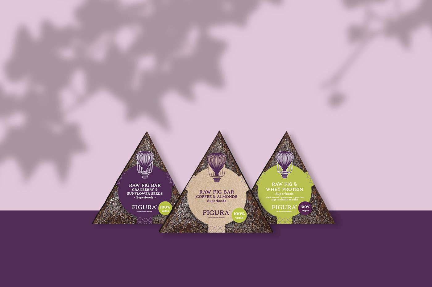
Our task also included the creation of the brand name and the entire verbal identity. Because the products belong to the family of superfoods that are organic and support a healthy lifestyle, we combined that with the word ‘fig’;.and that’s how the name Figura was coined. To bring the brand’s essence closer to its audience, we added a uniquely created product category – Mediterranean Delights – to the brand name.

Figura’s new brand promotion in Hong Kong turned into a successful launch event attended by many citizens passionate about healthy and tasty food. The brand also established a website and an online store, which both proudly feature its new identity.


