Typefaces - A book about typography
What would a typeface look like if it was human?
"What a weird question", you might think. But this is not as crazy as it sounds: As a designer or someone who has already got in touch with typography, you know that every typeface has its character: It's got its own look, strengths and weaknesses. So why not transfer this to actual people?
I analyzed each typeface, searched for people with the same characteristics, and took photographs of them. Along with these portraits, every chapter gives historical background information about the classification, shows the main attributes, shows an application from the streets of Nuremberg. and presents an exemplary typeface.


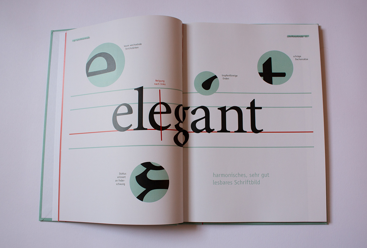
To loosen up the clean and tidy look of the layout, I wrote key sentences across the spread.

The time beam at the top of the contents page shows the time in which the classifications originated. To give the reader orientation, I repeated the time beam at the start of every new chapter.

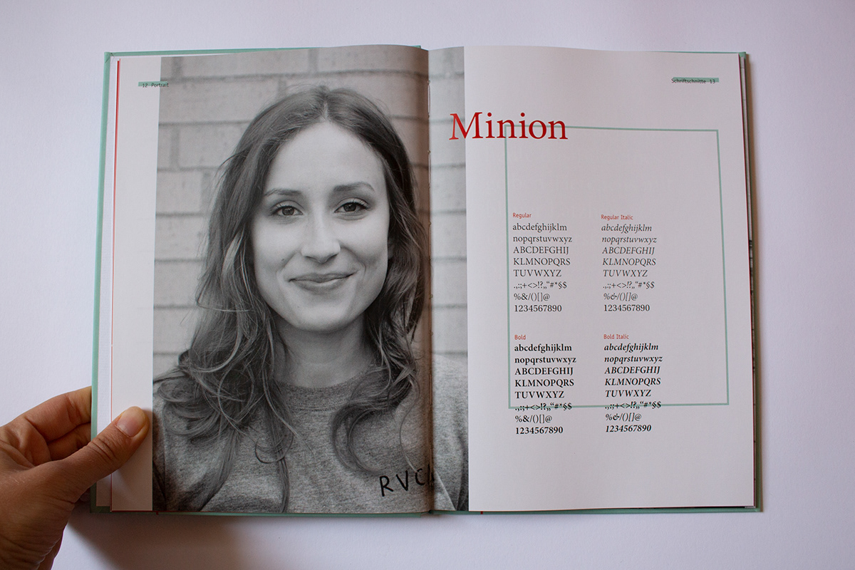
This spread is the heart of every chapter: The portrait of each typeface: On one side its letters and glyphs, on the other a human face.


In every chapter, you can find a photgraph of an application where a typeface from the classification portrayed is used in context. I took the photographs on a walk around Nuremberg.


Created during the 2nd semester of graphic design at the university Georg Simon Ohm in Nuremberg, Germany.

