Rebranding for the orthodontics "Macher" in Nuremberg, Germany.
Have you been one of the lucky ones that had braces? For most of us, this period in our lives isn‘t the most pleasant. Every visit at the dentist is a stress factor, having to deal with toothache for days afterwards.
But it doesn‘t have to be this way. How would it be if the clients were excited and happy to come to the dentist? This is exactly what I tried to accomplish with my corporate design proposal for the orthodontics “Macher” in Nuremberg. Their claim is to offer a comfortable and stress-free treatment in a friendly atmosphere while doing an accurate and excellent job. So, I created an identity that represents professionality and know-how on the one, and sympathy and friendliness on the other hand.
But it doesn‘t have to be this way. How would it be if the clients were excited and happy to come to the dentist? This is exactly what I tried to accomplish with my corporate design proposal for the orthodontics “Macher” in Nuremberg. Their claim is to offer a comfortable and stress-free treatment in a friendly atmosphere while doing an accurate and excellent job. So, I created an identity that represents professionality and know-how on the one, and sympathy and friendliness on the other hand.


First, I designed a logo and chose the brand colors and fonts.
Then, I applied the design to digital and print products: I created business cards and contact cards, the notepaper and a login sheet.


For their online presence, I drafted a website and thought about how their social media presence could look like.


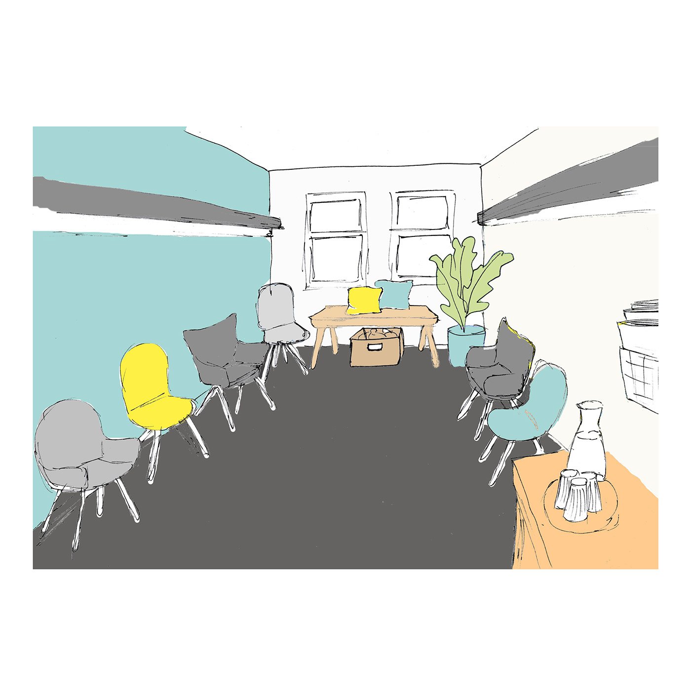
Finally, I developed an interior concept to create an environment the clients enjoy to be in.
Created for an internal competition to rebrand the orthodontics “Macher” during the 4th semester of graphic design at the university Georg Simon Ohm in Nuremberg, Germany.

