Redesigning a brand with a strong smelling underground fungus.
From artwork to packaging.

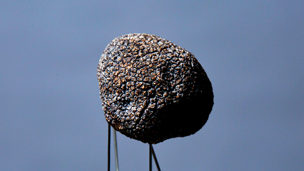
Madame Truffles redesign began by exploring the mysterious strong-smelling underground fungus that is a truffle. It resembles an irregular, rough-skinned potato and is considered a culinary delicacy, famously found with the aid of trained dogs or pigs – known to have bitten off a farmers hand of two in the attempt to not only locate but to devour.
All that said we looked to explore the fungus for it’s odd beauty. We fired coloured power at it with an array of devices to bring to life the combination of flavours found in the Madame Truffles range and cut the truffle into thin slices and photographed it over a light box to reveal it’s inner markings.
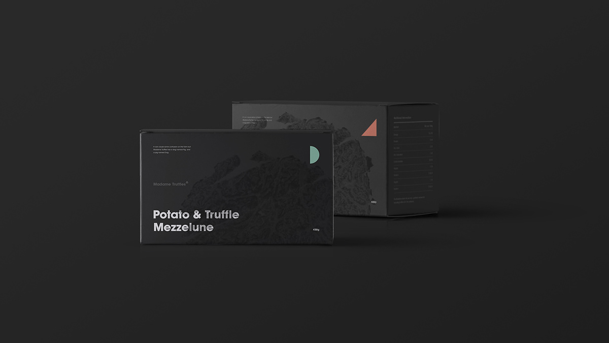
The imagery formed the basis of the brand redesign. Taking the form of shop artwork, packaging and all manner of the consumer experience. We also added new symbolism to each product line to make the range easier to shop.


Brand strategy and creative by www.Ne-Lo.com
Final designs and rollout by www.extrablack.com.au who do extra_ordinary work.
Executive Creative Director: Kieran Antill
Creative Director: Ander Hernando
Head of Strategy: Simon McCrudden
Photographer: Marcin Haber
Senior Graphic Artist: James Ayling
Stylist: Jacqui Erskine


