The main purpose of the center is to conduct modern trainings for the development of students receiving education in the field of agriculture. To this end, the center periodically organizes meetings, seminars and master classes among specialists and students, as well as creates conditions for the participation of distinguished students in conferences and trainings abroad.
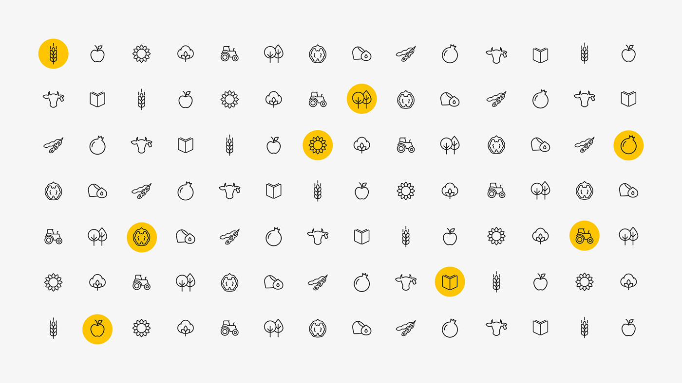
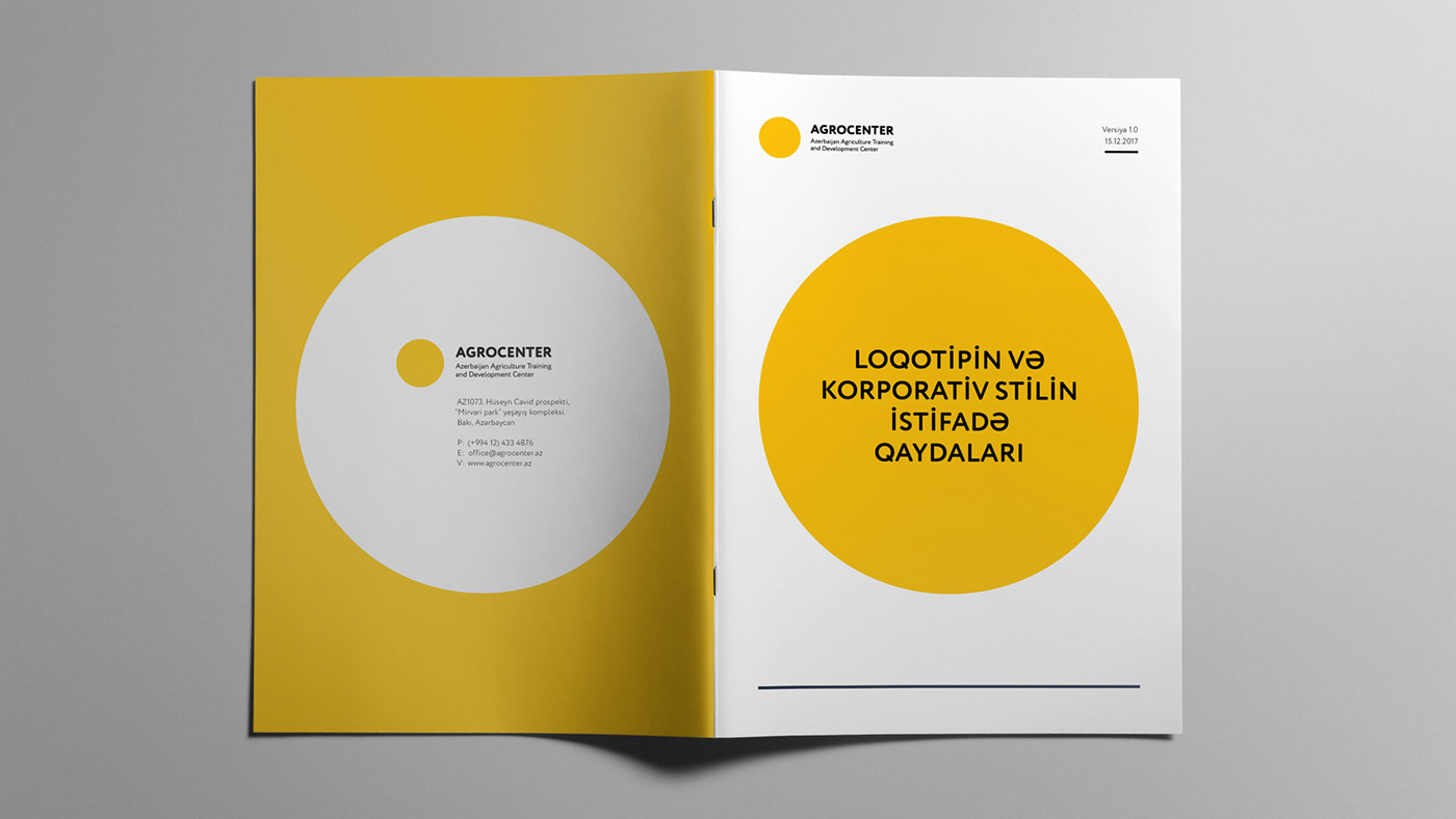
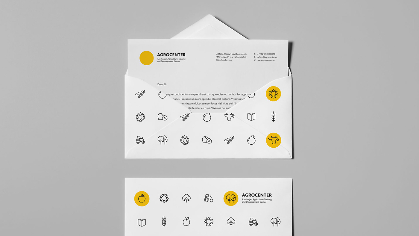
In Azerbaijan, the agricultural sector lags behind the level of modern development. Figuratively speaking, this sphere needs lighting, to bring it out of the darkness. The branding of the center is based on this metaphor. The various symbols of agriculture left in the dark are illuminated, brought to the fore. The idea is based on a light orange circle symbol. This circle reflects both the image of light and the center. As a result, we have a modern, dynamic branding.