

O Tempero
Cozinha E Barra
Brand Identity
Restaurant Design
––––––––––––––
The Brief
When I first met Ralph, he excitedly stumbled through describing a culinary adventure he'd been in the Portuguese countryside–agriturismo. He was absolutely dumbstruck at how he'd never heard of this style of cuisine–a welcome barrage of spices on his senses. Fresh seafood and quality local ingredients cooked in these overly fanciful large home-style pots. Ralph was adamant that he would bring this back home with him. Ralph and I talked for more than two hours while excitedly took notes and sketched some quick thoughts out. With a name like O Tempero–literally translating to "flavor" in Portuguese–I knew I was starting on pretty solid ground.
With fusion and, perhaps most importantly, flavor in mind, I chose Futura PT Bold with literal accents built into the letter forms. Futura has a modernity and practicality to it, but the accents make it something new and fresh.


The logo mark, a rooster perched on top of the logotype, is the Galo de Barcelos. The unofficial symbol of Portugal, the Galo, known for its lively colors, is the embodiment of the love of life in Portugal. It symbolizes honesty, integrity, trust, and honor.
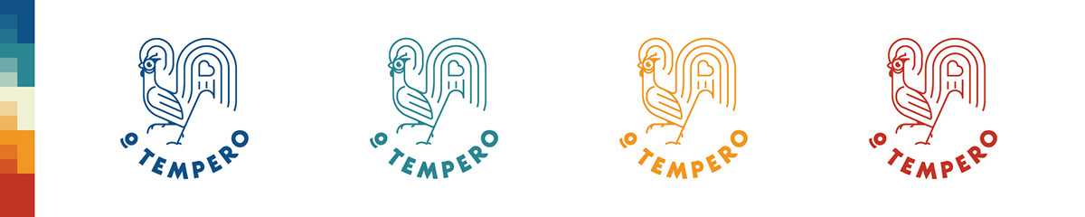
On the more spherical versions of the logo, the logotype is rounded upwards to represent the large Cataplana pots used in traditional Portuguese cooking–a center point of Ralph's vision.
Combined with a warm palette of reds and yellows, the Galo beckons you to the restaurant and welcomes you inside like a delicious tangible beacon.
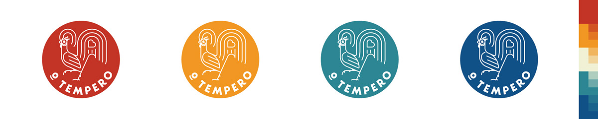
Various explorations of the badge.

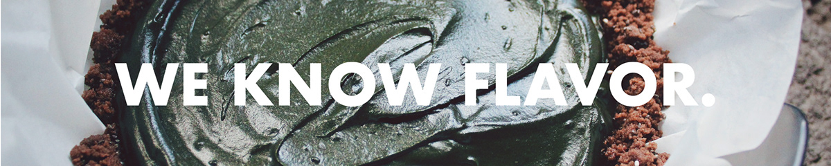


Marketing would use gritty, more realistic (read, less polished) photography.


Left: Fountain drink cup design utilizing repeating Portuguese tiles.
Right: Fountain drink cup design utilizing the Galo mark and overprinted logotype.

Initial concept for the menu design.


