


This project is my first logofolio, and the works inside it are presented as drafts on paper, so you can follow the thought behind each work. Hand drawings are also the first step in a creative process, so I wanted to emphasize that this is my first portfolio project of this kind, and that every logo here is an idea, not definitive, ready to be reworked and possibly improved in the future.


Pups, online store of articles for dogs, made on the fifteenth day of the creative challenge "Thirty Logos Challenge". For this logo I decided to play with negative shapes, reducing the space between the letters and forming the silhouettes of two dogs. The word, in this way, also expresses visually its meaning.


Sword & Shield, security systems. For this logo I liked the idea of forming the initial letter of the two words that make up the name (Sword, Shield), with the objects that the words themselves are.


Natalie, female fashion brand. With this logo I wanted to emphasize the originality that characterize the brand, making a customized lettering by hand.


Acqua (water). Two drops that form the initial letter of the name (A for acqua in Italian). The minimal style of the mockup was chosen to be in line with the simplicity of the product: the natural water.

Vitruvian man. The logo was born for an agency that deals with non-verbal communication and represents the Vitruvian Man of Da Vinci. The first image is a frame extracted from the video of the creation of the design, which you can find on my instagram profile: @mpszwedo. In the second image, you can observe the process that brings from the design (top left) to the finished vector logo (bottom right).

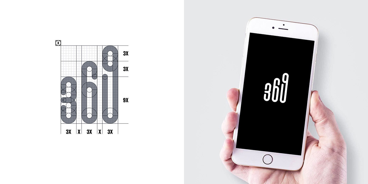
369, statistics monitoring app. To represent the brand, the idea of growth (purpose of the product), combining the numeric sequence of the name to a growing bar graph. The logo was made by extending the next two numbers by 1/3 of the number 3, spacing them by 1/3 of the base. Even at the level of measurements and therefore spaces, it refers to the number 3. The logo in this way translates visually the idea of improving, the basis of the project.

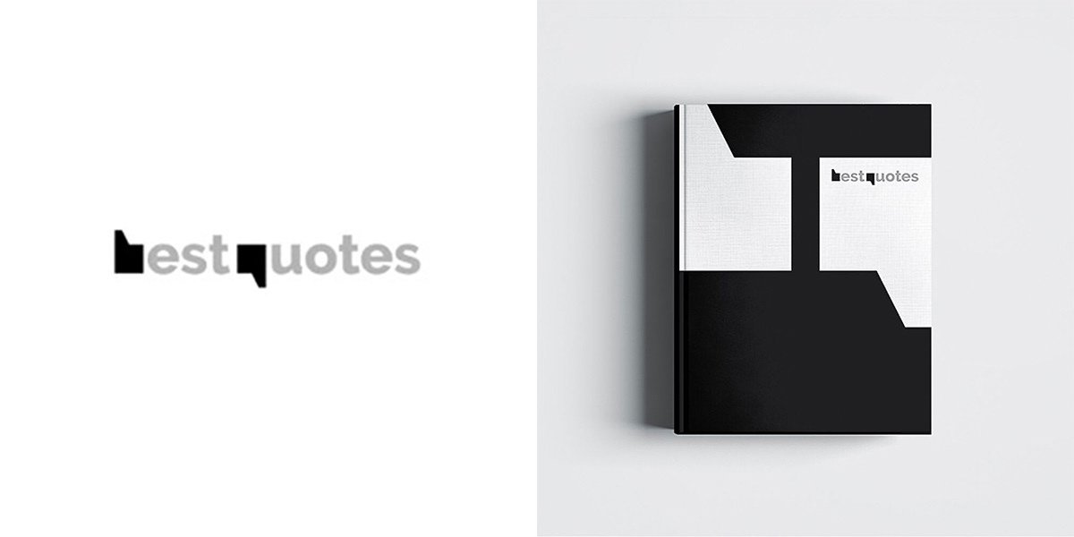
Best quotes, a collection of the best quotes. The initials of the name take the form of quotation marks. In the second image (in addition to the mockup) there is a frame of the logo animation, inspired by the pages of a book that are browsed, you can find it on my Instagram profile: @mpszwedo.


NP. The logo for the winner of the competition organized to overcome the goal of 1000 followers on Instagram, a monogram with the initials of the name (N + P). The second image was recovered from the video made from on the computer, of the birth of the logo (see the social profile for the video and more info on the contest: @mpszwedo).


Love's Jewelry. The idea for this logo was to express, through a single continues line, the love for jewels, blending the form of a diamond and that of a heart.


Basket Trieste. The logo for a Trieste basketball team, made during the last day of the "Thirty Logos Challenge". The idea was to blend the Alabarda (symbol of the city) on the lines of ball. In the second image, the process of forming the logo in 4 phases, from the image used as a starting point, to the alabarda and the finishing of the lines.

Latorre. The logo was born from the desire to create a strong geometric pictogram, through the isometric grid, enclosed in a hexagon. In the pictures you can see a video extract that documents (through a timelapse) on the paper (which are found on the Instagram profile@mpszwedo), followed by a variation of the logo and its negative version.


Notarte, a name that is the combination of the words "nota" (referring to the Italian word for note, music) and "arte" at the same time a provocation if not divided into art. The concept of the distorted note forming the letter A (common letter of the union of the two names that make up the mark in Italian: notA-Arte), takes shape with the golden proportions, as shown in the grid of the second image.


K! The style of this logo is inspired by the world of graffiti, wanting to represent a group of hip hop dancers.


A coat of arms for a school. Wants to convey seriousness and professionalism, while maintaining a modern and minimal appearance. Composed by a crown (symbol of power) placed over an open book, like this is imparts the importance of study and knowledge. Within the pages the year of foundation (MCMXCIV = 1994) and an X formed by a ruler and pencil. The motto of the institute going around the logo "DUBIUM SAPIENTIAE INITIUM" (doubt is the origin of wisdom).


Science Daily News, a website that publishes the latest news from the scientific world. Through the pictogram we want to merge these two worlds: that of information and that of science. The logo represents the page of a distorted newspaper in the shape of a double helix of DNA, with the lines of text replacing the nitrogenous bases.
Thanks for watching!
Thanks for free mockups! Freepik (3rd "PUPS" image), Pixeden (3rd "Sword & Shield" image), Anthony Boyd (3rd "Acqua" and "Stemma scolastico" images), and also Graphicburger.
Check this profiles if your looking for some great free resources!


