


Marko Nikolajević is a front-end developer. Builds what the user sees when opening an Internet page, along with the whole part of the interaction with the site.
After brief and the first researches it's decided to create a monogram of the name, with a simple and representative tone, recalling the classical programming elements.
With these ideas, some drafts have been developed.

After numerous paper tests, the best sketches are played in vector. The idea that jumped the most for cleanliness, personality and concept was the first of the third line. So it was decided to elaborate it giving it a more geometric shape.

Once defined the monogram, it is necessary to combine it with the right font, also to determine appropriate size ratios, and creat two types of lockups to ensure that the logo does not lose its legibility and impact if reproduced in different sizes.

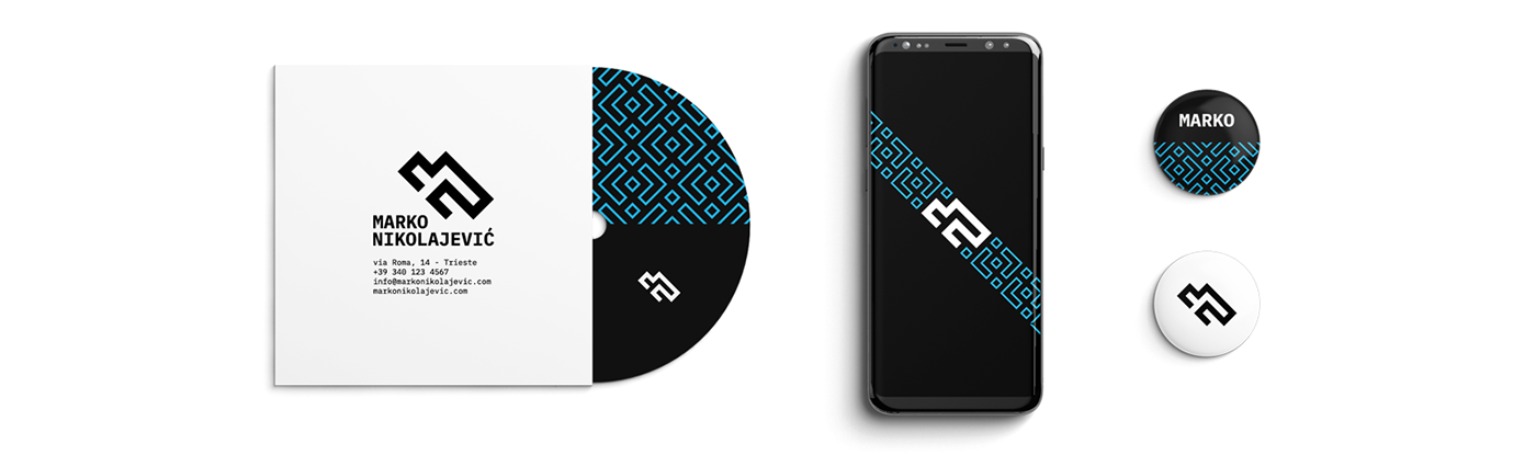
The monospaced font wants to take up the aesthetic style of programming languages, where each letter is enclosed in its space. The typeface used is the IBM Plex Mono, in its various weights. The negative look was chosen inspired by DOS, with cyan as the accent color.

We also decided to develop a pattern, using the grid of 45° rotated squares used for the construction of the monogram, thus reinforcing the geometries and visual identity with another characterizing element.

After better defining the visual identity, we began to develop all the corporate material.


Thanks for watching!


