One Year of Visual Narratives
Visualizing cultural, current and social topics for «La Lettura – Visual Data»
«Visual Data» column is a data visualization weekly published within «La Lettura» the cultural supplement of the Italian newspaper «Corriere Della Sera». I periodically collaborate with «La Lettura», designing the data visualizations.
My design process is characterized by a constant research for meaningful subjects to be visualized and new visual experimentations. Every visualization is the result of a multistep design process: research of topic and data, data analysis, design of the visual model and stylistic finishing.
The visualizations deal with subjects that are carefully chosen in order to create meaningful storytelling pieces. The aim of the design process is to engage the reader with interesting contents and visually appealing aesthetics, generating a connection between designer and reader that passes through shapes, colors and lines. I work across different topics: literature, art, society and current and urgent issues. For every topic, a specific visual model is designed, in a constant balance between aesthetics and clearness.
Every piece tells a unique story: the contents are presented in layers of information, so as to allow the reader to choose how to explore the visualization and the deepness of the analysis. The project is characterized by a constant research for new aesthetics and forms, created by a stream of dialogue between the contents and the visual elements, combined to the designer's will to create a different visualization every time, but with the same stylistic matrix.
The visualizations have been published on Corriere della Sera – La Lettura between 01/09/2017 and 1/09/2018.
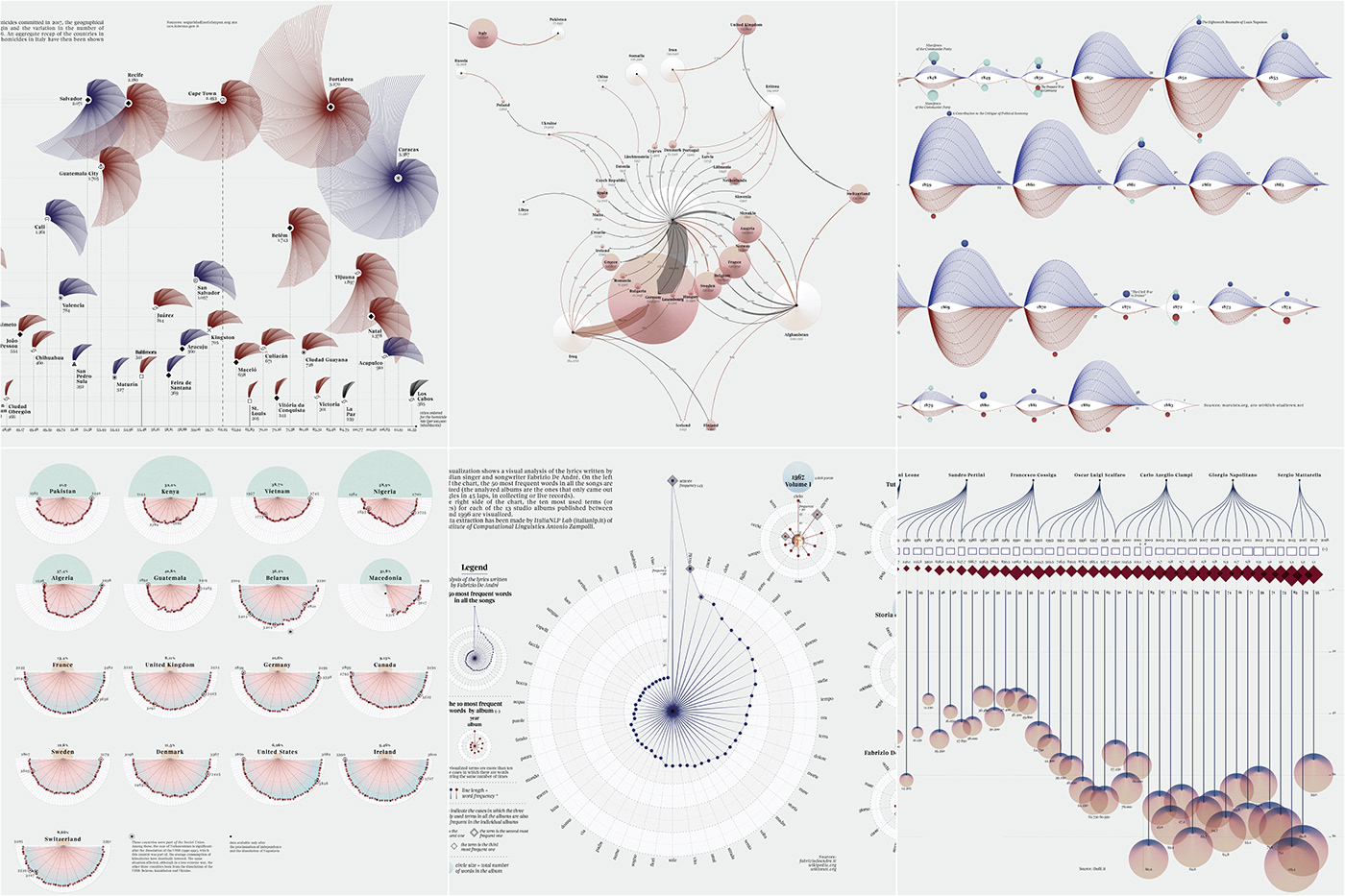
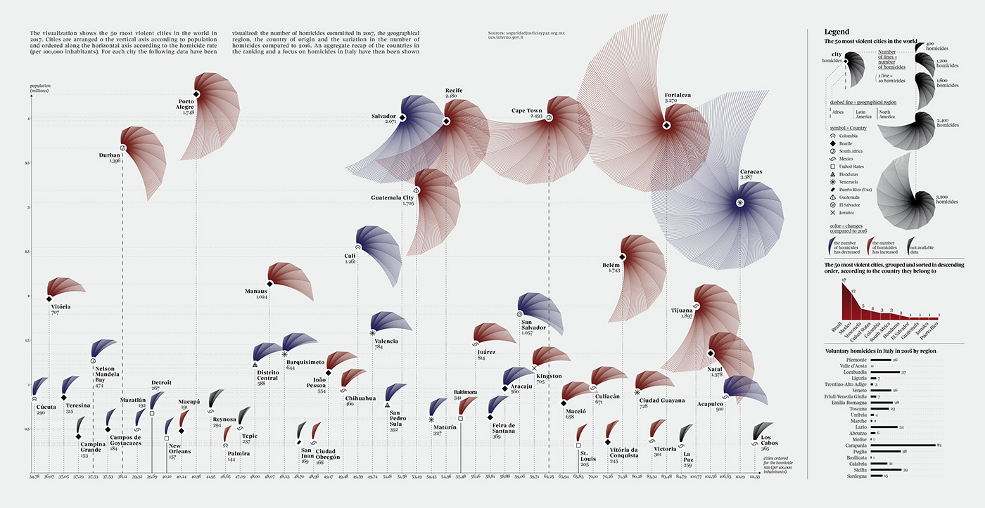
The 50 Most Violent Cities in the World
The visualization shows the 50 most violent cities in the world in 2017. Cities are arranged o the vertical axis according to population and ordered along the horizontal axis according to the homicide rate (per 100,000 inhabitants). For each city the following data have been visualized: the number of homicides committed in 2017, the geographical region, the country of origin and the variation in the number of homicides compared to 2016. An aggregate recap of the countries in the ranking and a focus on homicides in Italy have then been shown.
Sources: seguridadjusticiaypaz.org.mx ucs.interno.gov.it
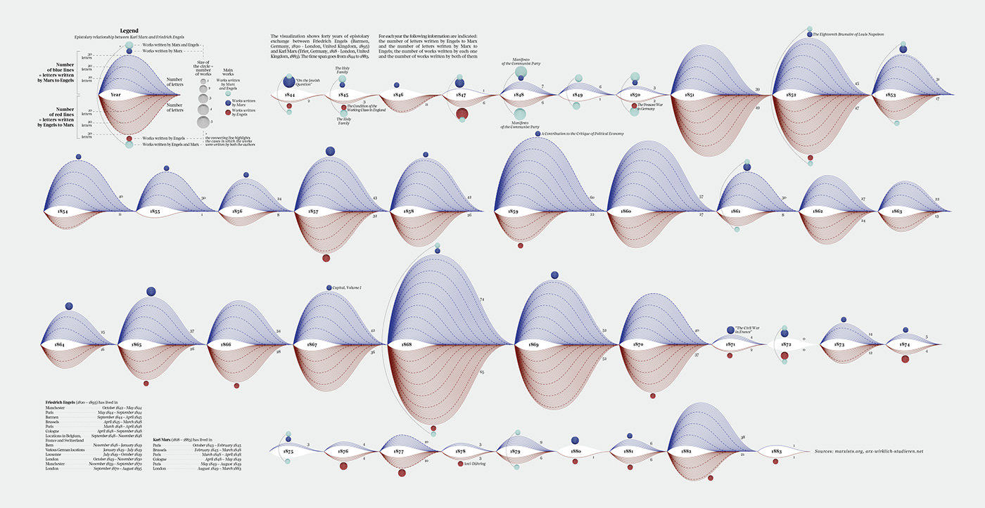
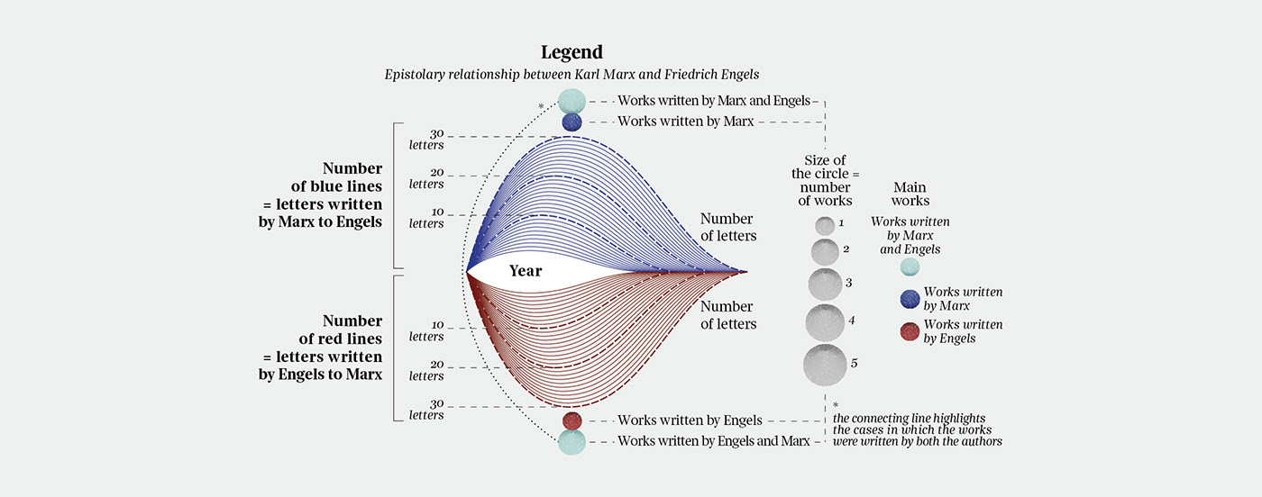
Marx and Engels
Visual analysis of the epistolary relationship between Karl Marx and Friedrich Engels
The visualization shows 40 years of epistolary exchange between Friedrich Engels and Karl Marx. The time span goes from 1844 to 1883. For each year the following information are indicated: the number of letters written by Engels to Marx and the number of letters written by Marx to Engels; the number of works written by each one and the number of works written by both of them.
Sources: marxists.org, arx-wirklich-studieren.net
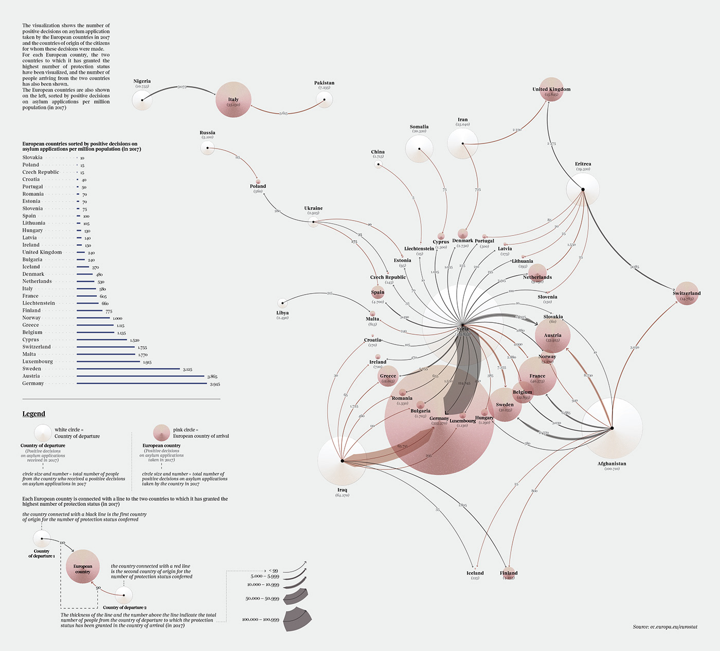
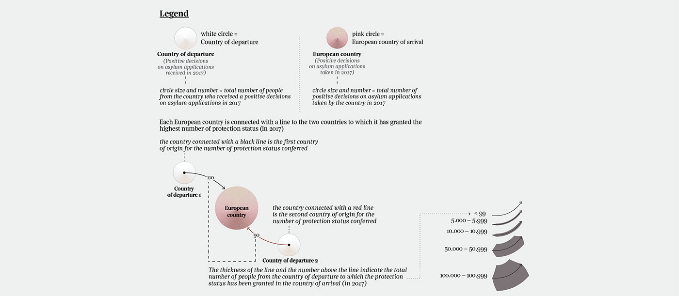
Asylum Seekers and the Network of Positive Decisions
The visualization shows the number of positive decisions on asylum application taken by the European countries in 2017 and the countries of origin of the citizens for whom these decisions were made. For each European country, the two countries to which it has granted the highest number of protection status have been visualized, and the number of people arriving from the two countries has also been shown. The European countries are also shown on the left, sorted by positive decisions on asylum applications per million population (in 2017).
Designed in collaboration with Francesco Majno
Source: ec.europa.eu/eurostat
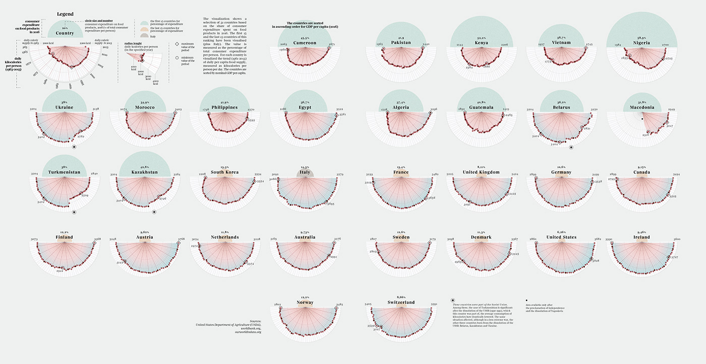
Food expenditure and calories
The visualization shows a selection of 31 countries based on the share of consumer expenditure spent on food products in 2016. The first 15 and the last 15 countries of this ranking have been visualised (plus Italy). The value is measured as the percentage of total consumer expenditure per person. For each country is visualized the trend (1961-2013) of daily per capita food supply, measured as kilocalories per person per day. The countries are sorted by nominal GDP per capita.
Designed in collaboration with Francesco Majno
Sources: United States Department of Agriculture (USDA),worldbank.org,ourworldindata.org

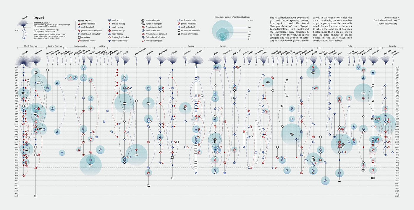
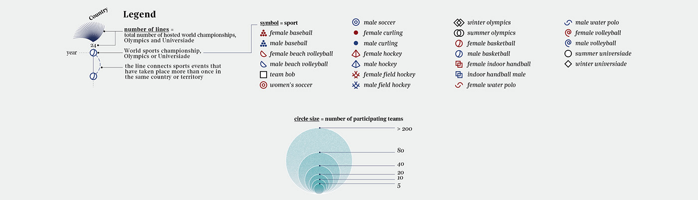
50 Years of Sports
The visualization shows 50 years of past and future sporting events, from 1978 to 2028. The World Championships of the Olympic Team disciplines, the Olympics and the Universiade were considered. For each event the year, the sports category and the country or territory in which it took place are indicated. In the events for which the data is available, the total number of participating teams is then indicated. For each country, the cases in which the same event has been hosted more than once are shown and the total number of events hosted in the years taken into consideration is visualized.
Designed in collaboration with Francesco Majno
Source: wikipedia.org
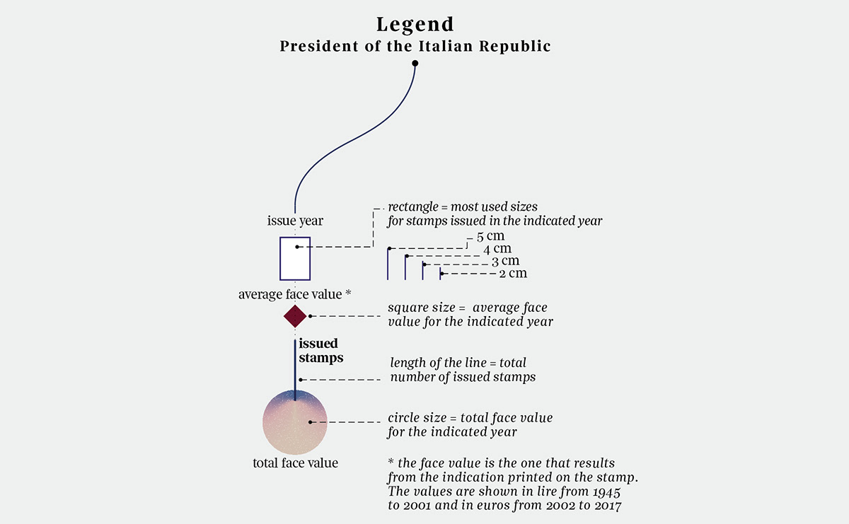
The Italian History of Stamps
Artwork for Visual Data, the column on "La Lettura", the cultural supplement of "Corriere Della Sera".
The visualization shows the stamps issued in Italy from 1945 to 2017. For each year the following information are indicated: the President of the Italian Republic, the number of issued stamps, the most used sized and the average and total face value.
Designed in collaboration with Francesco Majno
Source: ibolli.it

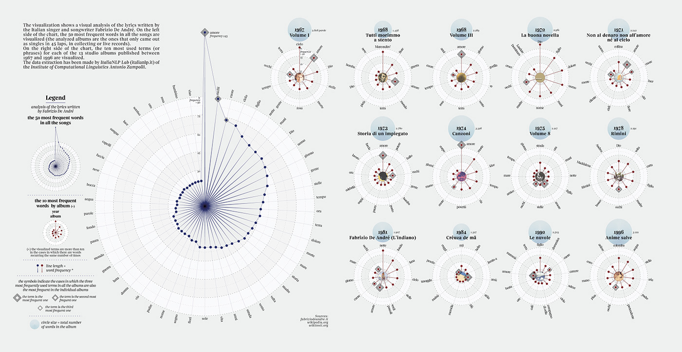
Fabrizio De André
Visual analysis of Fabrizio De André's vocabulary
The visualization shows a visual analysis of the lyrics written by the Italian singer and songwriter Fabrizio De André. On the left side of the chart, the 50 most frequent words in all the songs are visualized (the analyzed albums are the ones that only came out as singles in 45 laps, in collecting or live records).
On the right side of the chart, the ten most used terms (or phrases) for each of the 13 studio albums published between 1967 and 1996 are visualized.
The data extraction has been made by ItaliaNLP Lab (italianlp.it) of the Institute of Computational Linguistics Antonio Zampolli.
Sources: fabriziodeandre.it; wikipedia.org; wikitesti.org

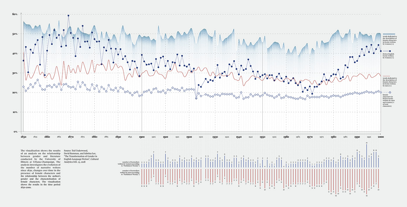
Gender and Literature
The visualization shows the results of an analysis on the relationship between gender and literature conducted by the University of Illinois at Urbana-Champaign. The analysis investigates the evolution of the number of narrative writers since 1850, changes over time in the presence of female characters and the relationship between the author's gender and the characterization of female characters. The visualization shows the results in the time period 1850-2000.
Source: Ted Underwood, David Bamman, and Sabrina Lee, “The Transformation of Gender in English-Language Fiction”, Cultural Analytics Feb. 13, 2018
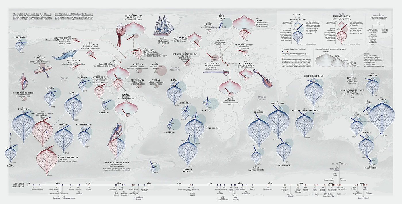
Map of Remote and Literary Islands
The visualization shows a collection of 60 islands, 30 remote islands and 30 literary islands. The first category includes the locations mentioned in the volume Atlas of Remote Islands: Fifty Islands I Have Never Set Foot On and Never Will, written by Judith Schalansky. For the category of literary islands the first 30 books (and the relative islands in which they are set) have been selected in the ranking "Books Set on the Islands", published on goodreads.com.
Designed in collaboration with Francesco Majno
Sources: Judith Schalansky, Atlas of Remote Islands: Fifty Islands I Have Never Set Foot On and Never Will; goodreads.com; britannica.com; www.distancecalculator.net
🎐 Instagram: federicafragapane
🔖 Twitter: fedfragapane


