


SILKY SAW SELECTOR
Case Study


Project Summary
The Silky Saw Selector helps a user discover the saws developed for their specific situation, while educating them on why that choice is perfect for them. It helps makes sense of a large inventory when the differences aren’t easy to see.


Over 120 saws to choose from!

Current Problems
The current inventory is too large and a user often gets confused in understanding the differences between the saws. In watching the analytics from our website, they often have tabs open from several different saws open and try to compare them. We also often get repeated questions on the chat page for major choices. We took those questions and created common scenarios from them.
User Interviews
While at fairs, we interacted with prospective customers. From these interviews, we ascertained that there not enough educational material in choosing a saw. Often, people chose based off brand recognition, but did not choose a saw suited for their work.
Pain Points:
- Website has many saws, too much choice with no explanation of the differences
- Search bar only works well if you already know the name of the saw you want
- Reliance on chat function for questions - can not find answer other places
Affinity Mapping
While the website is divided into groups based on user personas, through card sorting and affinity mapping, we divided the products into four main groups:
- Wood Saws
- Pole Saws
- Folding Saws
- Fixed Saws

Our final affinity map of saw families

Personas
Our personas were already developed from creating the website. We decided on separate entry points based on all the personas to skip as many clicks as possible. For instance: Outdoor users go straight to folding saws, as the outdoor/bushcrafter persona prioritize compact and lightweight saws.
Design Solutions
We came up with a few iterations of a Saw Selector, each choice whittling down the answers until the user was left with a single saw for them. In speaking with our back end designers, they said that to build this we could have two choices for each question. From this, we built a decision tree that ended on only one saw family.
User Flow
We created a user flow for each persona and adapted the questions and choices within the Saw Selector’s decision tree to direct them to the saws that were best developed for them. For example, an arborist is often sawing while climbing in a tree, this means he frequently saws many different kinds of wood and in positions above his shoulders and below his knees quite often. We minimized his clicks by directing him to the Zubat family as one of the first choices.


Decision tree blurred for privacy

Sketches of possible layouts

First a rough wireframe created in Adobe XD. From left to right : Desktop entry, desktop question page, desktop question page with informational blocks displayed, and desktop end result page, then mobile vertical entry page, mobile vertical question page, mobile vertical question page with informational blocks displayed, and finally mobile vertical end result page.

Visual Design
We had a brand style to work with, with specific colors of black and red. The Saw Selector helps a user get to the saw that is perfect for them, without relying on them to know the exact name of the saw family. The questions are short and to the point and each question is accompanied by an education info page. This informational page offers explanations to help a user understand the differences between a saw that are difficult to see to an uneducated eye. The end result page is packed with information on the saw that was chosen and specifically why it is the perfect saw for their situation. The information on the end result page is organized by importance, with the name of the family being the most important.

Mapping the visual hierarchy. Our highest priority items are raised and noted.

Prototype
We created first a design guide to show the style and cohesiveness of the design. In addition to this, we made a video showing the design, transitions, and some of the micro interactions of the saw selector to be as clear as possible when handing it off to the back end developers. We worked closely to make the experience as seamless as possible.
Prototype video created in After Effects

A few pages from the design sheet

Build and Asset Creation
While the developers were busy building the app, we went out to start collecting all the specific assets needed for every choice. We needed video clips for the choices, saw collection photos (Called “Saw Families”) for the end result page, and some supporting images for the informational pages.
We also worked on illustrations and educational video clips for the information pages that went alongside every question.

Assorted clips used in questions


A few of the supplementary images to the informational pages


An end result page for desktop, second iteration
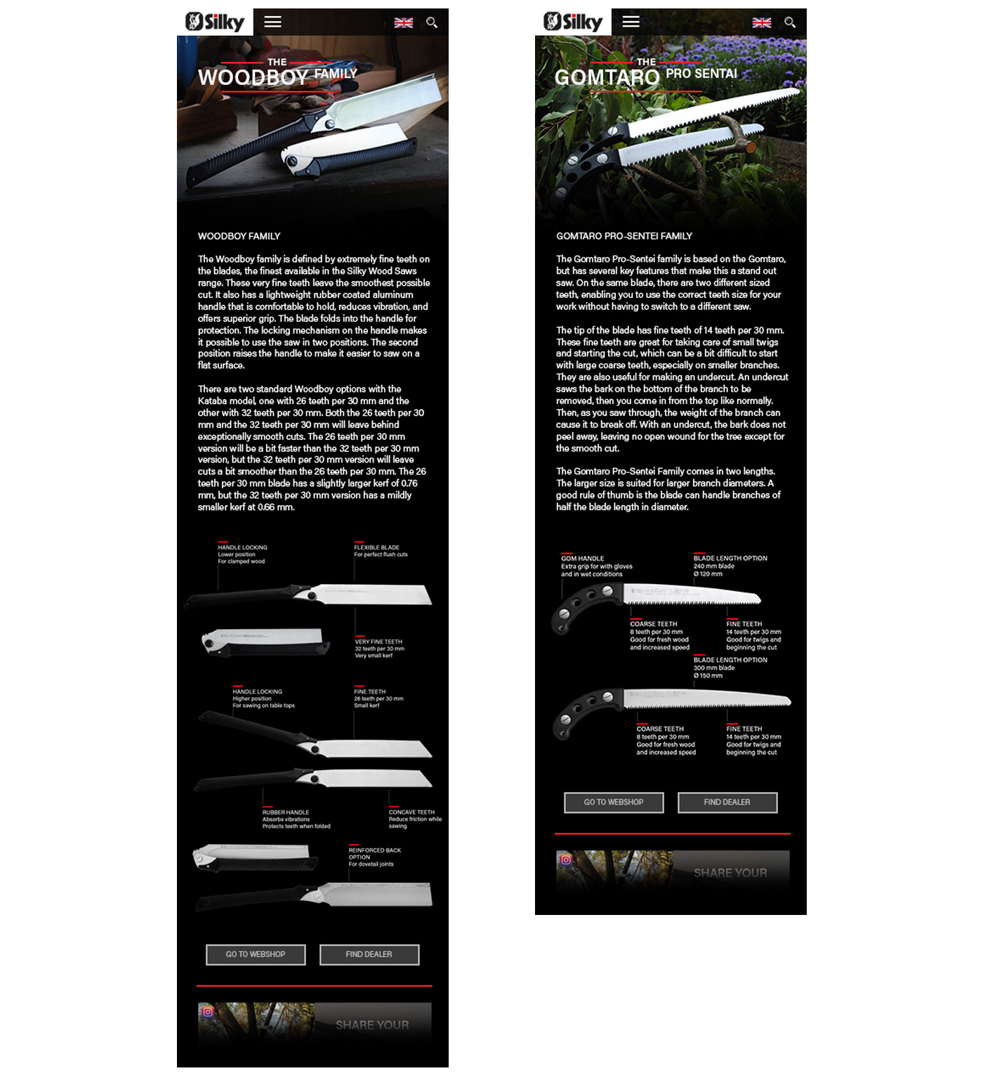
An end result page for mobile vertical, second iteration

Iterations
From our first testing, we realized we needed a way to give the importance to the dealers, rather than on our webshop, so we added a button to find a dealer immediately. We also discovered that the informational buttons were often not apparent enough. Some people missed seeing them entirely. We decided to raise the informational button in the visual hierarchy by making it grow and shrink softly after 3 seconds. This gives someone enough time to read, but if they are having trouble making a choice, the info button grabs their attention. We also realized that though we had four blocks for information, it worked better simplified to only one image and supporting text.
Conclusion
The Saw Selector has now been launched on the website. We learned immediately that many people are using it to discover the range that Silky has, as well as seeing what other saws are similar to what they already own. They are also sharing the end result page on social media to show to friends their choice and compare to what their friends have.
The most challenging part was creating the decision tree and optimizing it for our user personas. Many of the personas conflicted, so having the separate entry points helped minimize the amount of clicks needed.
In the future, we would like to translate the Saw Selector into Dutch, German, and French. We also look forward to seeing if the top path leads to our most popular saw families, and seeing if there are any undiscovered gems in our lines that we should start featuring more on social media. We also plan to see how many clicks the average user goes through before they leave and further minimize the tree to be below that number. Most choices are within 5 clicks, but the maximum path is at 10 clicks.


