

A serene, luxe and evocative identity for Atlas Apothecary, a range of organic skincare products inspired by scents from around the world.
____________________
____________________
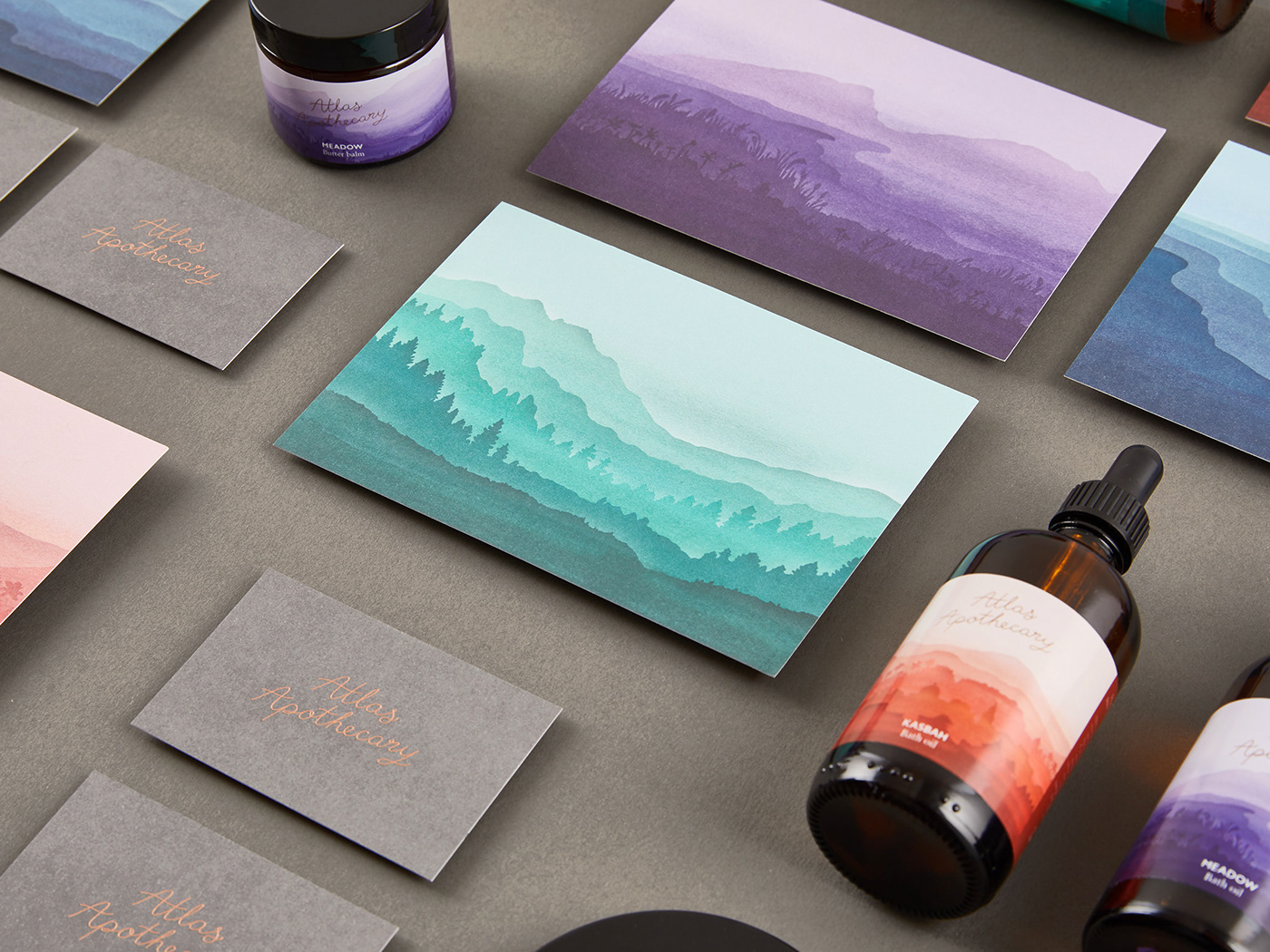
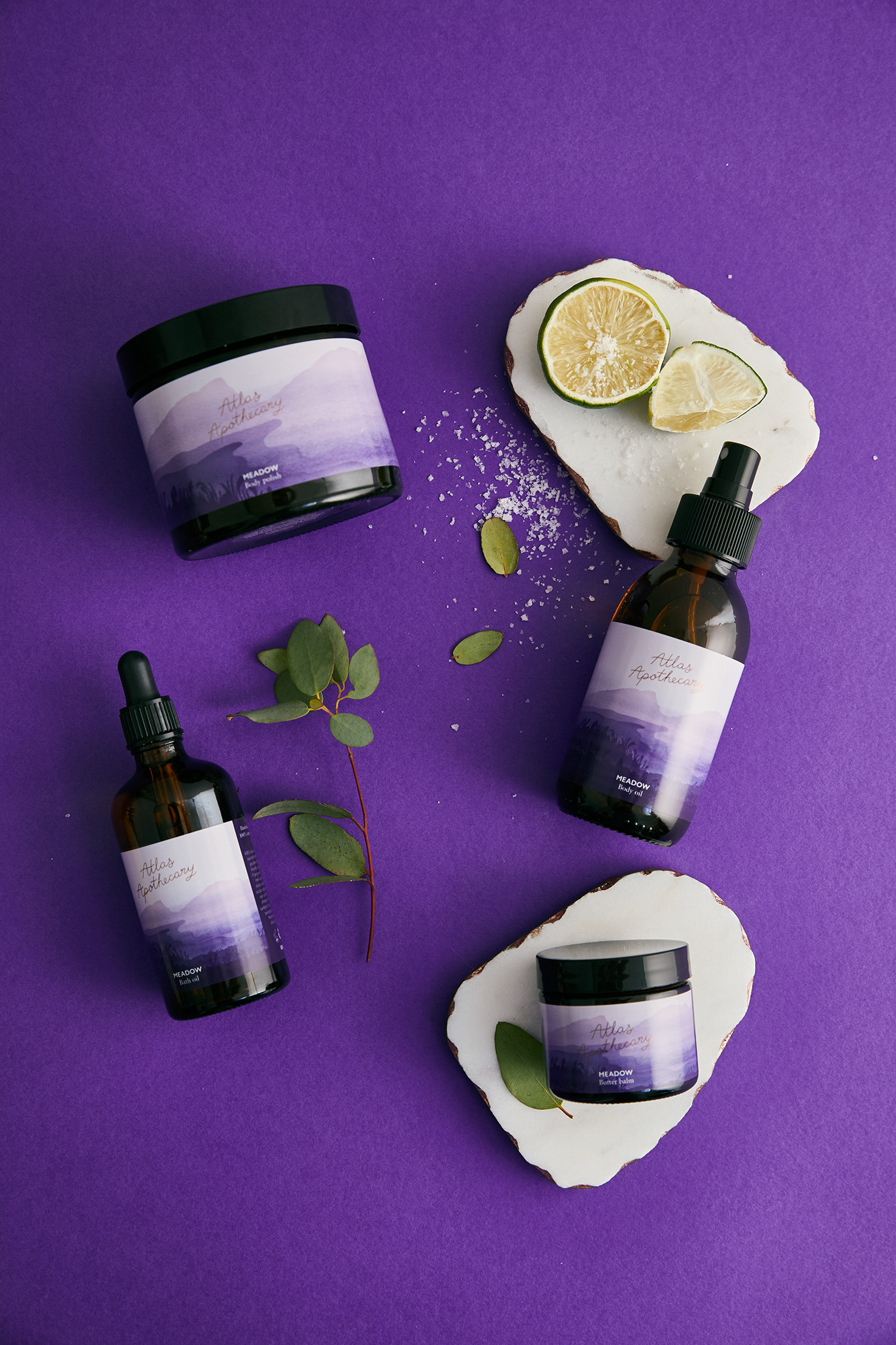
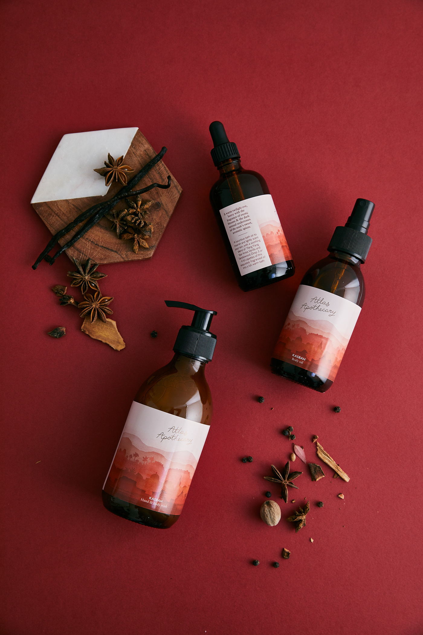
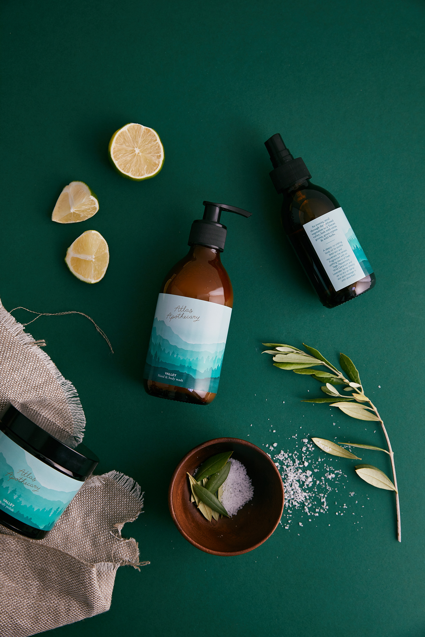
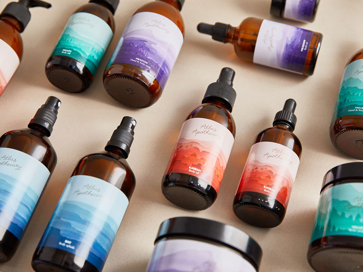
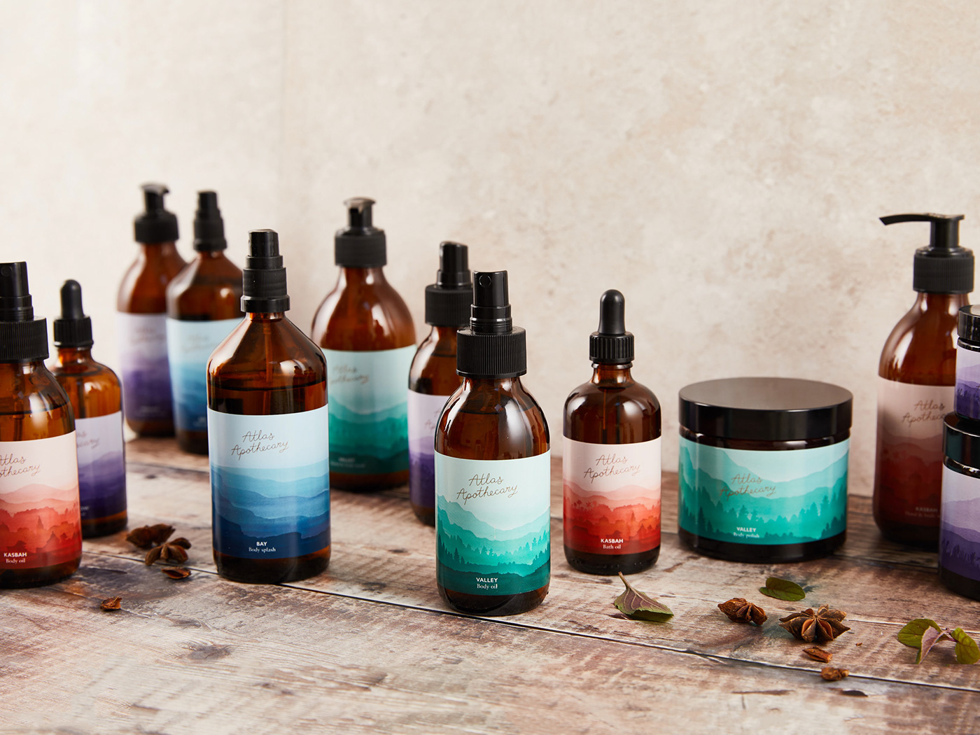
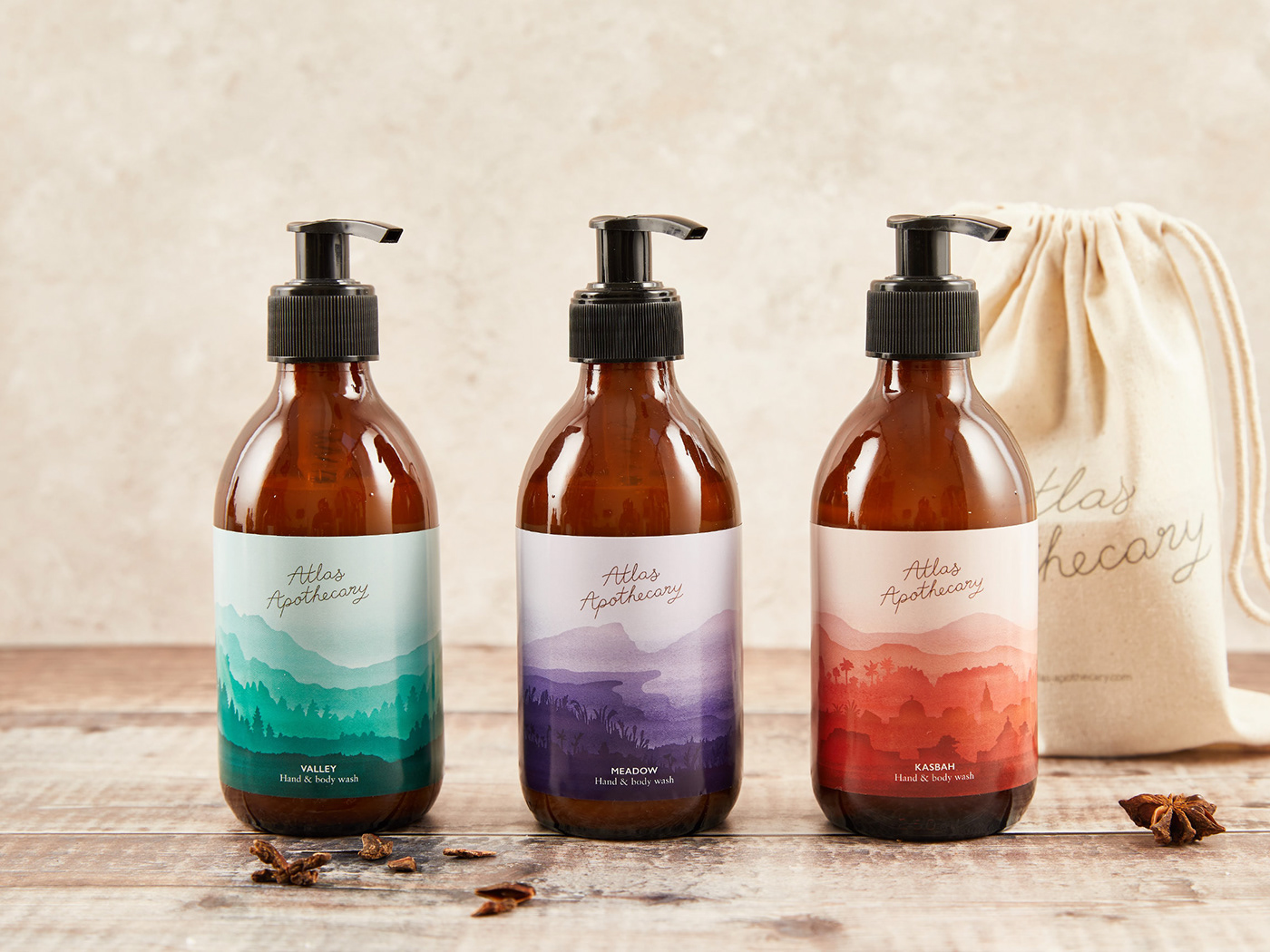
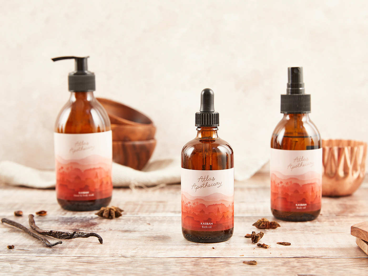
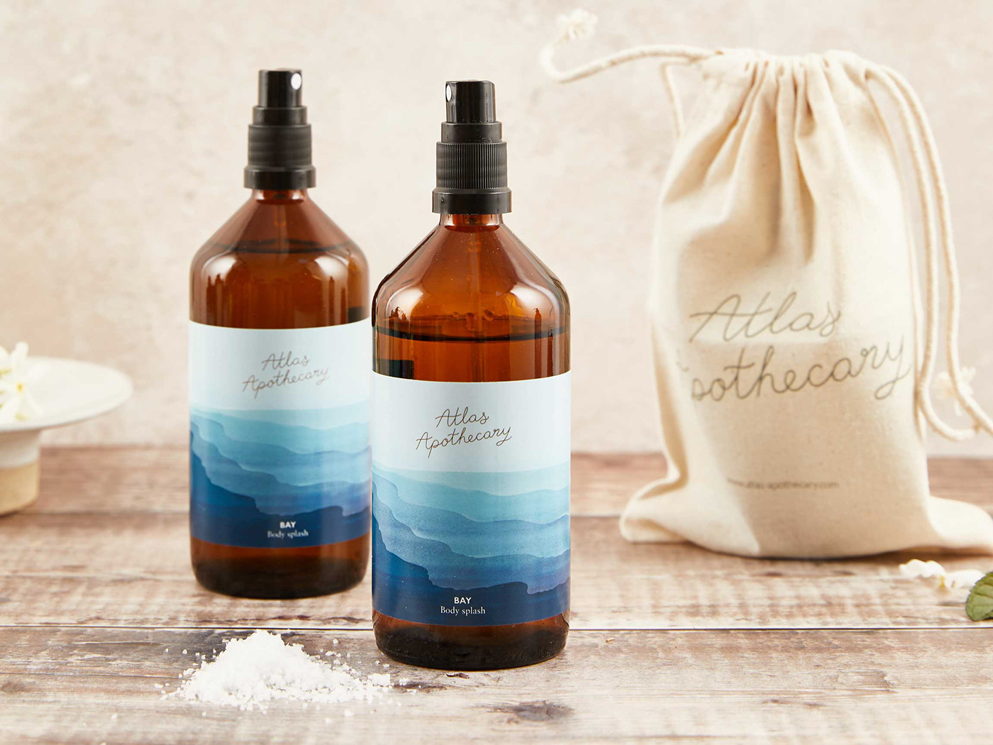
When designing the brand’s all-important shelf presence, ombre watercolour landscapes set the scene. With traditional apothecary-style amber bottles linking back to the natural science behind the skincare and jewelled tones giving off a rich, vibrant feel.
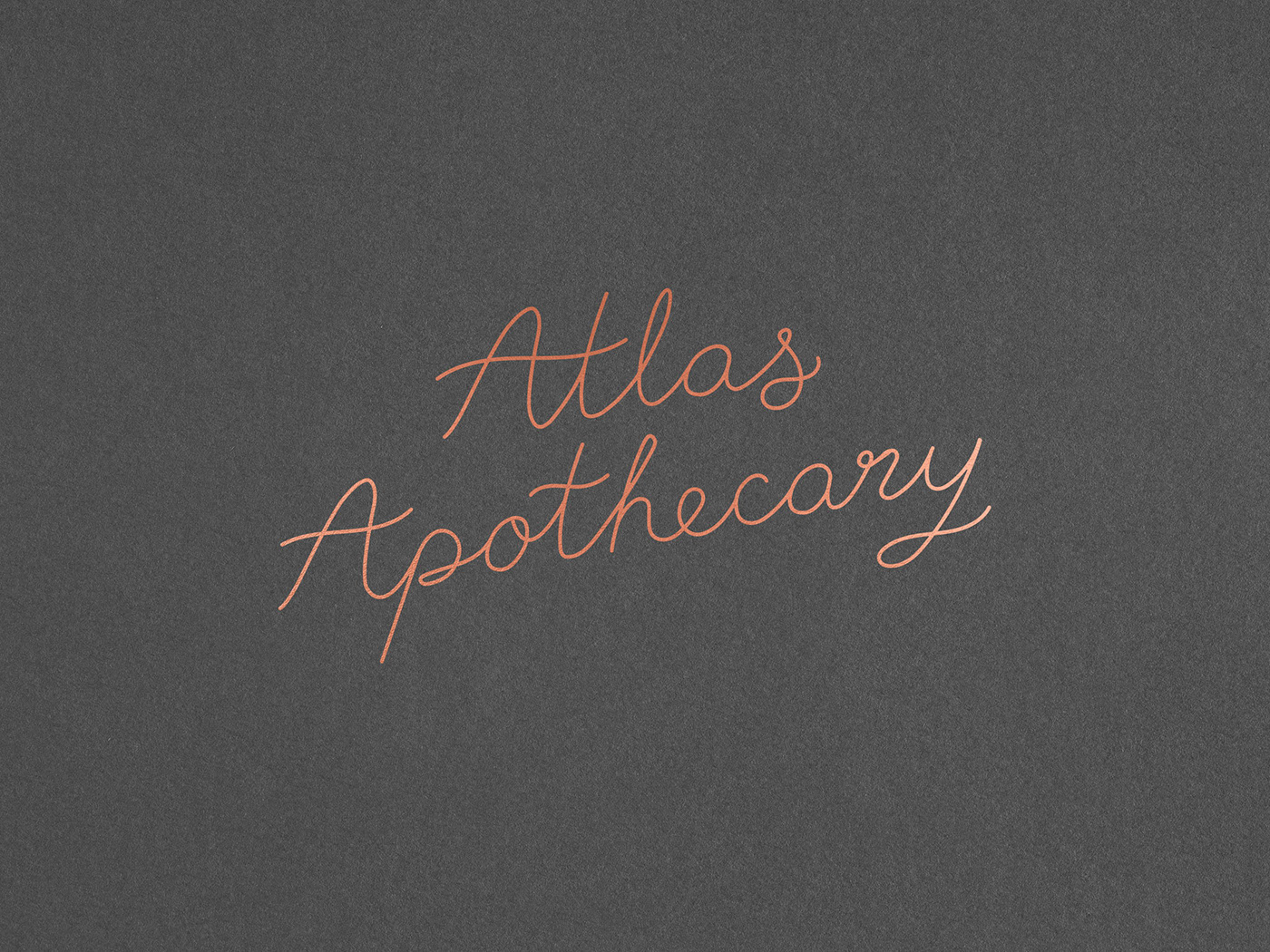
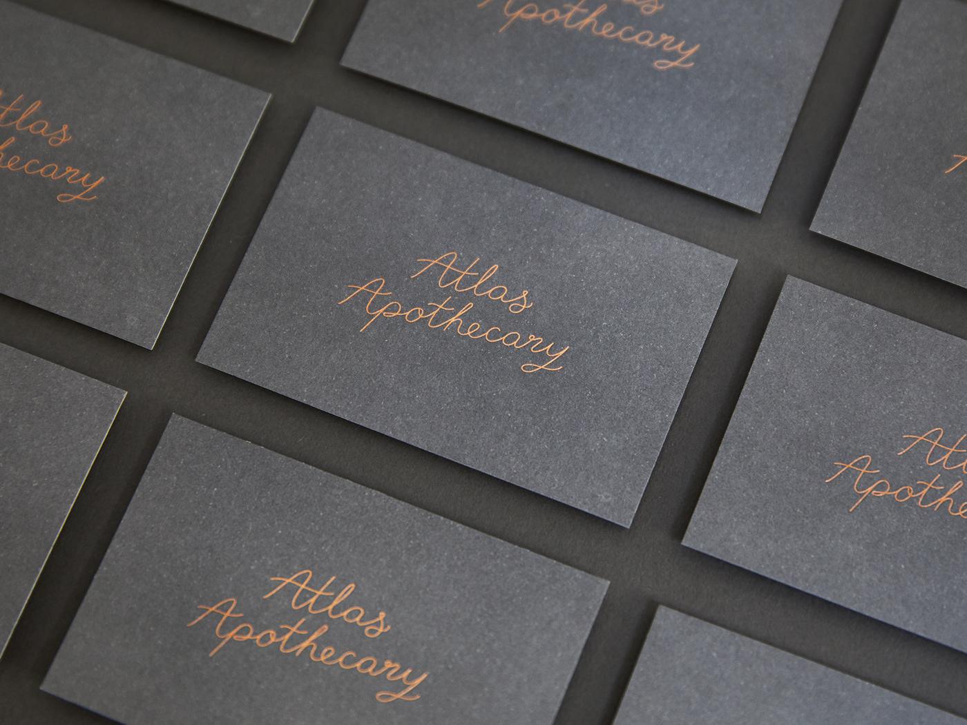
A hand-drawn logo adds a flash of metallic copper and a personal touch. Keeping the overall look simple yet effective, much like the natural plant oils at the heart of the range. Using nothing but natural ingredients, the Atlas Apothecary collection is lovingly handmade in the UK.
As the collection takes you from an evening stroll through a Tuscan ‘Valley’ to the fresh daybreak dew of the ‘Bay’ - each fragrance transports you in an instant. From a tranquil amethyst ‘Meadow’ to the sensual ruby ‘Kasbah’ - each series within the collection takes on a hue and name to reflect the mood of its blend. A feeling of calm, beautiful therapy runs through the entire range as it appeals to both the senses and the soul.


