Before we started this project, we were made familiar with the 51% childhood obesity rate in Rosedale. We were informed of the efforts to remedy the situation, as well as programs like the Healthy Kids Initiative.
Our first idea was based on the notion that the students don’t have access to healthy food in their cafeteria. So we developed a concept that would change the school lunch standards and introduce healthier foods to their environment.
Before we had an opportunity to visit the school, we speculated what the cafeteria could look like in an ideal situation. The cafeteria would be lit to make the healthier items look more appetizing, with a strategic lunch line sequence to make the students choose healthier options before they even see their entree. This is an idea that stuck with us throughout the project.
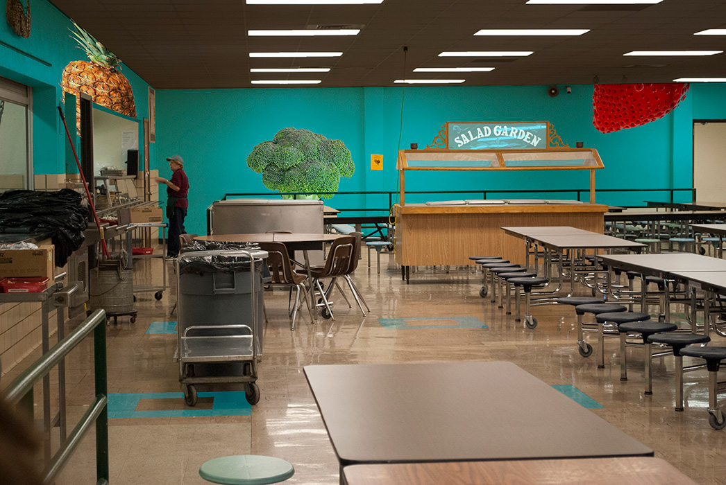
When we visited the middle school, we observed some things that changed our outlook on the project. The menu items weren’t as unhealthy as they seemed on paper, and the school’s enthusiasm about healthier habits was noticeable. This caused us to change our project a bit, and base our concept around utilizing the options they already have, instead of introducing a whole new menu.
Our solution to reinforce these healthy habits is, in a nutshell, an environmental redesign. Our components consist of: a lunch line reversal, a new look for the cafeteria, and a menu with healthy items renamed to be more appealing.
The simplest change, by far, is to reverse the way the students go through the lunch line. Instead of starting with a carb-heavy entree and glossing over the rest of the options, we enforce the opposite perspective where the students will start by loading up on a-la-carte items like vegetables and fruits, and then get to their entrees at the end. Simply being exposed to a different way of filling their trays will get them to more carefully consider the choices they make.
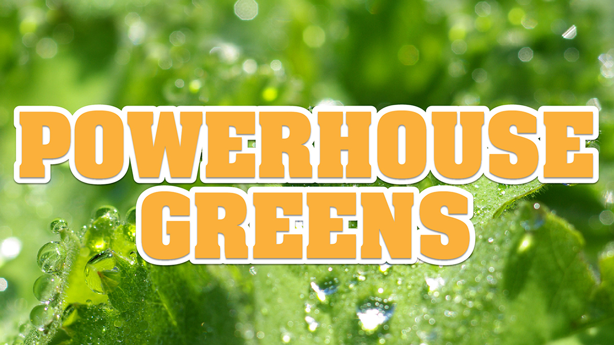
Another aspect in the cafteria redesign is replacing the laminated wall menu, which was not up to date when we visited, in the cafeteria with a large display showing the day’s menu items in a slideshow format. Using appetizing photos and lively typography adds a sense of sophistication to the space, which conveys a more uplifting feeling to the formerly drab cafeteria. In a study by Cornell University’s Food & Brand Lab, it was found that simply renaming and branding the fruits and vegetables in a school cafeteria nearly doubled the consumption of healthy foods. Attractive names are a great way to sell healthy food to kids. So, with that knowledge, we’ve renamed the healthier items at Rosedale Middle School to be fun and engaging. The names also let the students know the health benefits of each item, making them aware of the reason why these are healthy for them.
When we visited the Rosedale Middle School cafeteria, it was beige. Floor-to-ceiling beige, and a sterile, metal lunch line. Our redesign adds a friendly, more sophisticated feel, with wood paneling on the lunch line, energetic color scheme, and fruit and vegetable decals on the walls.
The whole point of this project is to influence the choices that kids make so they can have healthier lives. Our ultimate goal would be to lower the Rosedale obesity rate, and every meal counts.
Student work from the Kansas City Art Institute, Fall 2012.
This project won a Design Ignites Change Idea Award in February 2013 and was nominated for Cooper-Hewitt's People's Design Award in August 2013.