


SIMCUP is a contest about medical simulation, that takes place in Novara, Italy, created by Pierluigi Ingrassia e Luca Carenzo, medical emergency and simulation experts. The event was also supported by the UPO (Università del Piemonte Orientale). After 3 editions, they decided to give an identity to the contest itself and to other contests derivated form SIMCUP.
The social mission of this event is to comunicate the importance of practice medicine on simulators before touch a real patient, reducing the risk for the patients and doctors.
The objective of this project was to give a strong identity to the event, give an easy personality to comunicate also that this contest is based on "learn by doing", leaving behind the stress and the "school" pressure (having fun), and at the same time, make it a "must do" for the Universities.
The words I used to arrive to the main concept were:
simulation= to emulate> to repeat> repeat a process> vibration (the repetition of a pattern)> waves (repeat a pattern) >water movement with sound/music> circles patterns.
After several tests with this concept, we choose the final logo, thinking also on make this contest became "The Olympic Games" of Simulation (and this graphic option has a sort of Olympic circles) so it close the circle.
This circles are different between them to give the idea of multidisciplinary work (as the uniforms at hospital) and the movement: the visual trick with the strokes, some of them seems to be closer or distant. They are together as a team, they are five as the members of each team at the contest.
I use a rounded font to match with the rest of the circles, but with a nice readability, it has also 2 different styles (slab & sans) that gives a clear difference between the both part of words that complete the name.
Almost all graphics and elements that support the entire 2018 event identity are based on the circles, the colours and number 5 (like pentagon).
SIMCUP logo

Squared version

Horizontal version
SpeakUP corner
It was created a small type identification for the specialist who speak about interesting topics around simulation. This was named "corner" and we use a "SpeakUPcorner" identification.

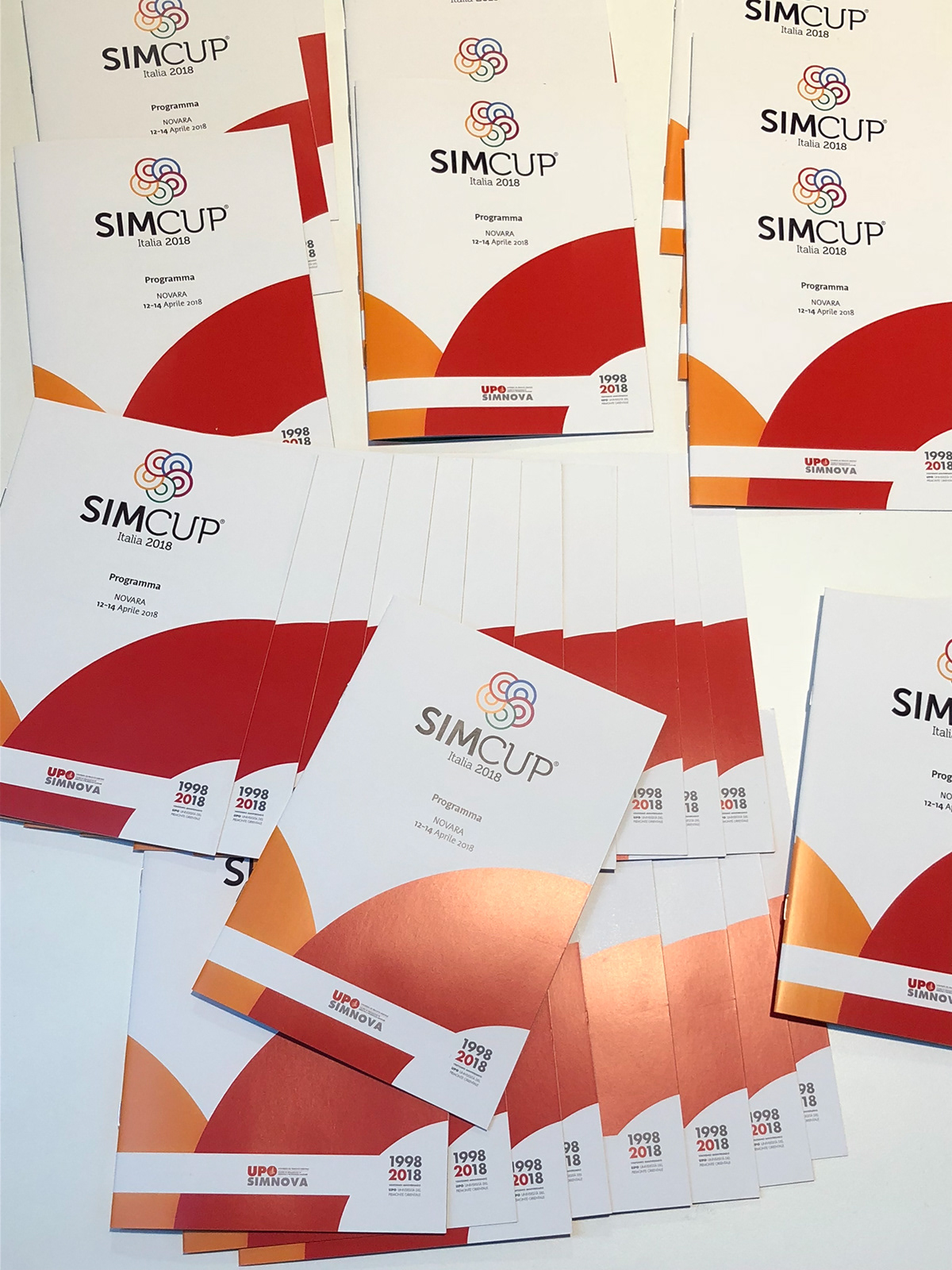
Program view: browse pages
Collaterals
For the event, were created:
A program as a guide inside of the event, hours, auditoriums, etc.
Badges
Ambient graphics, such as floor stickers, banners, rollups, totems, polystyrene laser cut logo.
There were also created screens for the keynote and the big opening.


