Theater National of Toulouse – Visual identity
DESIGN GUIDELINES
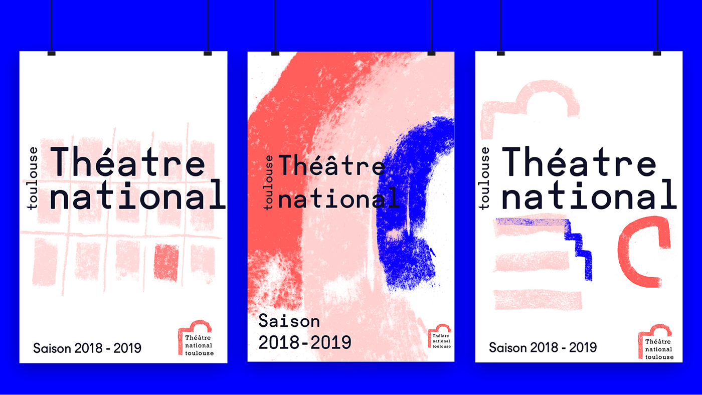
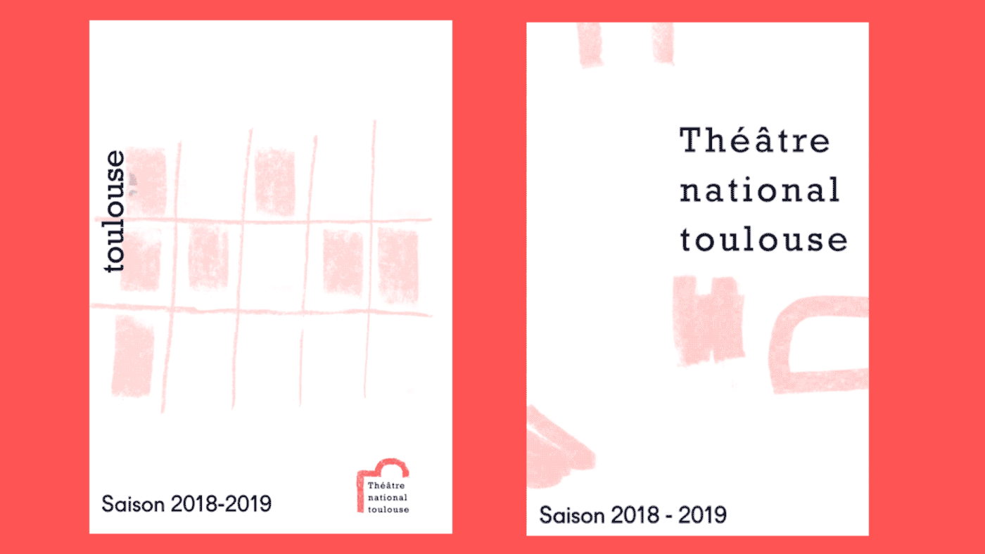
Typography: we had to select two typography: The Rockwell with wheelbase that refers to buildings bricks and the fugue because of its recent aspect. These two typography are a mix of the old and modern one.
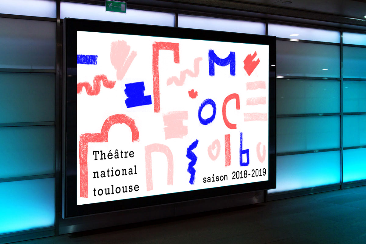
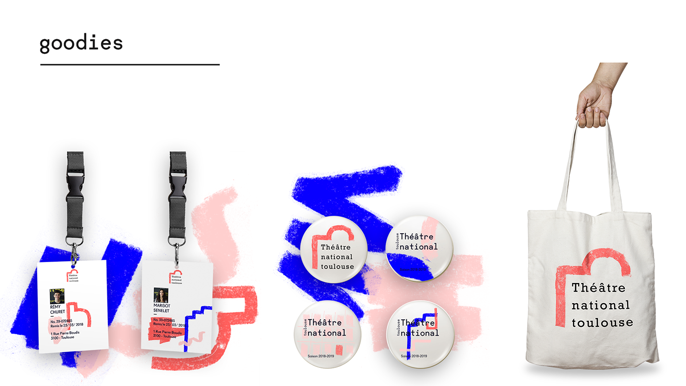
Color: We chose three colours: two tint of pink referring to the city of Toulouse, the blue for the typical theater piece named blue.
Logo: After many drafts and sketchs with chalk, one is catching our attention with some very fascinating shapes.
-
CONCEPTION
After analyzing our logo process, we decided to focus mainly on the architecture to design our logo, mixing between material forge and with a contrast between the old and modern one, with a final addition of colors and shapes.