

These images above show my understanding of modern typography. I created my own typeface using Origami as inspiration. Not only did I hand-make each individual alphabet letter, I also digitalised them using a unique website. These designs incorporated a standard alarm clock font, origami style and regular shapes. I found this topic very inspiring and creative.

Here I have experiemented with gold effect ink pads. I was using the themes of tradition, age, history and vintage to create effect over both pages of my sketch book. I used both the negative and positive results to create several outcomes. I also played around with outlines, colour and texture.
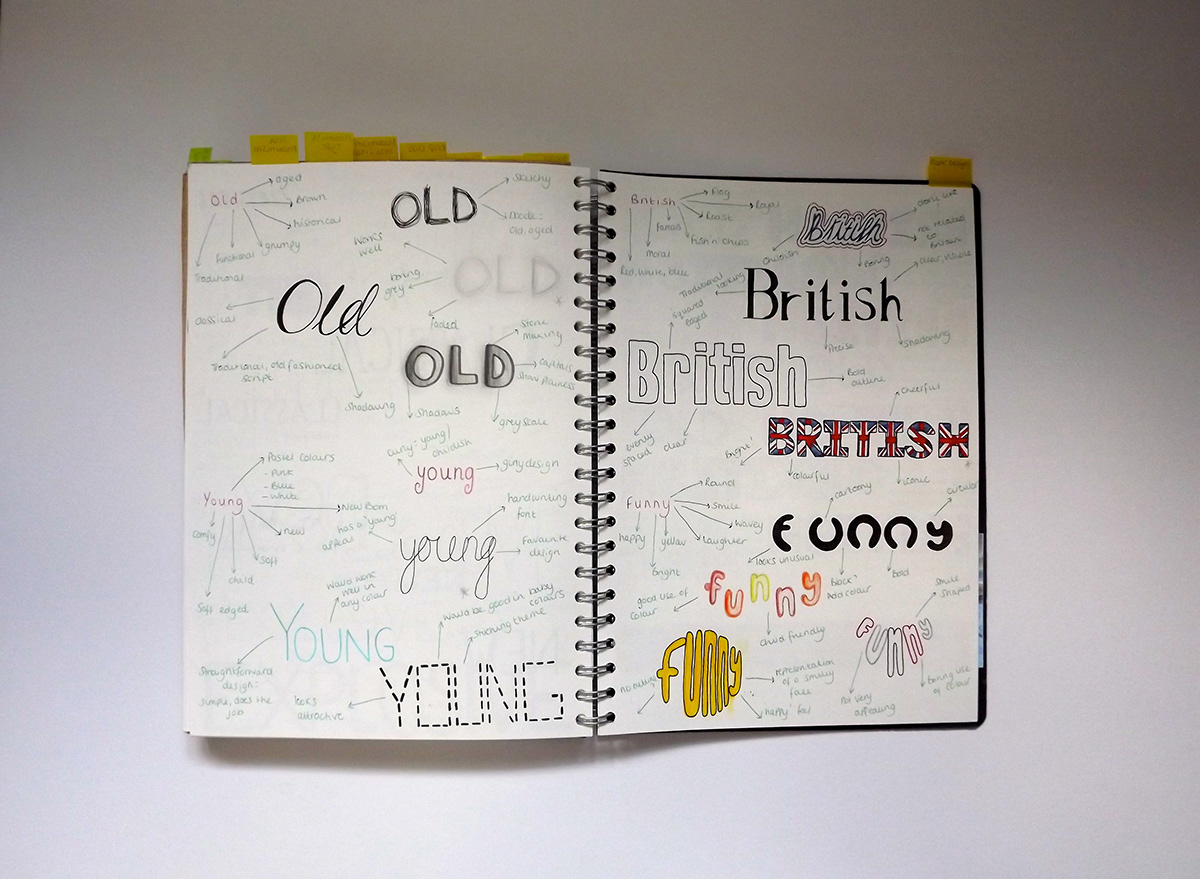

Here I have looked into Typography and how words can alter our thoughts and processes of design. I chose words to describe which I felt I could clearly communicate and represent. BRITISH and OLD were the two I selected and began working on designs for type. BRITISH used the theme of red, white and blue colour ways, symbolising the britishness theme, connecting with connotations of the word. I then experiemented with adding detailing into the type, using the flag image - but I found this to inhibit the style of the word, therefore just used these design as exploration.
I thought the word OLD would be quite easy to represent, but after initial thoughts and process ideas, I actually struggled to come up with innovate ways to portray this word! I used sketching and smudging to create effect and detailing around individual letterforms but also styled letters using bold, black outlines. I felt that this particular technique didnt successfully create the meaning I was after.

