The Last Drop
Branding, Art Direction, and packaging for perfume
Naming
"The Last Drop" is carried out in a radical way in our perfume, as we believe that this final breath should be represented by a single dose. For this reason, this perfume is intended to be used at the precise moment of death. When a person is about to die, it becomes the scent they want to pass away with, a choice made by themselves. With this, we aim to break the stigmas of death as something negative and view it as something natural.
Branding
With the branding of this perfume, our goal is to capture the utmost beauty and elegance of that final breath. That's why we have chosen a classic and contemporary style. We aim to emphasize the single dose concept by incorporating the representation of a drop within the letter "O" of "drop," creating an abstract connection. The design evokes the feeling of this last drop gracefully descending, adding a touch of visual allure.


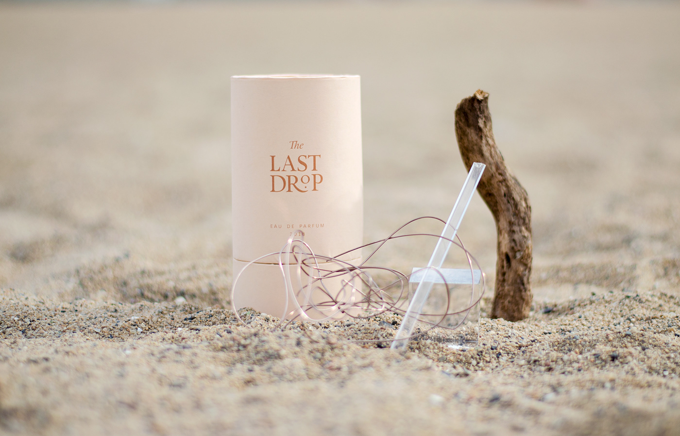
Packaging
The container enveloping the bottle showcases an organic shape that aligns with the overall project aesthetics. It takes the form of a divided cylinder, revealing the upper part upon opening—a captivating view of the glass vessel with the golden drop. This design allows us to appreciate the elegance of the glass and the allure of the golden essence. The exterior packaging prominently displays the brand, as the bottle itself is considered a work of art, devoid of a visible name or logo. Inside, a luxurious gold-colored paper lining reinforces the perfume's exclusivity, symbolizing the preciousness of the single golden dose housed within the glass.