

This is a rejected logo redesign for a restaurant owned by a friend. The old shop logo can be seen below for comparison as well as the process of the character design.
The concept for the logo is a simple mascot + lettermark taking advantage of colors that stimulate one's appetite for broiled pork belly.
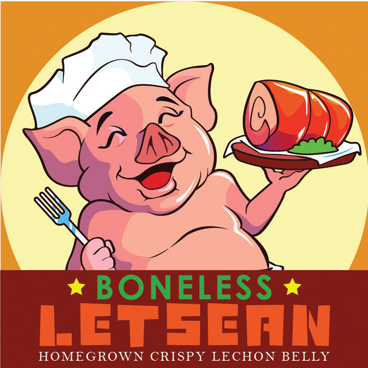
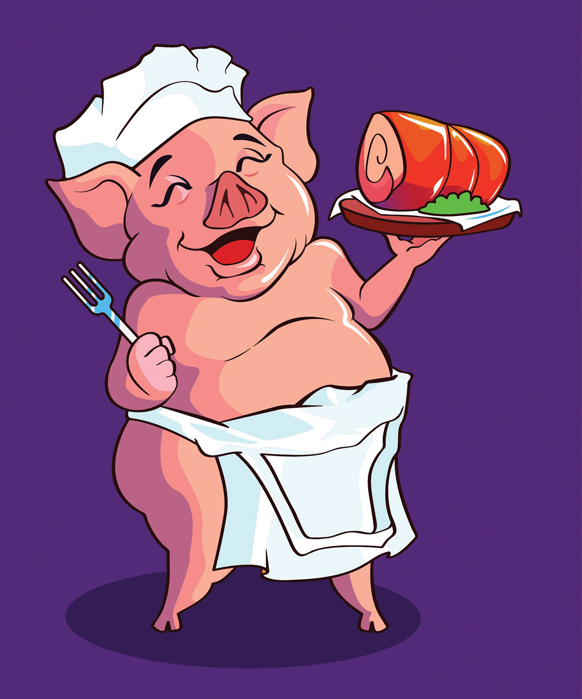

The image on the left is a variation supposedly created as a Profile Picture for social media. And on left is the old restaurant logo from which the elements and themes of the new logo was taken.
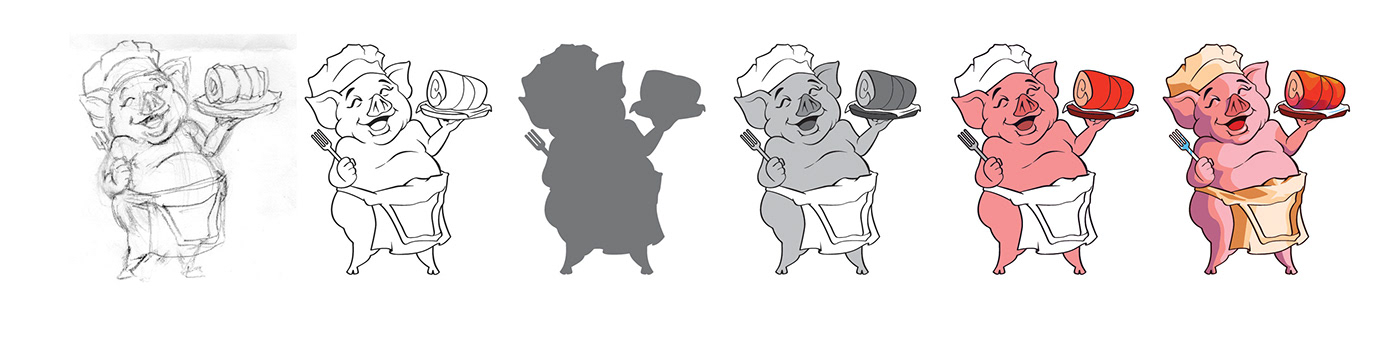
When creating a character, especially as a mascot, I always put careful consideration on how animated the character would look - I do my best to render it with as much personality as possible.
I use a straightforward method of pencil sketching the figure, then checking the line and silhouette before adding in the values in grayscale. After that, I try a bunch of colors as the base color then render it with shadows and highlights.

As a final step I check the character's contrast by placing it on a white, gray, and black background to make sure the image stands out.


