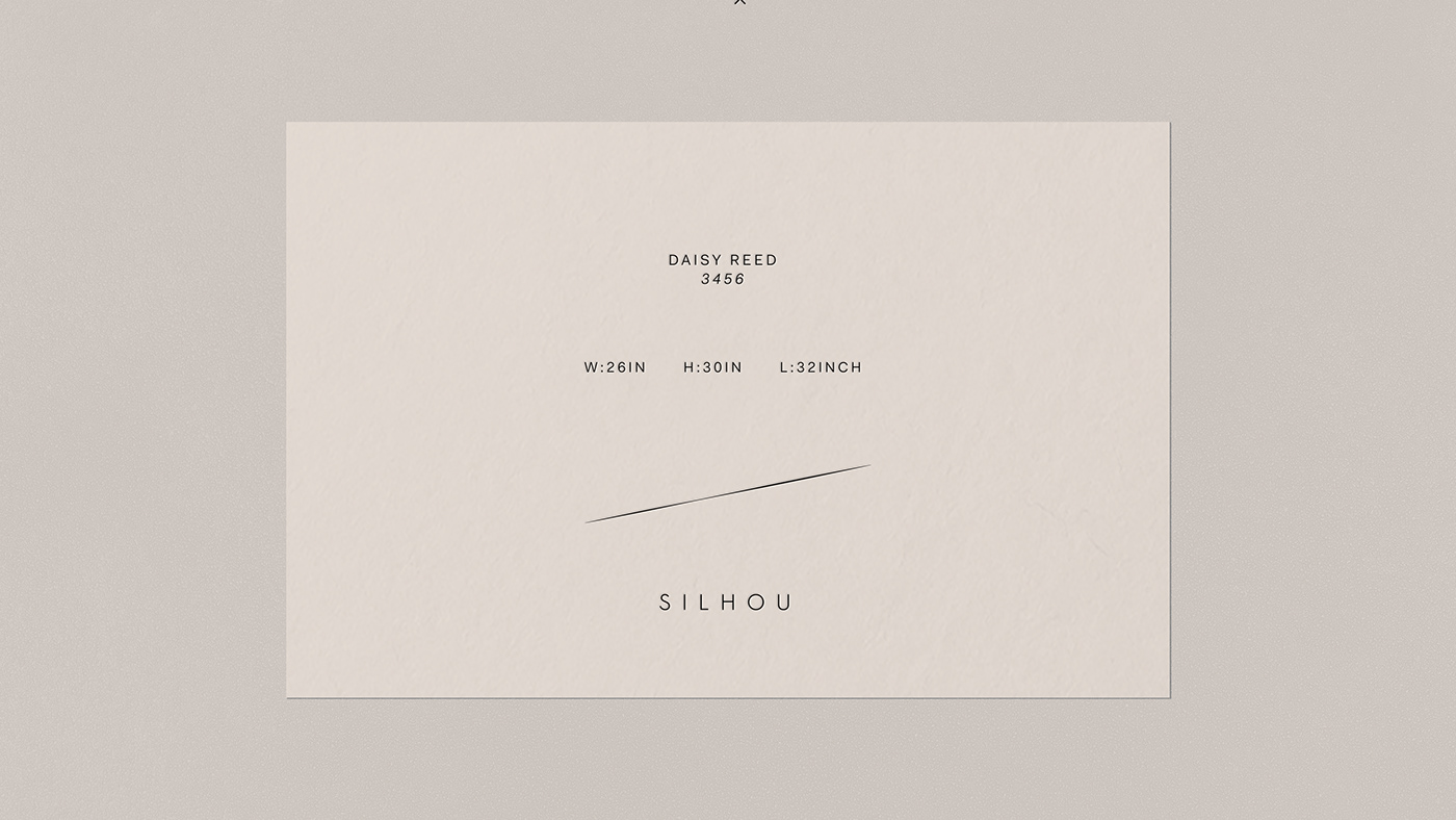
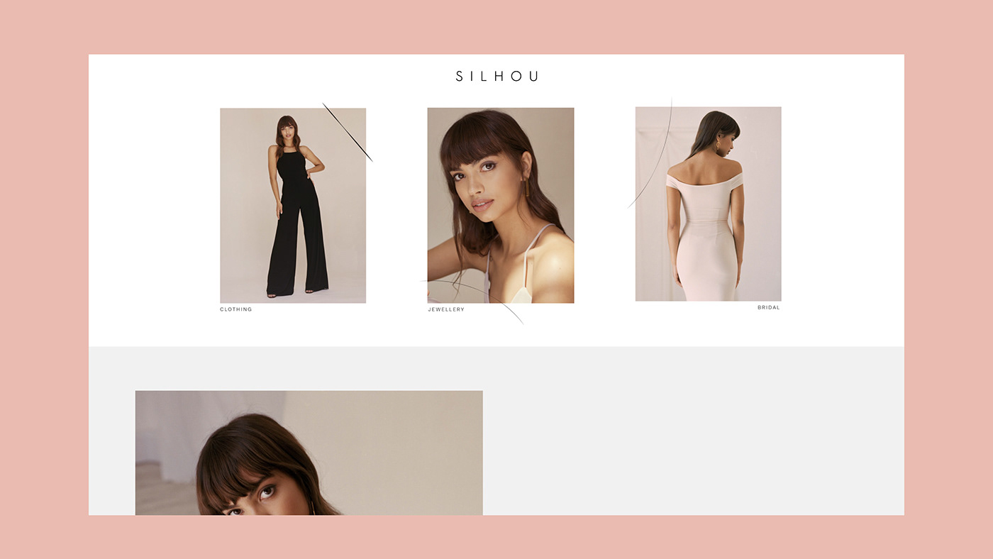
Tailoring is at the heart of Silhou, for the new brand we drew on the tailoring craft as our main source of concept and inspiration. Creating a brand identity that is firmly aligned with Silhou's vision.
A bespoke typeface was created that feels elegant, elongated and minimal. Unique forms that arch around assets, and bold strikes that frame assets create an interesting graphic dimension to the brand, these forms were created by tracing over tailor marks commonly seen on pattern cuttings and on garments before they have been tailored to fit. The secondary element to the brand is that of the dot and cross forms, these graphic motifs are taken from dot and cross paper used by tailors when drawing patterns. A tonal colour palette was developed to reference the hues commonly found in skin tones, creating a brand that is truly connected to every individual.
www.silhou.com