gigo—douro wine
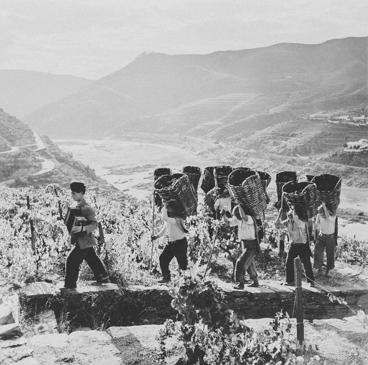
Winemaker Casal de Ventozela commissioned us an identity and label for its new venture: a bold and modern wine brand grounded on the Douro legacy. Douro is a wine region centred on the Douro River in the north-eastern part of Portugal.
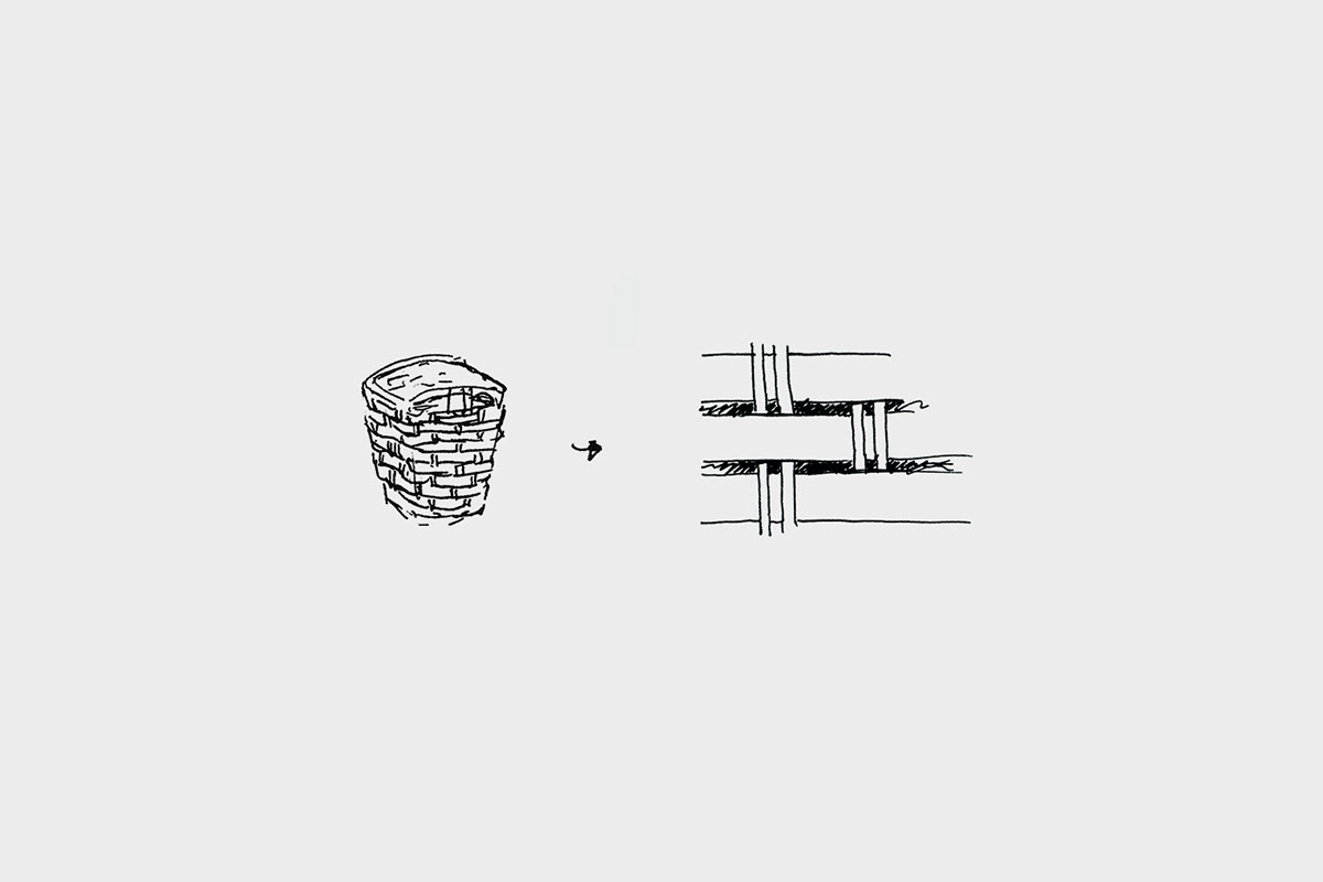
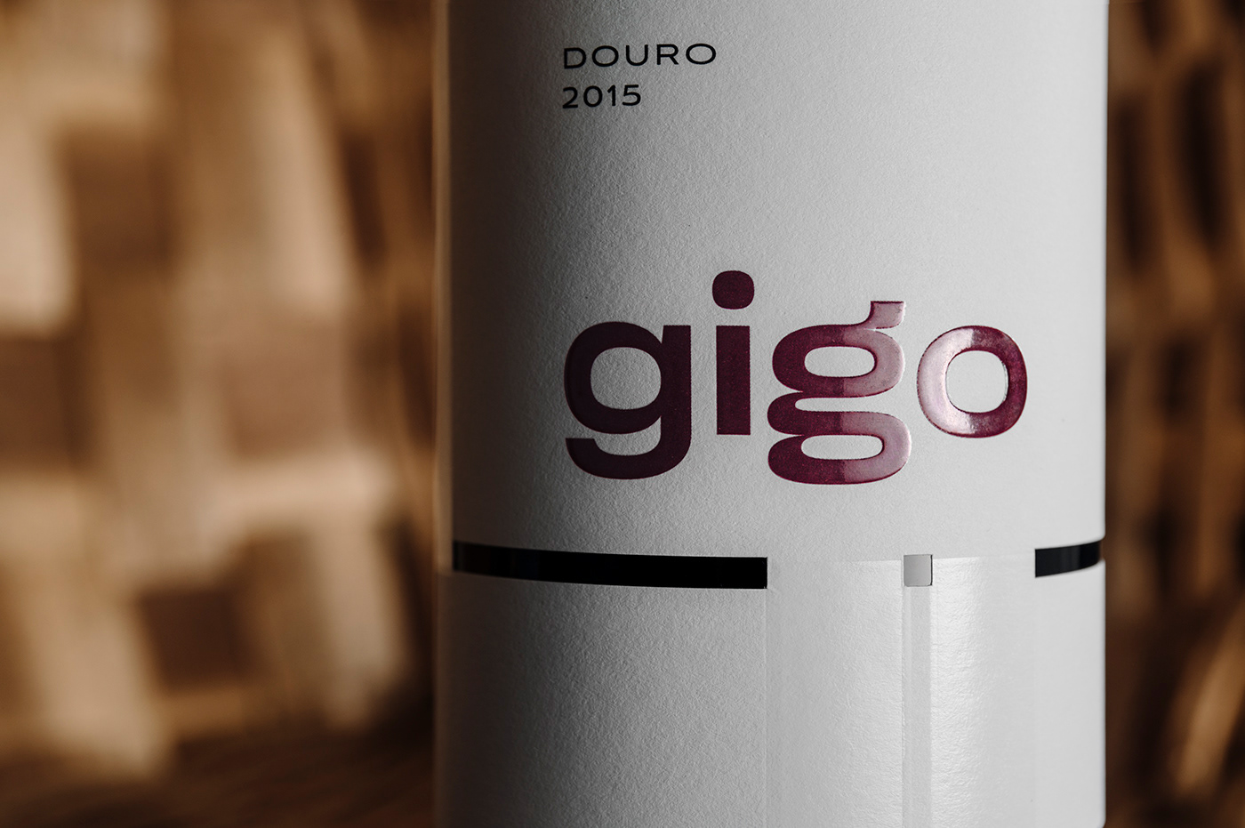
Naming it gigo—the iconic harvesting basket—already brought to mind all the Douro’s old traditions. To preserve this imaginary, we designed the label as an abstract representation of gigo, itself. The weave pattern served as the base for the label composition where the die-cut and transparent foil further enhance the interweaving recognition and perceived quality of the product. The use of two different letters g (a double-story and single-story) offers a singular and memorable quality to the wordmark, and the choice of the wide grotesk font gives it a bolder character.