


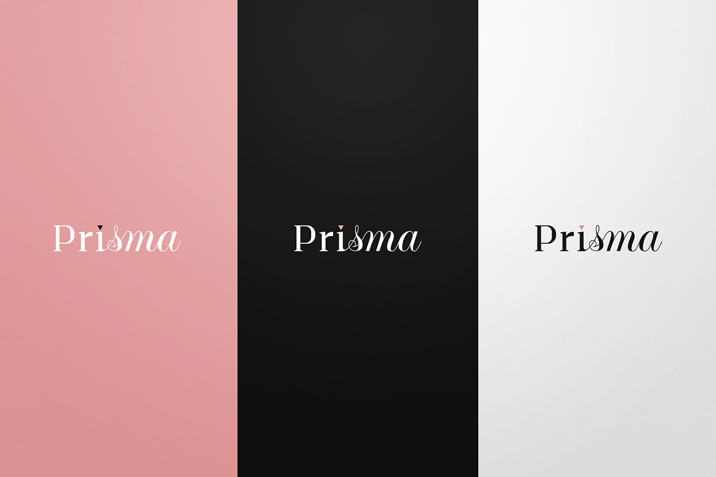
A white light passing through a prism turns into a multi-colored projection. By this concept Prisma (prism in PT-BR) defines its name, since its purpose is to cause a transformation of the image of its clients.
Prisma is a creative branding agency for artists and public people, directing the market positioning of each through social media, clothing, publicity materials, shows, presentations and so on.
We had the challenge of creating a visual identity based on this concept. Through the combination between two different font families (serif and cursive). We found a way to represent the change that happens when customers go through Prisma.
A texture based on the triangle (2D symbol for prism) has also been developed, which has a support function. The brand reinforces these characteristics, making them more evident. With it, we have developed printed and digital materials for the brand.


