

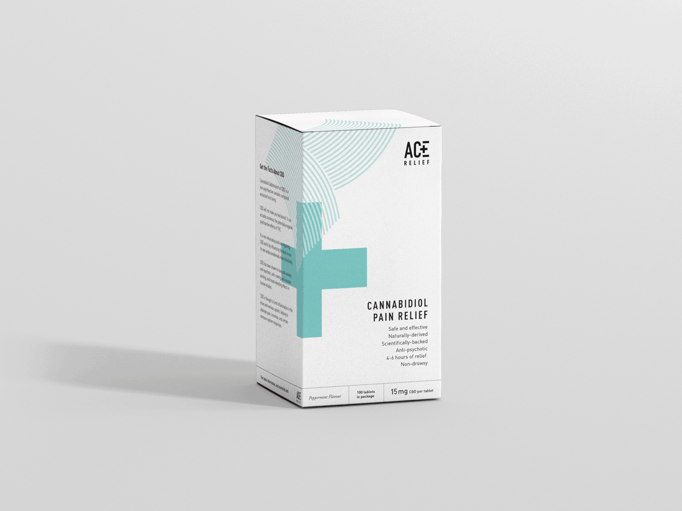
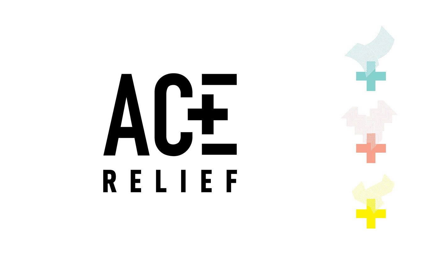
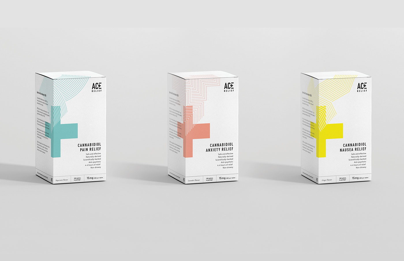
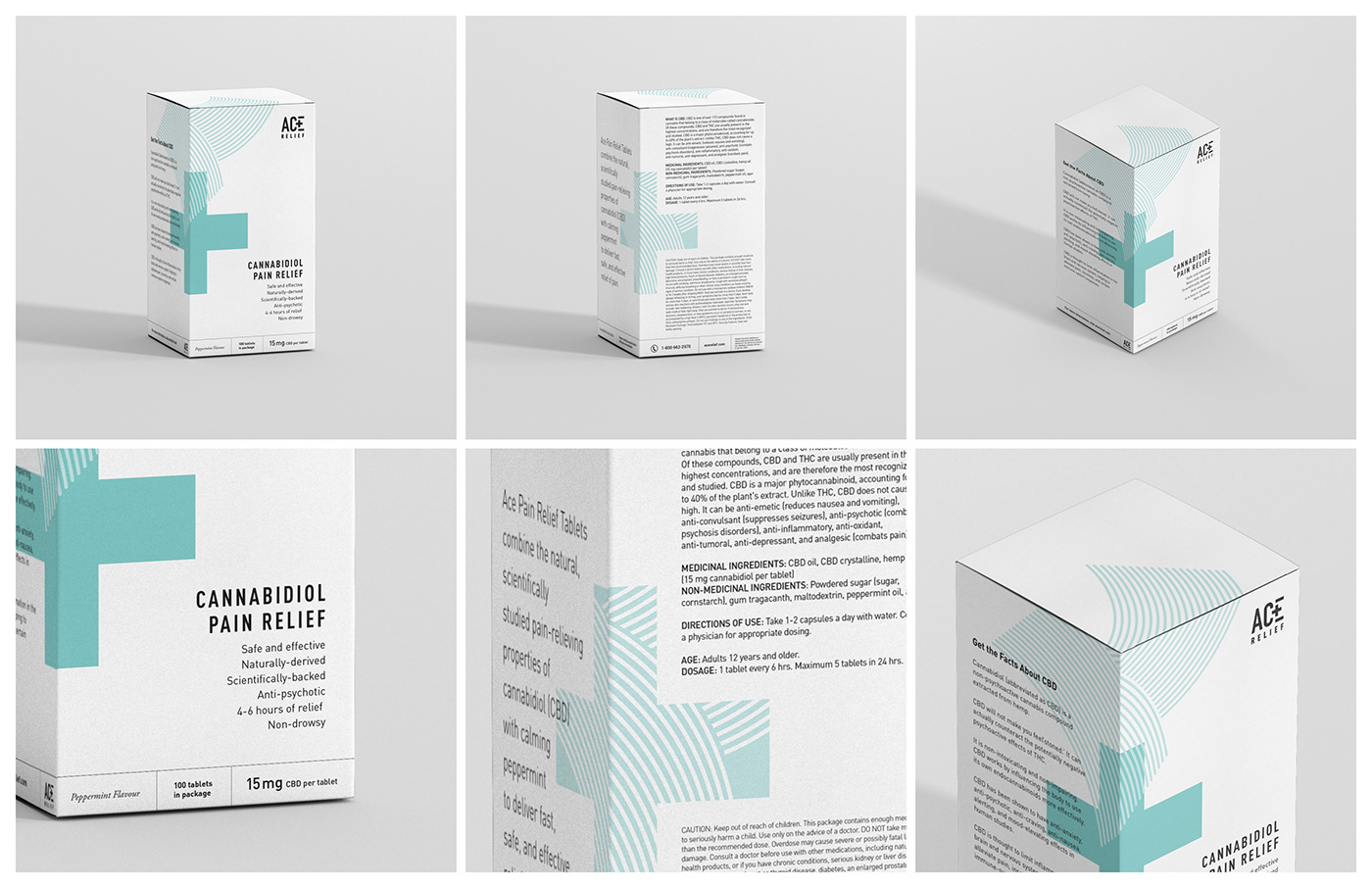
For a branding class, my challenge was to brand and package CBD tablets that would compete alongside medications like Advil, appealing to an older, more conservative audience while remaining contemporary. Abstract geometric patterns that correspond to the product benefits extend over corners of the package, guiding the eye, while a cheerful palette softens the bold, technical-feeling typography. Generous white space and an asymmetrical grid help Ace Relief stand out against its competitors as medicinal yet modern, trustworthy yet innovative.
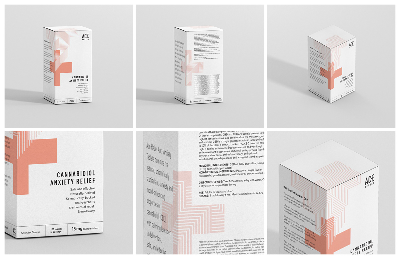
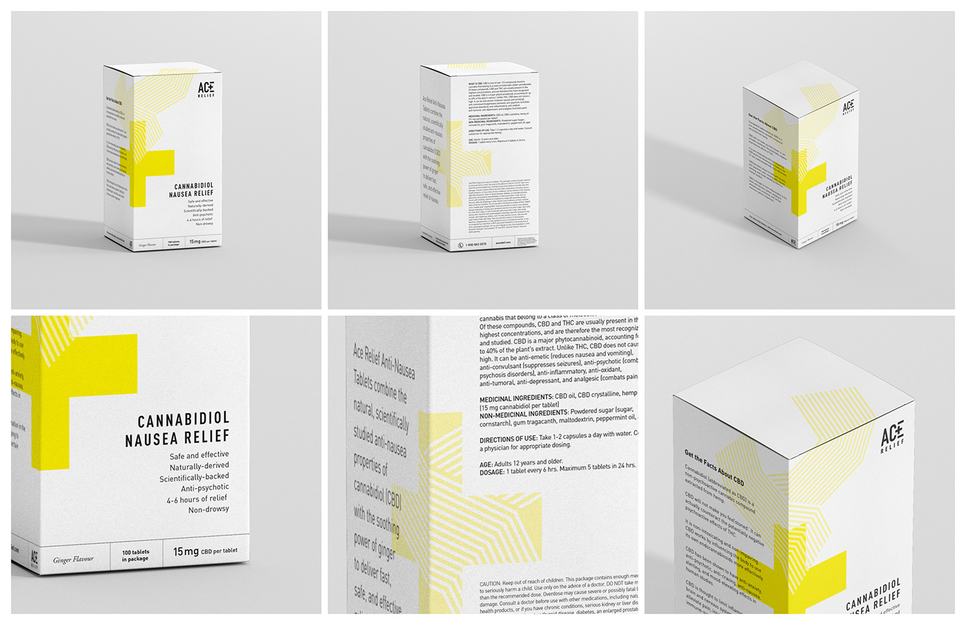
Created for a branding class at the IDEA School of Design, Capilano University


