


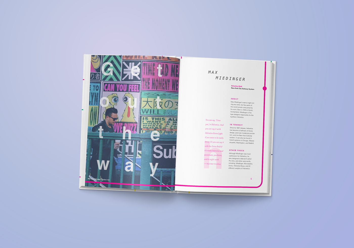
A book on typefaces in wayfinding and transit signage systems around the world. I wrote, typeset, and designed the entire book. The lefthand page of each spread displays a phrase you might hear while in transit in each place, along with a translation captioned in the bottom left corner. The cover design and interior layout was inspired by the visual language common to many subway systems. The choice of Menlo in the headers references the monospaced type found on many transit and rail tickets.


Created for a typography class at the IDEA School of Design, Capilano University. Published using Blurb.ca


