


I’m going to walk you through my design process from beginning to end. Starting with my thoughts on the current Exodus design and what things I feel could be improved. Then a walkthrough of the user experience in each of my screens, followed by a breakdown of the reasoning behind my changes.
PORTFOLIO
CURRENT DESIGN

What Could Be Improved
• As the main area dedicated to showing the user the total value of their crypto assets, it feels a bit trapped in between the logo and the Portfolio navigation link.
• At first glance it would seem like a good idea to have a pie chart for displaying a visual breakdown of which assets make up the users portfolio, broken down by percentages of value. The problem is that there is almost no way knowing which pie piece goes to which crypto asset unless the user memorizes the exact shade of every color for each asset that they own. Another issue is that the pie chart itself doesn’t actually provide much value that can’t be found in the lower area among the more detailed asset breakdown.
• The spacing of the navigation could be improved. There isn’t a good reason to have a gap in between the top 4 navigation items (Portfolio, Wallet, Exchange, Backup) and the bottom 2 navigation items (Settings, Help). Especially when the spacing between the top navigation item and the total wallet value is already too tight.
• This area is extremely valuable and it could be improved in a couple of important ways. First, the assets would make more sense if they were sorted sequentially from left to right, starting with the asset that holds the highest percentage within the wallet and ending with the asset with the lowest percentage. Assets with no value should automatically be hidden from view. Second, each asset would be more visually pleasing and quicker to locate if the logo was included among the details provided.
MY REDESIGN

The User Experience
1. This is the first screen that the user will see when they open the wallet.
2. A user with previous experience in the Exodus user interface will notice some big changes, among them will be the new horizontal navigation bar located at the bottom of the screen.
3. In the upper left, the user will always see the Exodus logo or any logo designated by the chosen theme. In the upper right, the user will always see the total value of their portfolio, calculated and displayed in their local currency.
4. The user will see each coin that they have in their wallet, which will be represented by a “Coin Card”. This card displays the coin logo, name, local currency value, and portfolio value percentage.
5. Each coin card is sorted sequentially from left to right and upper to lower, according to its portfolio value percentage.
6. When a mouse pointer hovers over a coin card, the border of that card will glow showing that it can be interacted with.
7. If the user clicks on a card, they will immediately open that coin’s wallet.
The Reasoning Behind My Changes
• Horizontal Navigation Bar - Even though many elements of my new design could be incorporated into the more traditional left-aligned navigation menu found in the current version of Exodus… I wanted to try something new and interesting. What I found is that this new navigation layout provides a large amount of horizontal screen space. Also, UI elements can now be aligned symmetrically from left to right, which provides a very clean and unique visual aesthetic.
• Upper Left Exodus/Theme Logo - Quite simply, the upper left corner is where the current Exodus/theme logo resides and I felt no good reason to change the location. I realigned the wordmark horizontally with the logo to give more vertical space which could be utilized by other elements throughout the overall design.
• Upper Right Total Portfolio Value - I felt that this location works really well for always displaying the user’s value because it is never distracted by other elements on any screen. The use of large white text adds a layer of visual clarity to this element, which in my opinion is one of the most important areas of information throughout the entire application.
• Coin Cards - One of the problems that I wanted to solve about the current portfolio screen was how to display the coin value percentages in an easier to absorb way, while also making the coins more visually pleasing to look at by incorporating their branding. This lead me down a path which ended in creating “Coin Cards”. The design of these cards and the way they are sorted solve every problem on my checklist and I think they really make the portfolio screen pop!
WALLET
CURRENT DESIGN


What Could Be Improved
After going through the current process of opening the Wallet screen and simulating the steps of sending or receiving Bitcoin, my first thought was that the information from the send/receive pop-ups could be implemented into a single screen along with the information and interactions that are already present.
My second thought was that the transaction history might be better served under one umbrella of every transaction that happened within Exodus, instead of each transaction history living segregated within each different coin wallet. Though it still might be valuable to have accessible in some way, either through a button or by clicking on a text link for the coin within the transaction history screen.
Finally, I feel that the visual layout for displaying the wallet options could be more interesting, with visual branding that makes each wallet quicker and easier to locate.
MY REDESIGN

The User Experience
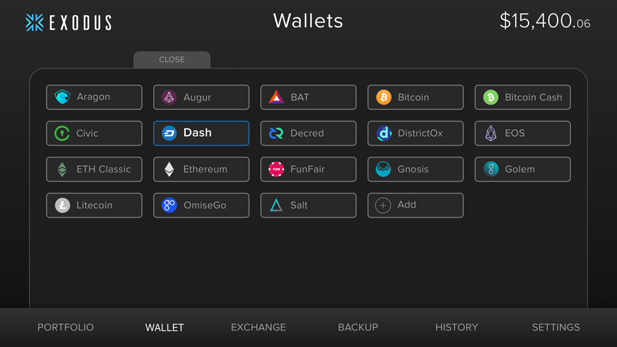
1. User clicks on “WALLET”.
2. A drawer slides out from behind the navigation bar.
3. The user can open any coin wallet they have made available, click the “Add” button to be brought to the settings screen, or close the wallet drawer by clicking the “CLOSE” tab on the top of the drawer. As the mouse pointer hovers over a wallet button, it will glow with the color of that button’s branding.
4. After a coin wallet has been opened, the drawer will slide back down and reveal the coin wallet screen.
5. From this screen, the user can find their address to receive coins in that that specific wallet, send coins, or open a new coin wallet by clicking on the “OPEN” tab at the bottom of the screen right above the navigation bar.
6. If the user decides to SEND some coin to another wallet, they simply type the amount in either value input area of the Send Card and the corresponding alternative value will also be shown.
7. When the user clicks “SEND” button, a confirmation overlay will pop up that shows all of the information which pertains to the transaction. If everything looks good, the user clicks the “SUBMIT” button. After clicking the SUBMIT button the transaction will be sent to the blockchain for confirmation.
The Reasoning Behind My Changes
• Slide Drawer - I feel that a slide drawer solves two problems. First, it gives a large amount of space for populating the list or buttons and can then be slid back down to give back that screen real estate to other elements. Also, the slide animation could bring a sense of delight when compared to a static list.
• Wallet Buttons - The buttons bring color and branding into the drawer, while capitalizing on the new horizontal layout. If you compare using a text list versus a group of branded buttons, it is much quicker and easier for a user to find the wallet they are looking for due to being able to spot the logo. In studies, humans have been shown to recognize and process image based symbols faster and more efficiently than text.
• Coin Card - I chose to use my “Coin Card” design for this screen for three reasons. First, since the wallet can also be opened up from the portfolio by clicking on that same coin card, it makes sense to carry over the design. Second, it does a great job of prominently displaying the coin’s value and amount. Third, the branding gives a sense of visual beauty to the screen while providing an immediate sense of comfort when the user receives that visual confirmation of being inside the correct wallet.
• Receive and Send Cards - One of the improvements I wanted to make was to try and bring the UI elements from the Receive and Send pop-up overlays that are in the current design. I carried over my theme of using rounded frames to create cards out of the Send and Receive UI elements. I feel this choice works well visually by playing off of the Coin Card and it works well functionally by making the information and interactive elements easy to locate and use.
EXCHANGE
CURRENT DESIGN

What Could Be Improved
In general, I like this layout. One area I thought I could improve upon was to remove the redundancy, in areas where the same information was repeated and could end up creating confusion for a user during the experience of trying to exchange coins.
Overall, I think the design could be simplified to provide a cleaner visual hierarchy and user experience.
MY REDESIGN

The User Experience
1. When the user first opens the screen they will see two boxes at the top of the screen. The coin they are exchanging on the upper left and the coin the will receive from the exchange on the upper right.
2. The box of the coin being exchanged contains the total value being kept in that coin’s wallet and an interactive arrow. When the arrow is clicked, a drop down menu appears which lets the user choose a different coin.
3. The box on the upper right contains the coin which will be received from the exchange and contains a simple reference equation which displays how much of that coin is an equal value to a single coin being exchanged. There is also an arrow icon within this box which gives the user access to a drop down menu for changing to a different coin.
4. Under the two boxes, the user will find an area which shows the actual values of the exchange along with a button to start the process.
5. On the left, the user can type in the amount of coin they wish to exchange or click on one of the “quick tabs” if that is more relevant to their immediate goals for the transaction.
6. When the user is ready to initiate the exchange, they will click the exchange button.
7. After the button is clicked, a summary overlay will pop-up which displays all of the information about the exchange with a “SUBMIT” button located at the bottom.
If the SUBMIT button is clicked, the transaction process begins and is sent to the blockchain network for confirmation.
The Reasoning Behind My Changes
• Condensing Information - I felt that by condensing information that was duplicated in the current design, a more comfortable user experience could be created.
• Linking Lines - I felt that by using colored linking lines to show a connection between the two coins being exchanged relayed the idea better than the double arrow icon being used in the current design. This is because the double arrows could cause confusion in which a new user may wonder what the arrow represents that is pointing away from the receiving coin box.
• Confirmation Summary Pop-up Overlay - I think implementing a pop-up summary so the user can confirm that everything is correct with the exchange before it is submitted is a good way to make the user feel secure and protected against accidental clicks or incorrectly typed values.
BACKUP
CURRENT DESIGN

What Could Be Improved
• Within the layout, the UI elements feel a little like they are floating throughout the space and I feel like the visual hierarchy could be improved.
• The CTA buttons could stand out more for visual clarity that they are clickable.
MY REDESIGN

The User Experience
1. After the user creates their first backup, they will be greeted by this screen.
2. At the top of the screen, under the title, the user will see a short description of when the last time Exodus was backed up.
3. Under that, two different areas can clearly be seen, with corresponding CTA buttons.
4. On the left, the user will find an area dedicated to information about their recovery email and password. When the CTA button is clicked, the user will be prompted to change their Recovery Email and Password.
5. On the right, the user will find an area dedicated to information about their Recovery Phrase. When the CTA button is clicked, the user’s Recovery Phrase will be revealed.
The Reasoning Behind My Changes
• New Icons - I feel that the current icons look a bit outdated and offer no visual cue as to the status of the backup. With the new icons, I added green check marks to visually comfort the user in knowing immediately that everything has been completely properly and is secure.
• Copy Rewrite - I think the current copy doesn’t provide enough context and detail, so I rewrote it slightly.
• More Prominent CTA Buttons - The CTA buttons were colored grey to give more contrast with the background. This makes them stand out more as clickable buttons when compared to the dark colored ones in the current design.
HISTORY
MY DESIGN

Why It's Important
I felt that it was a more efficient idea to have a screen dedicated to the history of every transaction made within Exodus, instead of that transaction history living within each separate coin wallet.
I think that having a dedicated transaction history for each coin could still be valuable, but the percentage of users that would need that specific functionality would most likely be very small in comparison to the amount of users that would benefit to a overall Exodus transaction history.
This is similar to what people are used to with their bank account and I feel that it creates a more familiar user experience.
The User Experience
When the user first opens their History they will automatically be shown the “All” tab, which slides out from behind the navigation bar just like the wallet. This screen shows every transaction the user has made through Exodus.
Other options the user can choose to see are Sent, Received, and Exchanged. Each tab will show a transaction history for the corresponding category.
Each transaction is represented by a long rectangular bar and is populated by the most relevant information. If more information is needed or wanted, the user can simply click on the chosen transaction and it will open up to reveal more information.
At the far left of the transaction is the category that transaction is sorted under. Next to the category, the user will see the value of the coin or coins which were used in the transaction. After that is the area where a Sent transaction shows if it is confirmed or unconfirmed. Finally, all the way to the right is the time stamp for the transaction.
The Reasoning Behind My Design Choices
• Slide Drawer - As with the cards, the slider drawer has become an element reused in multiple screens. This gives consistency to the design overall and it works well in accomplishing its UI goals.
• Tabs - Using these 4 different tabs accomplishes the goal of providing the user with being able to see their transaction history in a way that is both easy to use and highly functional.
• Colored Values - By implementing colored values, it helps each coin stand out throughout the transaction history. This helps with the speed in which a user can visually locate a specific transaction.
SETTINGS
CURRENT DESIGN

What Could Be Improved
The checkmarks work in a functional sense, but I think that using switches is a better way to relay the concept of turning something on/off or show/hide.
In its current form, the design aesthetics don’t work well with the UI elements of my redesign. So, some elements will have to be “tweaked”.
MY REDESIGN

The User Experience
1. User clicks on “SETTINGS”.
2. Immediately they will see the Settings Drawer with the “Assets” tab activated.
3. The user will see each asset listed in alphabetical order from top to bottom.
4. If they want to activate the wallet they toggle the switch green. Deactivated assets have their switches greyed-out to show them being off or hidden.
5. The coin logo, title, abbreviation, and description are prominently displayed next to the toggles for quick and easy reference.
6. If the user would like to follow the activity of a certain project or learn more about it, they can find the website, Reddit, and Twitter links can be found to the far right displayed in circular icons.
The Reasoning Behind My Design Choices
• Slide Drawer - My slide drawer design works well here for the same reasons as with the transaction history. It accomplishes the needs of the Settings functionality by providing tabs and the design aesthetic is in-line with the rest of the redesign.
• Integrating “Help” - Many people are used to touchscreen and modern interfaces which do not prominently display a “Help” in the main navigation. I felt that the interface could be cleaned up by moving it into the settings screen, as you might find in a mobile interface.
EXODUS MOBILE


