


Project
The following project will take you through the visual identity for a play called “The Dumb Waiter”. It’s a 1960’s play that criticizes the society and power hierarchy of the time. We follow two hitmen sitting in a basement waiting for an order, from up top, about who their target will be…
Idea
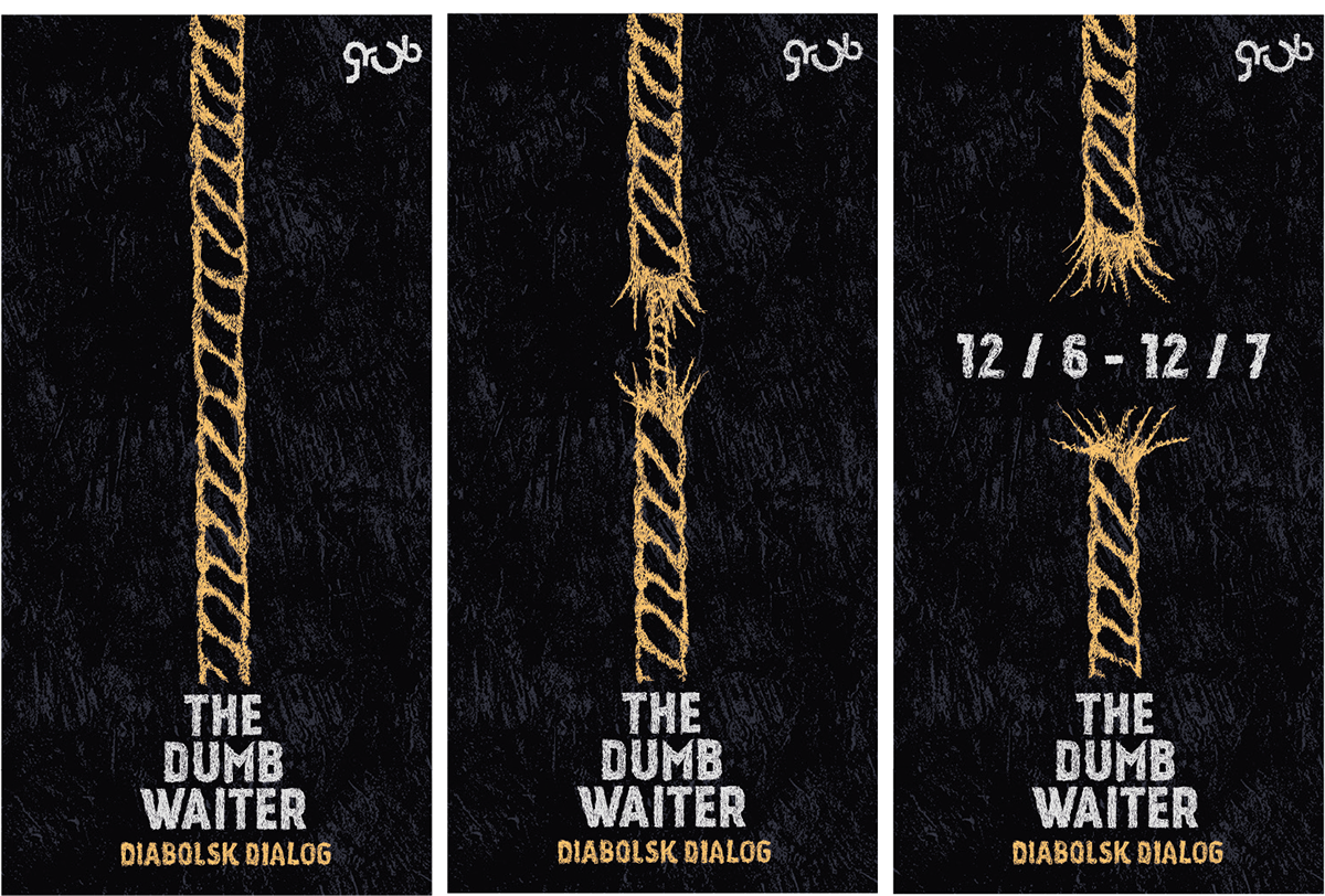
We chose to create a dark and gritty look, to resemble the feeling of uneasiness and uncertainty that the script conveys. The handdrawn lines that are used for both headlines and illustrations symbolises the strings used to control a puppet. The same way the hitmen are being controlled. This graphic choice also helps create a unique look and more recognizability.
Typography
The display typography, Kankin, which is used for both headlines and the logo, is meant to draw parallels to the gritty film noir univers.
The secondary font, Monaco, is used for paragraphs. The serif font is meant to resemble a classic typewriter font, that was used in the 60’s where the play was written.
Colors
Contrast is key. The dark blue/grey concrete texture used for backgrounds symbolizes the dark concrete basement where the two hitmen are waiting. Only they white text and illustrations breaks this dark and moody feeling of entrapment.

Video ad
Interactive web banner.

Poster.

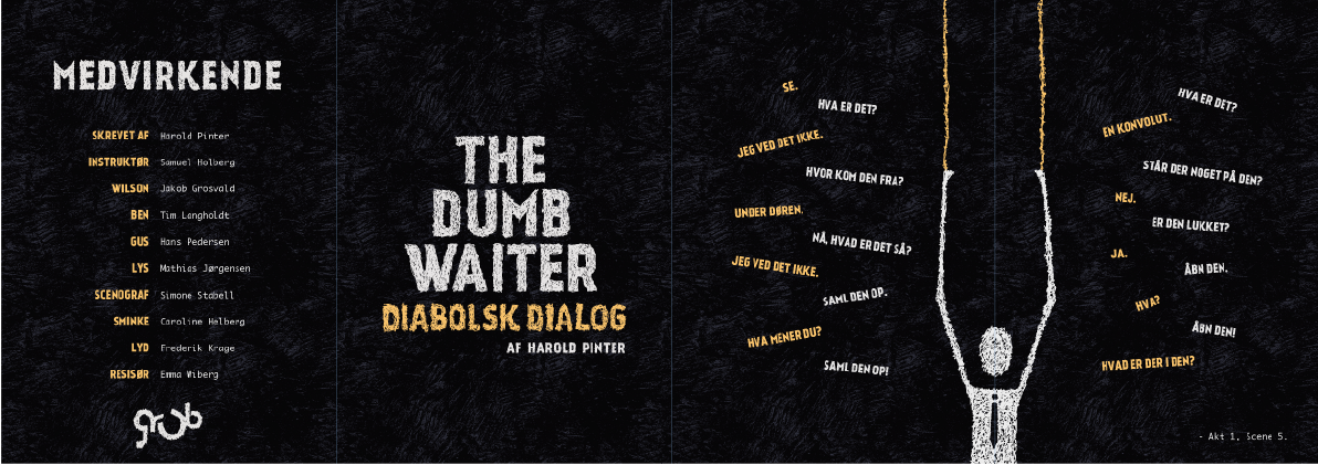
Magic folder, with poster on the back.
Thanks!


